
Ashton, a cornerstone of Canadian culinary history and the nation’s first restaurant chain dedicated to poutine, has embarked on a comprehensive brand revitalization, aiming to reconnect with its heritage while embracing a contemporary appeal to attract a new generation of diners and employees. The iconic eatery, which has been serving its signature dish since 1969, faced significant challenges stemming from decades of stasis in its brand image and physical restaurant environments. This strategic overhaul, spearheaded by new owners Émilie Adam and Jean-Christophe Lirette, seeks to address stagnant sales, an aging customer base, and the need for a more dynamic appeal to younger workers, positioning Ashton for future growth and potential international expansion.
A Legacy in Need of a Refresh
Founded in 1969, Ashton quickly established itself as a beloved Quebec institution, synonymous with the comfort and indulgence of poutine. For over five decades, it maintained a loyal following, but as consumer tastes evolved and the competitive landscape of the fast-casual dining sector intensified, Ashton’s brand identity began to feel antiquated. The existing 23 locations, while steeped in history, often reflected an aesthetic that had not kept pace with modern design trends or the expectations of a younger demographic.
The transition of leadership in 2022 marked a pivotal moment for the chain. Adam and Lirette, taking the reins from Ashton Leblond, recognized the urgent need for a significant transformation. Their vision extended beyond mere cosmetic changes; it encompassed a fundamental reimagining of the customer experience, from the visual identity to the physical space and the overall brand narrative. The primary objectives were clear: boost sales, modernize the restaurant atmosphere, appeal to a broader demographic, and foster a more attractive work environment for potential employees.

LG2 Spearheads a Comprehensive Brand Experience Overhaul
To navigate these complex challenges, Ashton partnered with LG2, a renowned creative agency recognized for its expertise in brand strategy and design. LG2 was tasked with reimagining Ashton’s entire brand experience, focusing on a flagship restaurant as a testbed for the new vision. The goal was to simplify the brand, imbue it with a renewed sense of relevance, and develop a model that could be successfully exported to other locations and potentially international markets.
The agency’s approach centered on striking a delicate balance between honoring Ashton’s rich history and injecting a contemporary sensibility. This involved a deep dive into the brand’s heritage, identifying key elements that resonated with its identity and finding innovative ways to translate them into a modern context. The result is a revitalized brand experience that feels both familiar and fresh, designed to appeal to both long-time patrons and newcomers alike.
A New Take on Nostalgia: Honoring the Past, Embracing the Future
LG2’s redesign masterfully blends modernity with traditions deeply rooted in Ashton’s history. The agency drew inspiration from the quintessential Canadian snack bar culture, integrating classic diner codes with a modern twist. This thoughtful approach ensures that the brand feels authentic and connected to its origins, while simultaneously presenting a polished and inviting image.
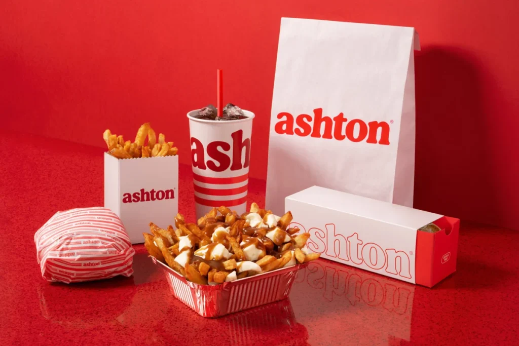
A significant element of this revitalization is the creation of a customized typographic signature. This new typeface is designed to emphasize the generous, indulgent nature of Ashton’s dishes, conveying a sense of hearty satisfaction. The brand’s signature red color, a long-standing visual cue, has been updated to a richer, more vibrant hue, reinforcing its presence and impact.
Nostalgia is woven throughout the new brand merchandise, featuring illustrations that evoke the spirit of Ashton’s earliest logos. This tactile connection to the past serves as a powerful reminder of the brand’s enduring legacy. The overall aesthetic is characterized by rich colors, prominent curved edges, and a distinctive triple red line. This iconic motif, inspired by the chain’s original neon lighting, is a unifying element that appears across all touchpoints of the graphic system. From updated packaging to playful details like stripes on socks, the triple red line serves as a consistent and recognizable brand identifier.
The Restaurant as a Culinary Experience: From Exterior to Interior
The transformation extends beyond branding and packaging to the very essence of the restaurant environment. LG2 aimed to create an atmosphere as comforting and inviting as Ashton’s poutine itself. The design concept was completely overhauled, affecting everything from the exterior facade to the minutiae of interior details.
Key design elements that pay homage to Ashton’s origins include pervasive curves, evocative neon lighting, and a signature red tin roof, all reminiscent of the brand’s original 1969 food truck. These elements create a sense of continuity and connect diners to the brand’s foundational story.
Within the dining area, a monochrome red border runs through the space, guiding the eye and accentuating the layout. The famous banquettes, a hallmark of classic diners, remain a prominent feature, centrally positioned to encourage communal dining and a sense of comfort. This carefully considered and reproducible layout is designed for seamless implementation across Ashton’s existing and future restaurant locations, ensuring a consistent brand experience nationwide.

Tangible Results: A Recipe for Success
The impact of Ashton’s revitalization has been swift and significant, with early data demonstrating the effectiveness of the new strategy. Within the first 30 days of launching the redesigned flagship location, the restaurant experienced a remarkable surge in customer engagement and sales.
- Traffic Increase: The renovated location saw a 35% increase in foot traffic, indicating a strong draw for both existing and new customers.
- Sales Growth: This surge in traffic translated directly into increased revenue, with a 34% rise in sales at the first renovated establishment.
- Digital Engagement: The brand’s online presence also experienced a substantial boost, with a 40% increase in visits to the Ashton website, suggesting growing interest and online exploration of the revitalized brand.
These metrics provide compelling evidence that Ashton has successfully found a winning formula. The revitalization efforts have not only secured the loyalty of its dedicated, long-time fans but have also effectively attracted a new cohort of food enthusiasts eager to experience a dining establishment that expertly balances retro charm with contemporary appeal.
Broader Implications and Future Outlook
The success of Ashton’s brand revitalization has significant implications for the chain and the broader Canadian restaurant industry. By successfully merging nostalgia with modern design principles, Ashton has demonstrated a viable path for legacy brands to adapt and thrive in a rapidly evolving market.
The strategy employed by LG2 highlights the power of a holistic brand approach. It’s not just about a new logo or a renovated space; it’s about crafting a cohesive and compelling experience that resonates with consumers on multiple levels. The emphasis on heritage, coupled with a forward-looking aesthetic, creates a unique selling proposition that can differentiate Ashton in a crowded marketplace.

The potential for international expansion, now more tangible with a refined and exportable brand model, could see Ashton introduce its beloved poutine and unique brand experience to new global audiences. This would not only represent a significant growth opportunity for the company but also a continued celebration of Canadian culinary heritage on a larger stage.
Furthermore, the revitalized brand is likely to have a positive impact on employee recruitment and retention. A modern, appealing, and well-designed workplace can attract a younger talent pool and foster a greater sense of pride and engagement among existing staff. This is crucial for a service industry that relies heavily on its human capital.
The case of Ashton serves as a valuable study for other established brands grappling with similar challenges. It underscores the importance of strategic investment in brand rejuvenation, recognizing that while heritage is a powerful asset, it must be thoughtfully integrated with contemporary relevance to ensure long-term success and sustained growth. The journey of Ashton from a retro diner to a revitalized brand is a testament to the power of thoughtful design and strategic vision in breathing new life into beloved culinary institutions.


