
The most impactful visual concepts in brand identity do not spontaneously emerge from design software; rather, they are the culmination of incisive questioning and rigorous definition in the often-overlooked "pre-concept phase." This crucial stage precedes any visual creation, focusing instead on deep research into brand context, uncovering latent stakeholder assumptions, and meticulously crafting a shared strategic direction that forms a robust visual foundation. Failures in branding projects frequently originate not from flawed execution at the logo stage, but from a lack of clarity in the strategic phase, where abstract terms like "modern," "trustworthy," "premium," "friendly," or "disruptive" remain ambiguously defined. This ambiguity creates a significant chasm between the intended brand communication and the visual output expected from designers.
The Unseen Pitfalls of Ambiguity
At the outset of a branding endeavor, designers typically receive a deluge of information: a project brief, stakeholder interviews, competitor analyses, and perhaps a mood board or a list of adjectives. From this mosaic, they are then tasked with generating visual concepts that "feel right." However, the subjective nature of "right" becomes an insurmountable hurdle when the entire team has not achieved a consensus on the brand’s fundamental communicative purpose. Industry analysis suggests that a substantial proportion of branding projects—some reports indicating as high as 40%—face significant delays, require costly revisions, or ultimately fail to resonate with their target audience due to these initial strategic misalignments. A 2022 survey of design and marketing agencies highlighted that semantic discrepancies and undefined strategic language are among the primary sources of friction and inefficiency in the branding process.
Consider a health technology company that sought a brand identity embodying modernity, trustworthiness, and disruptiveness. Initially, "disruptive" might evoke images of bold, unconventional, or even rebellious aesthetics. Yet, through deeper engagement, it became clear that for this particular client, disruption needed to be perceived within the conservative confines of the healthcare environment. Their primary clientele consisted of large governmental medical institutions. A brand that leaned too heavily into rebellious, experimental, or visually loud expressions would inadvertently undermine the very trust it aimed to build. Their interpretation of "disruptive," therefore, skewed more traditional than the word’s common usage might suggest.
The issue was not the client’s choice of language, but its inherent breadth, rendering it inadequate for guiding precise design decisions. Before a designer can effectively translate strategy into a visual concept, these broad descriptors must be meticulously refined. What specific kind of modern is desired? In what manner should the brand convey trustworthiness? Disruptive compared to whom? And crucially, how far can the brand deviate from established category expectations before it alienates its intended audience?
The Pre-Concept Phase: A Structured Approach
This critical pre-concept phase unfolds after the initial project kickoff but prior to any substantive visual direction. While the comprehensive brand identity process for digital products encompasses strategy, conceptualization, implementation, and asset development, this article specifically zeroes in on the foundational work that makes the initial concept viable. This involves meticulous research into the brand’s ecosystem, the systematic uncovering of hidden stakeholder assumptions, and the diligent process of transforming shared strategic direction into a tangible visual bedrock. It serves as a practical conduit, bridging the gap between what the brand fundamentally needs to signify and how it might begin to visually manifest.

The initial cornerstone for constructing this bridge is typically the brand workshop, where broad-stroke discovery transitions into a granular understanding of the brand’s context.
Stage 1: Researching Brand Context and Uncovering Assumptions
A well-executed brand workshop naturally delves into standard discovery topics: the business model, overarching goals, product or service offerings, the competitive landscape, and the target audience. However, the true efficacy of this stage lies not just in collecting facts, but in clarifying perceptions. The brand, as famously articulated by Marty Neumeier in "The Brand Gap," is "a person’s gut feeling about a product, service, or company." If the brand’s ultimate residence is in the minds of others, the workshop’s paramount objective must be to define precisely which perception the team aims to cultivate.
Beyond standard queries, a set of often-skipped but invaluable questions focuses less on data collection and more on elucidating perception. These questions probe the underlying assumptions behind opinions, preventing the workshop from becoming a mere aggregation of subjective viewpoints. They reveal what the brand needs people to believe, where its credibility must reside, and which category norms it should either embrace or strategically challenge.

For instance, when a stakeholder asserts the brand should feel "premium," universal nodding might ensue. Yet, one individual might envision a refined, editorial aesthetic; another, an exclusive and expensive visual language; and a third, a clean, quiet, and minimalist approach. The shared word masks three fundamentally disparate visual systems. In the health tech example, the word "disruptive" initially suggested a bold, loud approach. However, the client’s target audience—large government medical institutions—necessitated that disruption be conveyed through clarity, efficiency, and confidence, rather than overt rebellion. Had the term been taken at face value, the resulting visual direction would likely have strayed too far from what their audience would deem trustworthy. Similarly, a fintech client desiring a "bold" brand identity without sacrificing credibility presented a useful tension. "Bold" could imply vibrant colors and oversized typography, but in a financial context, it also had to communicate security, control, and competence. The challenge wasn’t whether to be bold, but what kind of boldness would still inspire trust.
When these attributes are defined within their specific context, designers are no longer grappling with vague adjectives. They are addressing a clear, well-articulated design problem. While strategically framed questions can uncover aspects of the verbal layer, words alone are rarely sufficient. To bridge language and visual direction, incorporating exercises that compel stakeholders to think through images, associations, and relative perceptions is paramount. As Jake Knapp underscored in GV’s "Three-Hour Brand Sprint," the purpose of such exercises is to transform the abstract notion of "our brand" into something concrete. These exercises also foster active stakeholder participation, moving them beyond passive agreement to revealing their attitudes, beliefs, and potential disagreements before they can undermine the first concept review.
Stage 2: Translating Words into Visual Insights (Exercises)
The process typically begins by examining the category externally, then shifting focus inward to the brand itself.

-
Exercise 1: Competitor Perception Mapping
Prior to the workshop, a curated collection of visual touchpoints from competitor brands (websites, product interfaces, social media visuals) is assembled. During the workshop, the client team is tasked with positioning these competitors on a simple two-axis map. This exercise transcends mere aesthetic judgment; its core purpose is to illuminate how the client interprets the category. It reveals what registers as credible, generic, overly conservative, or excessively experimental, and crucially, where a potential visual "white space" might exist for the new brand.The axes are strategically chosen to reflect the inherent tensions the brand needs to navigate. For the aforementioned health tech company, a map might utilize "Traditional to Progressive" and "Corporate to Human." For a fintech brand aiming for distinction without compromising trust, "Understated to Bold" and "Accessible to Exclusive" could be effective axes. The most illuminating aspect of this exercise often isn’t the final map itself, but the healthy disagreements it sparks. One stakeholder might perceive a competitor as progressive, while another dismisses it as generic. Such discrepancies expose differing definitions of trust, innovation, credibility, and differentiation – precisely the ambiguities that demand resolution before design work commences.
-
Exercise 2: Visual Brand Driver
Following the category discussion, the focus shifts internally. The "Visual Brand Driver" exercise asks each stakeholder to select images for a series of seemingly unrelated categories: transport, typeface, activity, furniture, mood, object, animal, architecture, and drink. A critical instruction accompanies this task: the chosen images must represent the company, not the individual’s personal aesthetic preference.For example, if the company were a mode of transport, would it be a silent electric car, a high-speed train, a private jet, a bicycle, or a delivery van? If it were a piece of furniture, would it manifest as a plush lounge chair, a meticulously crafted modular desk, or a imposing boardroom table? After selecting images, each participant adds four or five adjectives explaining their choices. This explanation is often more valuable than the image itself, as the same object can carry diverse meanings. A train might signify speed, structure, reliability, mass accessibility, or a fixed trajectory. A lounge chair could suggest comfort, serenity, informality, or a lack of urgency.

This exercise cultivates a deeper understanding of brand perception by encouraging metaphorical and associative thinking, rather than direct description. It brings latent patterns and contradictions to the surface: one stakeholder might perceive the brand as refined and tranquil, while another sees it as energetic and experimental. One might describe it as precise and structured, another as warm and flexible. These differences are not problems but invaluable insights, highlighting areas requiring clarification before the visual concept phase begins. Moreover, this exercise effectively disentangles brand perception from personal aesthetic preferences, reinforcing the principle that the question is not "Do we like this?" but "Does this effectively express the right message about the brand?"
Stage 3: Building a Shared Visual Foundation
Once the workshop has unearthed core assumptions and clarified intent, the subsequent client meeting is dedicated to translating this shared understanding into a concrete visual foundation. This stage is still distinct from the first identity concept; it serves as a working layer between strategy and design, allowing the client to react to proposed perceptions, visual principles, and nascent asset directions before the designer commits significant resources to developing full concepts. This meeting is typically structured around three interconnected layers, progressing from abstract perception to practical design boundaries:
-
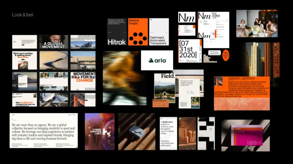
Look and Feel Boards
These are not merely collections of aesthetically pleasing visuals; they are perception boards. The designer curates references based on the workshop’s insights: desired perception, category tensions, competitor codes, identified stakeholder disagreements, and the evolving brand character. If the brand aims to be trustworthy, modern, and human, the board facilitates a discussion about the specific kind of trust, modernity, and humanity that is appropriate. Is the brand calm and institutional, or warm and approachable? Is its progressive nature expressed through precision, or through a more expressive, editorial tone? The objective is to elicit client feedback on perception before introducing fully formed logos, color palettes, or complete visual systems.
-
Design Code
The design code translates key brand ideas into more specific visual principles. For a parenting app focused on "personalized support for your unique journey," this might manifest as organic shapes, handwritten lines, and softer compositions. If the brand posits that "parenting is messy and magical," the code might include soft gradients, layered imagery, and playful irregularities. Conversely, "research-backed support for real life" could introduce elements like doctor calls, data snapshots, infographics, and structured editorial layouts to bolster credibility. For a PR agency serving prop tech companies, the idea of "momentum in motion" could be interpreted through lines, arrows, ripple effects, or motion blur. "Springboard" might evoke a lift-off dynamic and elastic visual energy, while "building blocks" could translate into modular shapes or stacked compositions. At this juncture, the team is not selecting the final graphic expression, but rather testing the coherence and relevance of visual metaphors before concept design commences. -
Brand Assets
This final layer brings the conversation down to the foundational elements of identity: typography, color, logo style, photography, illustration, and overall graphic language. At this stage, the team can address specific questions: Should the typography feel precise or expressive? Is the color palette vibrant or subdued? Should the logo be abstract or literal? What style of photography (documentary, stylized, aspirational) aligns best? This provides the designer with crucial boundaries, shaping the creative landscape without rendering the final identity predictable. The subsequent step remains concept design, but the team now operates from a shared understanding, free from vague adjectives or unspoken expectations.
Implications of a Robust Pre-Concept Phase
Adopting a thorough pre-concept phase offers significant implications for both the efficiency and ultimate success of branding projects. Firstly, it leads to enhanced efficiency and considerable cost savings. By resolving ambiguities and achieving alignment early, the need for extensive rework and multiple rounds of revisions at later, more expensive stages is drastically reduced. This streamlined process translates directly into faster project completion and optimized resource allocation. Secondly, it fosters stronger brand equity. A clearly defined visual foundation ensures consistent messaging across all touchpoints, which is vital for building a coherent brand narrative and establishing a clear, differentiated market position.

Furthermore, a robust pre-concept phase enhances collaboration between clients and designers. It transforms the client from a passive recipient of designs into an active, informed participant, fostering a sense of shared ownership and mutual understanding. This collaborative environment significantly reduces risk, mitigating subjective "likes" and dislikes by grounding all decisions in strategic alignment. Crucially, it provides creative freedom within defined boundaries. Designers receive a sharper, more insightful brief, which paradoxically liberates them to explore innovative solutions with greater confidence and purpose, leading to more targeted and impactful creative outcomes. Leading branding experts widely advocate for dedicated pre-concept phases, citing their transformative effect on project success rates and long-term brand health.
Pre-Concept Checklist: Ensuring Alignment
Before advancing to the initial concept phase, it is invaluable to pause and verify that the team possesses sufficient shared direction. This checklist is not intended to predetermine every design decision, but rather to ensure that the designer is not embarking on the creative journey armed with vague terminology, unexamined assumptions, or unresolved disagreements.
Before creating the first concept, the team should confirm that they have:

- Clearly defined what seemingly broad terms like "modern," "trustworthy," or "disruptive" specifically mean in the brand’s context.
- Achieved a shared understanding of the desired emotional tone and overall perception the brand should evoke.
- Agreed upon the relevant category boundaries and identified opportunities for differentiation.
- Discussed and resolved any significant stakeholder disagreements regarding brand perception.
- Established preliminary visual principles and asset directions (e.g., typography, color palette, photographic style) that align with the refined strategy.
This final point is particularly potent. A strong pre-concept phase not only illuminates what to explore but also clarifies what to avoid: directions that would be too predictable, too sterile, excessively playful, overly conservative, too loud, too generic, or simply incongruent with what the target audience expects and trusts. When these boundaries are clearly articulated, evaluating the first concept becomes a far more objective exercise. The conversation naturally shifts from subjective judgments like "I like it" or "I don’t like it" to a more strategic query: "Does this visual direction effectively express the brand we have collectively agreed upon?"
The First Concept Should Not Be A Guess
The initial visual concept should never feel like a speculative guess or a surprising revelation. Instead, it should be perceived as a logical and intentional progression, a natural next step in a direction that the entire team already comprehends and supports. This approach does not stifle intuition, experimentation, or creative risk in the branding process. On the contrary, it provides these vital elements with a sharper problem to solve. When the team has meticulously clarified the brand character, rigorously tested visual perception, translated abstract ideas into concrete design principles, and thoughtfully discussed the foundational building blocks of the identity, designers are empowered to explore with enhanced confidence and precision.
Ultimately, pre-concept work does not aim to render the final identity predictable. Its true purpose is to make the conversation surrounding it more meaningful. By moving beyond personal preferences and private expectations, the team can engage in a more profound and effective dialogue, continually asking the most pertinent question: Does this visual direction truly articulate what the brand needs to become?