
The journey to a potent visual brand identity rarely begins with a blank canvas in design software. Instead, it starts much earlier, in a crucial "pre-concept" phase where the most impactful visual concepts are forged not from immediate aesthetics, but from rigorously defined strategic questions and a profound understanding of brand context. This often-overlooked stage involves intensive research, the systematic uncovering of hidden assumptions among stakeholders, and the meticulous translation of shared strategic direction into a robust visual foundation, long before any concrete visual concepts are ever presented.
When branding projects falter, the root cause frequently predates the creation of a logo or a colour palette. The failure typically originates in the strategic phase, where ostensibly clear terms like "modern," "trustworthy," "premium," "friendly," or "disruptive" are left open to individual interpretation. This lack of precise definition creates a significant chasm between what the brand is ultimately intended to communicate and what a designer is expected to visually manifest. It is precisely this ambiguous territory that defines the critical "pre-concept" phase – a period of focused inquiry and alignment essential for bridging the gap between verbal strategy and tangible design.
The Challenge of Ambiguous Language in Brand Development
At the outset of a typical branding engagement, designers are often inundated with various inputs: a project brief, a series of stakeholder interviews, competitor analyses, perhaps a mood board, or a list of desired brand adjectives. From this mosaic of information, they are tasked with generating visual concepts that "feel right." However, determining what constitutes "right" becomes an insurmountable challenge when the entire team has not achieved a unified understanding of the brand’s core communication objectives. This initial misalignment is a leading cause of project delays, budget overruns, and ultimately, unsuccessful brand launches. Industry reports frequently indicate that up to 30% of creative projects face significant rework due to misinterpretations of initial briefs, highlighting the financial and reputational costs of skipping or inadequately addressing the pre-concept phase.
Consider the case of a health technology company seeking a brand identity that was "modern, trustworthy, and disruptive." Initially, "disruptive" might evoke imagery of bold, unconventional, or even rebellious design. However, through deeper dialogue, it became clear that for this client, disruption needed to be tempered with credibility within a highly conservative healthcare ecosystem. Their primary clientele consisted of large government medical institutions, where a brand perceived as overly rebellious, experimental, or visually loud would fundamentally undermine the trust essential for engagement. In essence, their interpretation of "disruptive" leaned towards efficiency, clarity, and confident innovation, rather than overt rebellion—a nuance lost if the term were taken at face value. This illustrates that the issue is not necessarily the client’s choice of language, but rather the inherent breadth and potential for misinterpretation within that language. Before any designer can effectively translate strategy into a visual concept, these broad adjectives must be meticulously refined and contextualized. What specific type of modernity is sought? In what precise manner should the brand exude trustworthiness? Who are the competitors against whom this brand aims to be disruptive? And critically, what is the acceptable boundary for deviating from established category expectations before the brand risks alienating its intended audience?
Defining the Pre-Concept Phase: A Strategic Bridge
This article specifically delves into the pre-concept phase: the intensive work that unfolds subsequent to project kickoff but prior to the development of the initial visual direction. While the broader brand identity process encompasses strategy, concept generation, implementation, and the creation of assets for consistent product development, the focus here is on the foundational activities that make the first concept viable and impactful. This includes comprehensive research into the brand’s context, the proactive identification and resolution of hidden assumptions among stakeholders, and the crucial process of converting shared strategic direction into a tangible visual blueprint. It serves as a pragmatic bridge, connecting what the brand must signify with how it might authentically appear. The cornerstone of constructing this bridge is typically the brand workshop, where expansive discovery efforts are meticulously distilled into a granular understanding of the brand’s ecosystem.
Stage 1: Researching the Brand Context Through Collaborative Workshops
A well-structured brand workshop naturally covers standard discovery topics: the business model, its overarching goals, the specific product or service offerings, the competitive landscape, and the identified target audience. While a comprehensive list of workshop questions is extensive, the emphasis in the pre-concept phase shifts to a specific subset of questions that, though easily overlooked, are indispensable before any visual work commences. These questions are less about gathering factual data and more about clarifying perceptions—understanding precisely what beliefs the brand needs to instill in its audience, the spheres in which it must establish credibility, and which category conventions it should either embrace or strategically challenge.
Perception lies at the very heart of brand discovery because, as renowned brand strategist Marty Neumeier articulates in "The Brand Gap," "A brand is a person’s gut feeling about a product, service, or company." If a brand ultimately resides within the subjective perception of its audience, then the workshop’s paramount objective must be to articulate the precise perception the team endeavours to cultivate.
Key perception-focused questions for this stage include:

- What does our brand need to make people believe about us?
- Where do we need to feel credible within our industry?
- Which category assumptions do we need to follow to be understood and trusted?
- Which category assumptions do we want to challenge to differentiate ourselves?
These questions are designed to unearth the underlying assumptions that drive individual opinions, rather than merely accumulating more subjective viewpoints. The specificity of these questions is paramount because brand attributes, such as "premium," can sound harmonized until their true meaning is probed. One stakeholder might associate "premium" with refined elegance and an editorial aesthetic, another with exclusivity and high cost, and yet another with minimalist design and quiet sophistication. While the word appears to be shared, it can inadvertently lead to three fundamentally distinct visual systems.
Revisiting the health tech example, the client’s desire for a "disruptive" brand in a conservative medical environment necessitated a deep dive into what "disruptive" meant in their specific context. It was not about loud visuals but about a quiet confidence, efficient processes, and cutting-edge clarity that would resonate with large governmental institutions. Had the design team proceeded solely on the face value of "disruptive," the resulting visual direction could have veered too far from the trust-building aesthetic required by their audience. Similarly, a fintech client aiming for a "bold" yet "credible" brand faced a similar tension. "Bold" could imply vibrant colours and expressive typography, but in finance, it also had to convey security, control, and competence. The critical question wasn’t whether to be bold, but rather, what kind of boldness would still unequivocally inspire trust. By defining these attributes within their specific context, designers transition from working with vague adjectives to addressing clearly articulated design challenges.
Unearthing Nuances: Key Exercises for Stakeholder Engagement
While strategically crafted questions are vital for revealing the verbal layer of brand perception, words alone are rarely sufficient. To effectively translate abstract language into concrete visual direction, it is highly beneficial to integrate exercises that compel stakeholders to engage with images, associations, and relative perceptions. Jake Knapp, in GV’s "Three-Hour Brand Sprint," aptly notes that "The point of these exercises is to make the abstract idea of ‘our brand’ into something concrete."
These exercises are crucial for fostering active stakeholder participation. When clients merely receive a strategy presentation, they can remain passive, potentially agreeing in meetings without fully recognizing their own ingrained assumptions. However, when they are required to position a competitor on a perceptual map, select an image, or articulate why a particular visual reference resonates as credible, they transform into active collaborators. Their attitudes, beliefs, and even disagreements become transparent and addressable before they have the potential to derail the initial concept review process. This proactive approach significantly reduces the risk of subjective feedback later on.
The workshop typically progresses by first examining the external category landscape, then shifting focus inward to the brand itself.

Exercise 1: Competitor Perception Mapping
Prior to the workshop, a collection of visual assets from competitor brands—such as website screenshots, product interface elements, social media visuals, or other prominent brand touchpoints—is assembled. During the workshop, the client team is then tasked with strategically placing these competitor visuals onto a simple two-axis map.
The primary objective of this exercise is not to judge the aesthetic quality of competitor designs, but rather to gain insight into how the client perceives their competitive landscape. This reveals what is considered credible, what feels generic, what appears overly conservative, what seems too experimental, and crucially, where a viable visual white space or open territory might exist for the brand to carve out its unique identity.
The axes for the map are deliberately chosen to highlight the key tensions or dichotomies the brand needs to navigate. For instance:
- Traditional to Progressive: Ideal for brands seeking to innovate within established industries.
- Corporate to Human: Useful for brands aiming to balance professionalism with approachability.
- Understated to Bold: Relevant for brands needing to differentiate without alienating a cautious audience.
- Accessible to Exclusive: Appropriate for brands defining their market positioning based on reach or prestige.
For a health tech company aiming to be innovative yet operate within conservative medical institutions, the axes might be "Traditional to Progressive" and "Corporate to Human." For a fintech brand striving for distinctiveness without compromising trust, "Understated to Bold" and "Accessible to Exclusive" could be highly effective. The most valuable outcome of this exercise often emerges not from the final map itself, but from the discussions and disagreements it provokes. One stakeholder might interpret a competitor as progressive, while another dismisses it as generic. One might perceive a brand as premium, while another views it as cold and unapproachable. These divergences are invaluable, as they illuminate precisely where definitions of trust, innovation, credibility, and differentiation diverge among the team—ambiguities that are imperative to resolve before design work commences.
Exercise 2: Visual Brand Driver

Following the external category discussion, the conversation pivots inward to the brand’s intrinsic character. The "Visual Brand Driver" exercise asks each stakeholder to select images across a range of seemingly unrelated categories, such as transport, typeface, activity, furniture, mood, object, animal, architecture, and drink.
A critical instruction accompanies this exercise: the chosen images must represent the company, not the individual’s personal aesthetic preferences. For example, if the company were a form of transport, would it be a silent electric car, a high-speed bullet train, a private jet, a bicycle, or a robust delivery van? If it were a piece of furniture, would it be a plush lounge chair, a meticulously crafted modular desk, or a formidable boardroom table?
After image selection, each participant adds four or five adjectives to elucidate their choices. This explanatory component is often more revealing than the image itself. The same object can carry diverse meanings: a train might symbolize speed, structural integrity, reliability, mass accessibility, or a fixed trajectory. A lounge chair could suggest comfort, tranquility, informality, or even a lack of urgency.
This exercise delves into a deeper layer of brand perception by prompting stakeholders to think through metaphor and association, rather than direct description. This reveals patterns and contradictions. One stakeholder might envision the brand as refined and serene, while another perceives it as energetic and experimental. One might describe the company as precise and structured, another as warm and flexible. These differences are not obstacles; they are rich, actionable insights, highlighting areas that demand clarification before the visual concept phase.
Crucially, the Visual Brand Driver exercise helps to decouple brand perception from personal aesthetic preferences. A stakeholder might personally admire a particular image, but if it fails to accurately describe the company’s essence, it must be excluded. This distinction is fundamental throughout the branding process: the pertinent question is not "Do we like this?" but rather, "Does this effectively express the right thing about the brand?"
Building the Visual Foundation: Bridging Strategy to Early Visuals

Once the workshop has surfaced and clarified the main assumptions and perceptions, the subsequent client meeting is dedicated to translating this shared understanding into a concrete visual foundation. This stage is still not about presenting the final identity concepts; instead, it represents an intermediary working layer between strategy and design. It allows the client to provide feedback on overarching perception, visual principles, and nascent asset directions before the designer invests significant time and resources in developing full-fledged visual concepts.
This meeting is typically structured around three interconnected layers:
- Look and Feel: Broad perceptual direction.
- Design Code: Translation of key brand ideas into visual principles.
- Brand Assets: Early exploration of foundational identity elements.
Together, these layers progressively guide the conversation from abstract perception towards practical design boundaries.
Look and Feel Boards
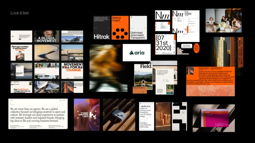
These are not merely mood boards comprising visuals the team "likes." They are perception boards, meticulously curated by the designer based on insights from the workshop: desired perceptions, identified category tensions, competitor visual codes, resolved stakeholder disagreements, and the defined brand character. If the brand needs to project trustworthiness, modernity, and humanity, the board facilitates a discussion about the specific kind of trust, modernity, and humanity that is appropriate. Is the brand calm and institutional, or warm and approachable? Is its progressive nature conveyed through precision, or through a more expressive, editorial tone? The objective here is to elicit client reactions to perception before they react to a fully developed logo, colour palette, or finished visual system. This prevents premature judgments based on personal taste.
Design Code
The "Design Code" refines the direction by translating core brand ideas into actionable visual principles. For example, for a parenting app in Germany, the strategic idea of "personalized support for your unique journey" might translate into a design code featuring organic shapes, handwritten lines, and softer, more fluid compositions. The concept that "parenting is messy and magical" could inspire soft gradients, layered imagery, and playful irregularities. If the brand emphasizes "research-backed support for real life," the design code might incorporate elements like doctor consultations, data snapshots, infographics, and structured editorial layouts to enhance credibility. For a PR agency specializing in prop tech, "momentum in motion" might manifest as lines, arrows, ripple effects, or motion blur. "Springboard" could suggest lift-off dynamics and elastic visual energy, while "building blocks" could lead to modular shapes or stacked compositions. At this stage, the team is not selecting the final graphic expression, but rather validating whether the chosen visual metaphors and principles are strategically sound before concept design commences.
Brand Assets
The final layer of this pre-concept review brings the discussion down to the fundamental building blocks of identity: typography, colour palettes, logo style, photography direction, illustration style, and overall graphic language. At this juncture, the team can engage with specific questions such as:

- Should the logo be logomark-focused, logotype-focused, or a combination?
- What emotional range should the colour palette convey (e.g., vibrant, muted, authoritative, playful)?
- Which type of photography style best aligns with the brand’s personality (e.g., candid, stylized, abstract, documentary)?
- What graphic elements are appropriate for expressing the brand’s key messages (e.g., geometric patterns, organic textures, illustrative motifs)?
This provides the designer with crucial boundaries and guardrails without making the ultimate identity predictable. The subsequent step is indeed concept design, but the team is no longer starting from vague adjectives or disparate private expectations. This structured approach ensures that creative exploration is channelled towards solving a clearly defined problem, rather than navigating a landscape of ambiguity.
The Pre-Concept Checklist: Ensuring Shared Direction
Before transitioning into the creation of the first visual concepts, it is prudent to pause and verify that the team has established sufficient shared direction. This checklist is not intended to pre-empt every design decision but rather to guarantee that the designer is not embarking on the creative phase based on nebulous terminology, unarticulated assumptions, or unresolved disagreements.
Before commencing the first concept development, the team should confirm that they have:
- Articulated the desired brand perception in specific, contextual terms.
- Identified key category assumptions to either follow or challenge.
- Resolved major stakeholder disagreements regarding brand attributes.
- Validated visual metaphors and design principles that connect strategy to visuals.
- Established early boundaries for core brand assets (e.g., logo style, colour mood, photo approach).
- Explicitly named directions to avoid based on audience trust or category relevance.
This final point is particularly valuable. A robust pre-concept phase not only illuminates the pathways for creative exploration but also clarifies what not to pursue: directions that might be too generic, too cold, excessively playful, overly conservative, too visually loud, or ultimately, misaligned with what the target audience expects and trusts. When these boundaries are clearly articulated, the evaluation of the first concept becomes far more objective and productive. The conversation naturally shifts from subjective preferences like "I like it" or "I don’t like it" to the more strategic and actionable query: "Does this visual direction effectively express the brand we have collectively defined and agreed upon?"
Implications for Design Success and Business Value

The strategic investment in a comprehensive pre-concept phase carries significant implications for both design agencies and their clients. For design teams, it fosters greater efficiency by minimizing rework, clarifying creative briefs, and enhancing client satisfaction through a collaborative, transparent process. This leads to more successful project outcomes and stronger, long-term client relationships. For client companies, this approach mitigates the substantial risks associated with misaligned branding. A well-defined brand identity, rooted in shared understanding, translates into stronger market positioning, enhanced customer recognition, and ultimately, a higher return on investment for their branding efforts. Research consistently demonstrates that brands with clear, consistent identities enjoy higher customer loyalty, command stronger pricing power, and experience more robust market share growth. By professionalizing the initial stages of brand development, the pre-concept phase elevates the entire design industry, promoting a more strategic, data-driven, and ultimately, more impactful approach to brand creation.
The First Concept Should Not Be a Guess
The initial visual concept presented to a client should never feel like an arbitrary guess or a surprising reveal. Instead, it should be perceived as a logical and compelling progression in a direction that the entire team already comprehends and has contributed to shaping. This does not imply stifling intuition, curbing experimentation, or removing creative risk from the branding process. On the contrary, it serves to endow these creative elements with a sharper, more defined problem to solve. When the team has meticulously clarified the brand’s character, rigorously tested visual perceptions, translated abstract ideas into tangible design principles, and engaged in early discussions about the foundational building blocks of the identity, designers are empowered to explore with significantly greater confidence and purpose.
Pre-concept work is not intended to render the final identity predictable. Its fundamental purpose is to make the conversation surrounding the brand’s visual evolution more meaningful and productive. Instead of grappling with whether the design aligns with an individual’s unstated personal expectation, the team is equipped to ask a far superior and more critical question: "Does this visual direction authentically express what the brand truly needs to become to succeed in its market?" This strategic clarity empowers creativity, fostering innovative solutions that are both aesthetically compelling and deeply resonant with the brand’s strategic objectives.