
Successful brand identity development, often mistakenly believed to begin with visual concept creation in design software like Figma, fundamentally originates in a meticulously executed "pre-concept" phase. This crucial stage, preceding any tangible design work, focuses on profound research into brand context, the rigorous uncovering of latent stakeholder assumptions, and the strategic translation of shared directional clarity into a robust visual foundation. Industry experts and empirical data consistently underscore that without this foundational work, branding projects are highly susceptible to misalignment, costly revisions, and ultimately, a failure to effectively communicate the intended brand message, impacting everything from market perception to financial performance.
A prevalent challenge in branding projects stems from a premature leap to visual execution without adequate strategic groundwork. Terms such as "modern," "trustworthy," "premium," "friendly," or "disruptive" are frequently cited in project briefs but often remain abstract and undefined. This semantic ambiguity creates a significant chasm between the brand’s aspirational communication goals and the designer’s mandate, frequently leading to dissatisfaction and project delays. Surveys within the design and marketing industries consistently indicate that a substantial percentage of branding initiatives falter at this strategic juncture, not due to a lack of creative talent, but because of an unaddressed gap in shared understanding and precise definition of these abstract attributes. This strategic oversight can lead to significant budgetary overruns and extended timelines, highlighting the critical need for a more structured preliminary phase.
This critical void, termed the "pre-concept" phase, is where the most impactful strategic work for visual identity truly unfolds. Designers typically receive a deluge of information at the outset – briefs, stakeholder interviews, competitor analyses, and sometimes rudimentary mood boards. However, the expectation to spontaneously generate "right" visual concepts becomes an insurmountable task when the collective team has not unequivocally agreed on the core communicative essence of the brand. This initial phase, therefore, is not about designing, but about deeply understanding and meticulously defining the parameters within which design will subsequently thrive.
The Perils of Unexamined Language: Illustrative Case Studies
Consider a recent engagement with a health technology company that sought a brand identity embodying modernity, trustworthiness, and disruption. Initially, "disruptive" might conjure images of bold, unconventional, or even rebellious aesthetics, often associated with tech startups challenging established norms. Yet, through deeper dialogue, it became evident that "disruption" within their specific context – primarily targeting large, conservative government medical institutions – needed to manifest as credible innovation rather than overt rebellion. A brand perceived as overly experimental or visually audacious would inadvertently erode the very trust it aimed to build within its risk-averse client base. Their nuanced interpretation of "disruptive" leaned towards efficiency, clarity, and confident advancement through sophisticated, yet reassuring, technological solutions, presenting a visual challenge far removed from the word’s initial surface meaning. This required a visual language that spoke of cutting-edge capability without appearing frivolous or unproven.
Similarly, a fintech client desired a "bold" identity without compromising credibility. "Bold" could imply vibrant palettes, exaggerated typography, or highly expressive graphic systems in many sectors. However, in the highly regulated and trust-dependent financial sector, "boldness" must concurrently convey security, control, and competence. The objective was not merely to be bold, but to define a specific kind of boldness that resonated with financial trustworthiness – perhaps through confident, clear typography and a distinctive but restrained color palette, rather than an aggressive or flamboyant one. These instances underscore that the issue is rarely the client’s language choice, but rather the inherent breadth of such language, which is insufficient to guide precise design decisions without thorough contextualization and definition. These ambiguities, if left unaddressed, are a leading cause of client dissatisfaction and extensive revision cycles, draining resources and delaying market entry.
Bridging Strategy and Visuals: The Pre-Concept Framework

Before a designer can effectively translate strategic imperatives into compelling visual concepts, these broad descriptors must undergo a rigorous process of specification. Questions such as "What kind of modern is appropriate for our audience and sector?" "Trustworthy in what specific way that resonates with our stakeholders?" "Disruptive compared to whom in our competitive landscape?" and "How far can the brand deviate from established category norms without alienating its target audience?" become paramount. This article delves into this pivotal pre-concept phase: the diligent work that commences post-kickoff but precedes the generation of the first concrete visual direction. While the comprehensive brand identity process encompasses strategy, concept development, implementation, and asset creation for consistent product deployment, the focus here is on the foundational efforts that enable successful initial concept generation: in-depth research into the brand’s ecosystem, surfacing hidden stakeholder assumptions, and solidifying a collective vision into a tangible visual bedrock.
This phase serves as a pragmatic conduit, transforming abstract strategic meaning into actionable visual directives. By creating a shared mental model of the brand’s desired perception, it significantly reduces the subjectivity inherent in design critiques. The initial cornerstone for constructing this bridge is typically the brand workshop, a structured forum designed to distill broad discovery insights into a precise understanding of the brand’s context and desired perception.
Stage 1: Researching the Brand Context and Perception
A comprehensive brand workshop naturally covers standard discovery elements: the business model, overarching goals, product/service offerings, competitive landscape analysis, and target audience segmentation. While a detailed enumeration of every workshop question falls outside this scope (resources like our Brand Workshop Toolkit offer comprehensive frameworks), the emphasis here is on a specific set of questions, often overlooked, that are crucial before any visual work commences. These questions are less about gathering factual data and more about clarifying perceptions – understanding what beliefs the brand needs to instill, where its credibility must reside, and which category conventions it should either embrace or subvert.

Perception occupies the nucleus of brand discovery, for as branding luminary Marty Neumeier articulates in "The Brand Gap," "A brand is a person’s gut feeling about a product, service, or company." If the ultimate manifestation of a brand resides in the consumer’s mind, then the workshop’s imperative is to precisely define the perception the team endeavors to cultivate. This clarity is not merely an internal exercise; it directly impacts market positioning and consumer engagement.
The perception-focused questions are designed to unearth the underlying assumptions behind opinions, rather than merely accumulating more viewpoints. This is critical because brand attributes, though seemingly aligned verbally, often harbor vastly different interpretations. A stakeholder might advocate for a "premium" brand, eliciting nods of agreement across the room. Yet, for one, "premium" could signify refined and editorial elegance; for another, it might mean expensive and exclusive; and for a third, clean, quiet minimalism. The shared word "premium" thus belies three entirely distinct visual systems, each leading to a different brand experience and market segment. Uncovering these nuances early prevents the design team from working on a potentially misdirected path, saving valuable time and resources.
Unveiling Nuances Through Interactive Exercises
Strategically deployed questions can illuminate the verbal layer of brand identity, but words alone are rarely sufficient to build a truly shared visual understanding. To effectively transition from linguistic strategy to tangible visual direction, incorporating exercises that compel stakeholders to think through images, associations, and relative perceptions proves invaluable. As Jake Knapp highlights in GV’s "Three-Hour Brand Sprint," "The point of these exercises is to make the abstract idea of ‘our brand’ into something concrete." These exercises facilitate the translation of stakeholder pronouncements into actionable material for look and feel, design principles, and subsequent concept development.

Crucially, these interactive exercises elevate stakeholder participation beyond passive reception. When clients are merely presented with a strategy, they might tacitly agree without recognizing their embedded assumptions. However, when tasked with positioning a competitor on a perceptual map, selecting a representative image, or articulating why a particular reference conveys credibility, they become active co-creators. Their individual attitudes, beliefs, and even disagreements surface proactively, averting potential derailments during the subsequent concept review stage. This process typically begins with an outward examination of the category before an inward focus on the brand itself, building context layer by layer.
Exercise 1: Competitor Perception Mapping
Prior to the workshop, a collection of visual touchpoints from competitor brands – screenshots of websites, product interfaces, social media visuals, advertisements, and even physical brand manifestations – is curated. During the workshop, the client team is instructed to position these competitor examples on a simple two-axis map. This exercise transcends mere aesthetic judgment; its primary objective is to decipher how the client interprets the category: identifying what registers as credible, what appears generic, what feels overly conservative, what seems excessively experimental, and crucially, where an untapped visual territory for their brand might exist. This mapping helps visualize market gaps and opportunities for differentiation.
The chosen axes are pivotal, designed to reflect the core tensions the brand aims to navigate. For instance, for a health tech company striving for innovation while operating within conservative medical institutions, axes like "Traditional to Progressive" and "Corporate to Human" could be employed. For a fintech brand seeking distinctiveness without sacrificing trust, "Understated to Bold" and "Accessible to Exclusive" might be more appropriate. These axes force a comparative analysis that reveals underlying strategic preferences. Often, the most illuminating aspect of this exercise is not the final map itself, but the productive disagreements it sparks. One stakeholder might perceive a competitor as progressive, while another dismisses it as generic. Such divergences reveal the varying definitions of trust, innovation, credibility, and differentiation within the client team – precisely the ambiguities that necessitate resolution before design work commences.

Exercise 2: Visual Brand Driver
Following the category analysis, the conversation shifts inward with the "Visual Brand Driver" exercise. Each stakeholder is prompted to select images across a diverse range of seemingly unrelated categories: transport, typeface, activity, furniture, mood, object, animal, architecture, and drink. A critical instruction accompanies this task: the chosen images must represent the company or brand, not the individual’s personal aesthetic preferences. This distinction is vital for maintaining objectivity.
For example, if the company were a form of transport, would it be a silent electric vehicle, a high-speed rail, a private jet, a bicycle, or a delivery van? If it were a piece of furniture, would it manifest as a plush lounge chair, a meticulously designed modular desk, or a formidable boardroom table? After image selection, each participant must provide four to five adjectives explaining their choices. This explanatory component is arguably more vital than the image itself, as a single object can carry myriad meanings. A train might signify speed, structured reliability, mass accessibility, or a fixed trajectory, while a lounge chair could evoke comfort, tranquility, informality, or a deliberate pace. The adjectives reveal the deeper associations stakeholders hold.
This exercise fosters a deeper understanding of brand perception by encouraging metaphorical and associative thinking, bypassing direct descriptive language. Patterns of alignment and contradiction emerge: one stakeholder might envision the brand as refined and serene, another as energetic and experimental; one as precise and structured, another as warm and flexible. These differences are not obstacles but valuable insights, pinpointing areas requiring clarification before the visual concept phase. Moreover, this exercise consciously separates brand perception from subjective aesthetic preference. The core question throughout the branding process remains: "Does this effectively communicate the right message about the brand?" not "Do I personally like this?" This separation is key to objective design evaluation.

Translating Shared Understanding into a Visual Foundation
Once the workshop has successfully surfaced key assumptions and areas of divergence, the subsequent client meeting can formalize this shared understanding into a tangible visual foundation. This stage still precedes the creation of the first actual identity concept; it functions as an intermediary layer between strategy and design, allowing the client to react to conceptual perceptions, overarching visual principles, and nascent asset directions before the design team invests significant resources into full concept development. This meeting is typically structured around three interconnected layers: Look and Feel, Design Code, and Brand Assets. Collectively, these layers progressively refine the conversation from abstract perception to concrete design parameters, ensuring a seamless transition from strategy to execution.
Look and Feel Boards
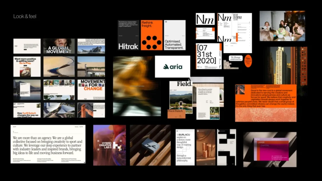
Look and feel boards, often misinterpreted as collections of preferred visuals, are more accurately described as perception boards. The designer curates these references based on the insights gleaned from the workshop: desired perceptions, identified category tensions, competitor visual codes, resolved stakeholder disagreements, and the defined brand character. If the brand aims to project trustworthiness, modernity, and humanity, the board facilitates a discussion about the specific kind of trust, modernity, and humanity that is appropriate for its target audience. Is the brand exuding calm institutional gravitas, or warm, accessible human connection? Is its progressiveness conveyed through precise execution, or through a more expressive, editorial tone? The overarching objective is to elicit client feedback on foundational perceptions before they react to a fully developed logo, color palette, or finished visual system, thereby de-risking later design presentations.

Design Code
The "design code" layer introduces a greater degree of specificity by translating core brand ideas into actionable visual principles. For instance, for a parenting application in Germany, the strategic idea of "personalized support for your unique journey" might translate into organic shapes, handwritten textual elements, and softer, more fluid compositions. The concept of "parenting is messy and magical" could inspire soft gradients, layered imagery, and playful irregularities. Conversely, "research-backed support for real life" might necessitate the incorporation of credible elements like doctor calls, data visualizations, infographics, and editorial layouts designed to bolster credibility. For a Public Relations agency specializing in prop-tech, "momentum in motion" could be expressed