
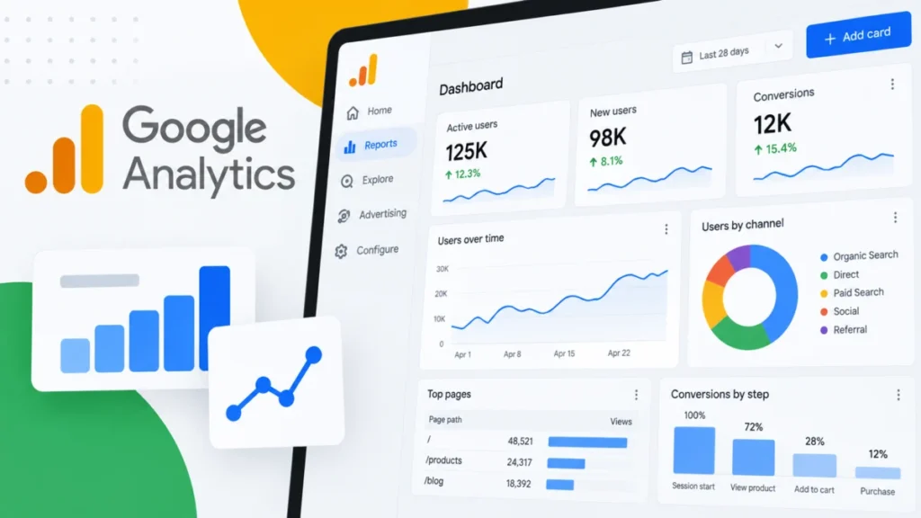

A New Era of Drag-and-Drop Reporting
The core of this release is the introduction of a grid-based canvas that utilizes drag-and-drop functionality. Historically, users of Google Analytics have been required to navigate through a labyrinth of pre-built reports or utilize the Library feature to construct custom views. The new Dashboard functionality simplifies this process significantly. By allowing users to manually position, resize, and align visualizations on a flexible grid, Google is democratizing the ability to create high-level executive summaries without requiring technical expertise in SQL or complex dashboarding software.
The workflow is designed to be intuitive. A marketer can now select specific metrics and dimensions—such as sessions, conversion rates, or user acquisition channels—and drop them directly onto the canvas. The system automatically renders the most appropriate chart type, which can then be adjusted by the user. This reduction in the "clicks-to-insight" ratio is expected to be particularly beneficial for agencies and internal marketing teams that manage dozens of accounts or properties simultaneously.
The Toolkit: Visualization Types at Launch
To ensure that the dashboards are not just visually appealing but also functionally robust, Google has introduced six distinct visualization types at launch. Each is designed to address specific analytical needs:
- Scorecards: Designed for high-level KPIs, these allow for immediate assessment of core performance metrics. When date comparisons are applied, scorecards display percentage changes, offering an instant view of period-over-period growth or decline.
- Tables: Essential for granular analysis, tables allow users to view multi-dimensional data sets side-by-side, providing the necessary depth for root-cause analysis.
- Line Charts: These support the visualization of trends over time, with granular control for daily, weekly, or monthly views, making them ideal for tracking seasonality and long-term marketing performance.
- Bar Charts: Ideal for direct comparisons, such as contrasting traffic volume across different geographic regions or comparing the performance of multiple landing pages.
- Donut Charts: Useful for immediate breakdowns of proportional data, such as device category split or channel acquisition mix.
- Funnel Charts: A critical addition for e-commerce and lead-generation businesses, these allow users to monitor specific conversion steps and identify precisely where drop-offs occur within the user journey.
Strategic Implementation and Governance
The deployment of these dashboards is tied closely to Google Analytics’ existing permission structure. Only users with an Editor or Administrator role have the authority to build and publish a dashboard. This governance model ensures that reporting standards remain consistent across an organization, preventing the clutter that might arise if every user were permitted to create and publish their own custom views.

Once an administrator publishes a dashboard, it becomes accessible to anyone with access to the property via the Reports navigation menu. This centralized approach fosters a "single source of truth" culture within marketing departments. Rather than disparate teams relying on various spreadsheets or conflicting reports, the published dashboard serves as the authoritative performance view for the entire organization.
However, there are technical constraints to consider. Standard Google Analytics properties are limited to 15 cards per dashboard, while premium properties are afforded up to 30. Furthermore, current limitations include the lack of API support, the inability to apply advanced segments at the dashboard level, and the absence of card-level comparisons. These constraints suggest that while the current iteration is highly effective for routine performance monitoring, it may not yet replace deep-dive BI (Business Intelligence) tools for complex, enterprise-level data modeling.
Contextualizing the Shift in Analytics
The introduction of these dashboards reflects a broader trend in the martech industry: the move toward consolidated, "all-in-one" analytics ecosystems. Over the past several years, the transition from Universal Analytics to Google Analytics 4 (GA4) has been marked by a steep learning curve and a reliance on the "Explore" section for custom reporting. While the Explore section is powerful, it is often too technical for stakeholders who simply need a snapshot of performance.
By introducing Dashboards, Google is effectively bridging the gap between the raw, event-driven data of GA4 and the reporting needs of non-technical stakeholders. This shift mirrors the evolution of competitors like Looker Studio (formerly Google Data Studio), which has long provided similar drag-and-drop capabilities. By bringing this functionality into the core GA interface, Google is acknowledging that the modern marketer demands efficiency and that context-switching between different platforms is a significant impediment to productivity.
Implications for Marketing Productivity
The "Why we care" factor, according to industry experts, lies in the time-saving potential. Marketing teams are often overwhelmed by the sheer volume of data available in modern analytics platforms. By enabling a "single-page" view, organizations can reduce the time spent on manual data consolidation.

For instance, a performance marketing manager can now build a single dashboard that tracks top-of-funnel traffic (Line Charts), conversion rates (Scorecards), and checkout abandonment (Funnel Charts). Instead of navigating through multiple standard reports, the team can log in, view the dashboard, and immediately pivot to strategy or optimization tasks. This is particularly relevant for businesses that track KPIs across different business units, where a unified dashboard can highlight how different channels interact and influence the overall customer journey.
Looking Ahead
While the current release is a major step forward, the lack of current API support for these dashboards hints at a potential roadmap for future updates. Integrating these dashboards with external reporting tools or allowing for dynamic, automated sharing via the API would be the logical next step for enterprise adoption.
Furthermore, as Google continues to refine the GA4 ecosystem, the integration of AI-driven insights into these dashboard cards—such as anomaly detection or automated trend explanations—would likely be the next frontier. For now, however, the focus remains on accessibility and centralization.
The launch of Dashboards represents a calculated move by Google to retain its dominant position in the web analytics market. By providing a user-friendly, highly visual, and centralized reporting interface, Google is making it easier for businesses to justify their investment in the platform. For marketers, the takeaway is clear: the ability to customize the reporting environment is no longer a luxury but a fundamental requirement for efficient data-driven decision-making. As organizations continue to move away from legacy reporting methods, the adoption of these native dashboarding features will likely become standard practice for teams looking to optimize their digital presence.