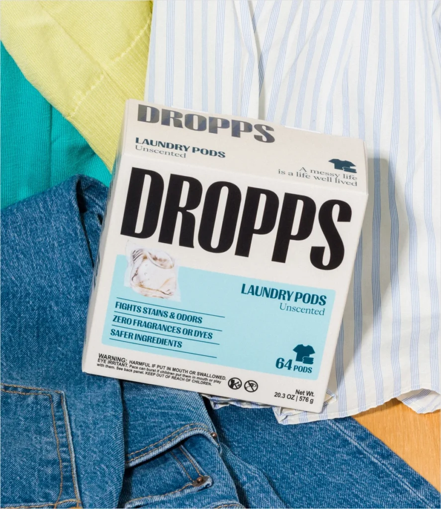

American sustainable home care pioneer Dropps has officially unveiled a comprehensive corporate rebranding, introducing a modernized logo, revamped packaging ecosystem, streamlined product architecture, and a completely overhauled digital presence. Announced on September 16, 2026, the sweeping update represents a major strategic pivot for the Chicago-headquartered enterprise, aligning its visual identity with an enhanced focus on scientific transparency, third-party product certifications, and wellness-driven consumer values.
The rebranding effort introduces a significantly warmer, bolder aesthetic designed to depart from traditional, clinical-looking eco-friendly product designs. Alongside the visual transformation, Dropps has implemented a refined product strategy that zeroes in on its core revenue drivers: highly concentrated laundry detergent pods and automatic dishwasher pods. This targeted streamlining is intended to optimize supply chain efficiency while delivering a more cohesive and intuitive shopping experience for both loyal customers and first-time buyers.
Background and Strategic Evolution of Dropps
Founded with a mission to eliminate unnecessary waste and reduce the environmental footprint associated with conventional household cleaning products, Dropps has spent well over a decade establishing itself as a trusted name in sustainable home care. The brand initially disrupted the legacy detergent market by pioneering water-soluble pods that eliminated the need for heavy plastic jugs, thereby reducing carbon emissions linked to shipping heavy water-filled containers.
Over the years, the direct-to-consumer (DTC) and retail landscape has experienced a dramatic surge in eco-conscious cleaning alternatives. As sustainability transformed from a niche market differentiator into an expected industry standard, brands were forced to find new ways to stand out. Dropps’ leadership recognized that while their functional product formulations remained exceptionally strong, the brand’s visual identity needed to evolve to capture a broader demographic of modern consumers who prioritize both aesthetic appeal and uncompromising environmental performance.
The new creative direction addresses this evolution head-on. By bridging the gap between high-end aesthetic appeal and everyday household utility, Dropps aims to solidify its position as a leader in the next generation of home care. The redesign is not merely cosmetic; it signals a deeper corporate commitment to demystifying the science behind biobased cleaning solutions.
Unveiling the New Brand Message and Visual Identity
At the heart of the 2026 rebranding initiative is a brand-new manifesto and messaging framework: "Messy Life. Kind Ingredients. Actually Clean." This tagline serves as a philosophical anchor for the company, acknowledging the messy reality of everyday human life while reassuring consumers that effective cleaning does not require harsh chemicals, synthetic toxins, or environmentally damaging packaging.
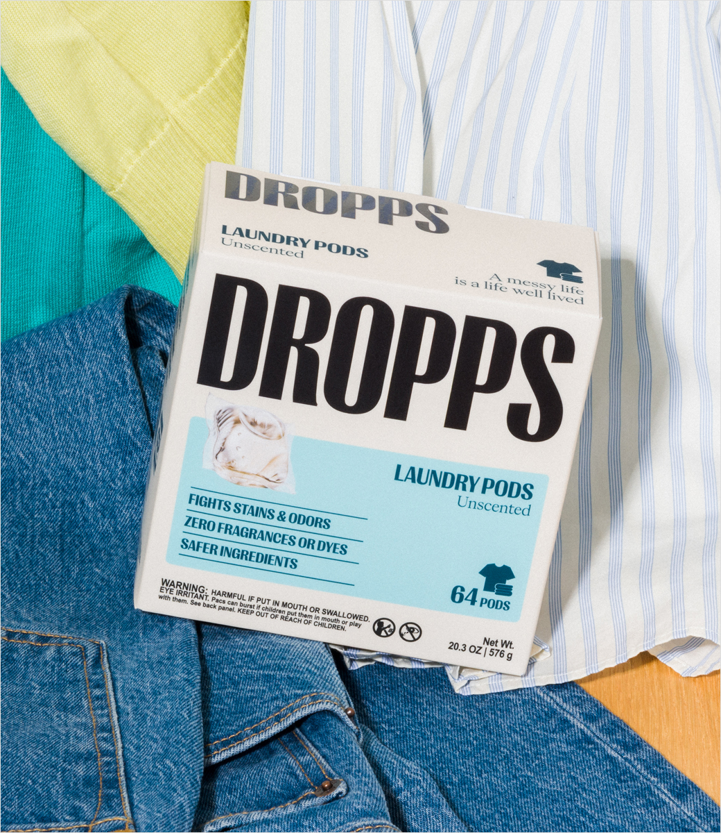
The updated visual identity moves away from stark minimalism in favor of an approachable, colorful, and vibrant design language. According to company statements, the new creative world is meticulously crafted to feel premium and scientifically effective while remaining deeply rooted in the practical routines of real life. The packaging redesign features tactile textures, clearer typography, and prominent callouts for the brand’s newly acquired third-party certifications, which validate the safety, sustainability, and biodegradability of its biobased formulas.
In addition to physical packaging transformations, the company has deployed a redesigned, user-centric e-commerce website optimized for seamless navigation and educational content delivery. Simultaneously, Dropps launched a fresh Instagram presence designed to engage its digital community through dynamic visual storytelling, educational reels detailing ingredient transparency, and interactive lifestyle content.
Executive Perspectives and Community Alignment
The leadership team at Dropps has emphasized that the multi-faceted rebrand was driven by extensive consumer research and a desire to reflect the evolving values of their core community. Emily Culp, Chief Executive Officer of Dropps, underscored the synergy between the new aesthetic and the brand’s long-term strategic ambitions.
"This new wellness-first identity matches the energy of our community and the ambition of the brand, giving us a clearer, more memorable way to show up in culture and build a deeper connection with consumers," stated Culp during the launch rollout.
Industry analysts note that Culp’s emphasis on "wellness-first" positioning is a calculated response to broader consumer trends. In the post-pandemic era, consumers increasingly view home cleaning products through the lens of personal wellness, indoor air quality, and skin safety. By framing laundry and dish care as extensions of a healthy lifestyle, Dropps is successfully expanding its addressable market beyond traditional environmentalists to health-conscious households.
Streamlined Product Portfolio and Operational Focus
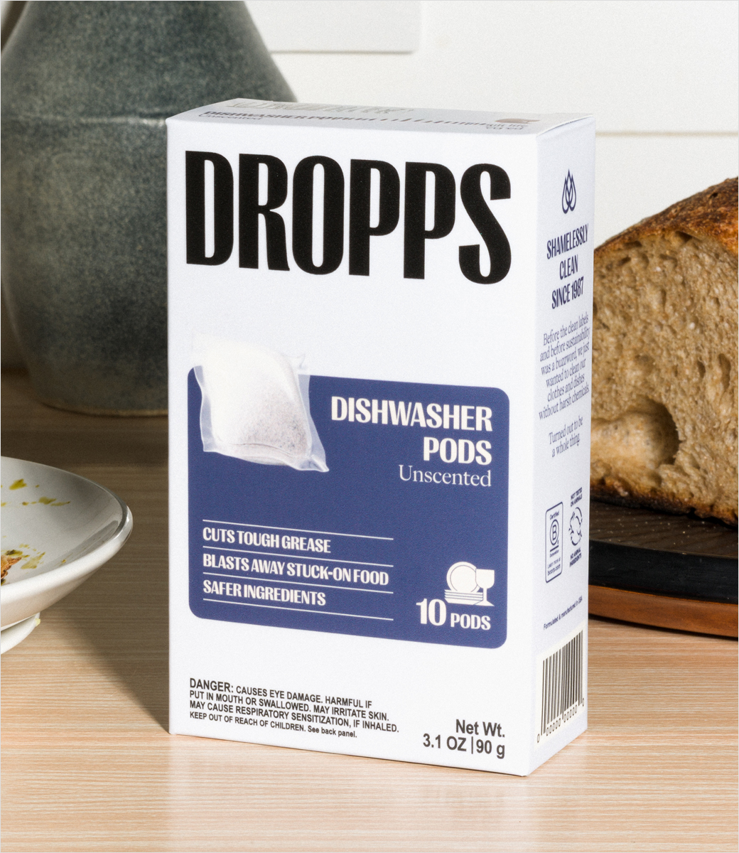
A critical component of the 2026 corporate update is the strategic streamlining of Dropps’ product offerings. While the company has historically experimented with a wide array of auxiliary home care items, the newly refocused catalogue concentrates primarily on its flagship product lines: high-efficiency laundry pods and high-performance dishwasher pods.
By consolidating production and marketing efforts around these core items, Dropps can optimize its manufacturing processes, enhance product efficacy through continuous research and development, and simplify the purchasing decision for consumers. The concentrated pods continue to leverage plant-based, biobased formulas designed to perform comparably to, or better than, legacy petrochemical-based detergents, all while maintaining minimal packaging waste.
Implications and Broader Industry Impact
The timing of Dropps’ comprehensive rebrand reflects a broader maturation phase within the sustainable consumer packaged goods (CPG) sector. As major multinational conglomerates continue to acquire or launch green cleaning lines, independent pioneers like Dropps must continuously elevate their brand equity to maintain market share.

The integration of rigorous third-party certifications into the new packaging design is a particularly shrewd strategic move. In an era where "greenwashing" has made consumers increasingly skeptical of environmental claims, independent verification provides a vital layer of trust and credibility. By highlighting these certifications prominently, Dropps reinforces its transparency and differentiates itself from competitors who rely solely on vague marketing buzzwords.
Furthermore, the omnichannel rollout—spanning physical retail packaging, a redesigned website, and a localized social media presence—demonstrates a sophisticated understanding of modern consumer journeys. Shoppers today demand a cohesive brand experience whether they discover a product through an Instagram advertisement, research its safety profile on a mobile-optimized website, or evaluate its shelf appeal in a brick-and-mortar retail aisle.
Conclusion
The unveiling of Dropps’ new logo, packaging design, and brand architecture marks a pivotal milestone in the company’s history. By blending a warmer, bolder visual identity with an unwavering commitment to scientific integrity and sustainable manufacturing, Dropps has positioned itself for sustained growth in an increasingly competitive marketplace. As the brand rolls out its updated products across digital and physical touchpoints, the overarching message remains clear: sustainable home care can be simultaneously effective, visually compelling, and deeply aligned with the realities of modern living.