
Jim Parkinson, the preeminent American letterer, type designer, and painter whose work defined the visual identity of some of the world’s most recognizable publications and brands, died on June 26, 2025, at his home in Oakland, California. He was 83. His passing followed a protracted battle with Alzheimer’s disease, throughout which he was supported by his wife, the noted book artist Dorothy A. Yule, who provided dedicated care.
Born on October 23, 1941, in Oakland, Parkinson’s trajectory as a master of the written letter began in his childhood. His early fascination with the craft was sparked by a neighbor, Abraham Lincoln Paulsen, a renowned "Wizard Penman" who demonstrated the technical precision of calligraphy by rendering the Gettysburg Address in reverse and inverted orientations. This early exposure fostered a lifelong commitment to the study of letterforms, which Parkinson supplemented by meticulously collecting and analyzing historical lettering manuals and correspondence-school textbooks.
A Chronology of a Illustrious Career
Parkinson’s formal training commenced at the California College of Arts and Crafts, where he studied painting and design, graduating in 1963. Shortly thereafter, he relocated to Kansas City, Missouri, to join the creative team at Hallmark Cards. While initially assigned to illustration, his transition to the lettering department proved to be a pivotal professional milestone. It was there that he identified the specific intersection of art and utility that would define his career.
Following his tenure at Hallmark, Parkinson returned to the San Francisco Bay Area to establish a freelance practice that would span more than half a century. His career can be categorized into several distinct phases, each characterized by a relentless pursuit of typographic excellence:

- 1963–1968: Formative years at Hallmark Cards, where he honed his technical drafting skills.
- 1969–1980: The establishment of his freelance studio in Oakland, focusing on hand-lettered logos for the music and entertainment industries.
- 1981–2000: An era of high-profile publication design, during which his work for the Los Angeles Times, Rolling Stone, and various newsstand titles redefined masthead aesthetics.
- 2001–2020: A transition toward digital type design, resulting in a robust catalog of both bespoke corporate fonts and widely distributed retail typefaces.
- 2021–2025: A focus on fine art, specifically the documentation of American neon signage, alongside his personal battle with neurodegenerative decline.
Impact on Media and Publication Design
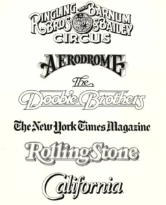
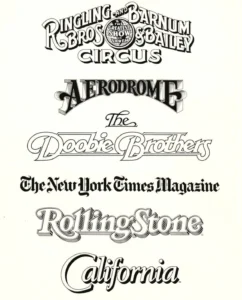
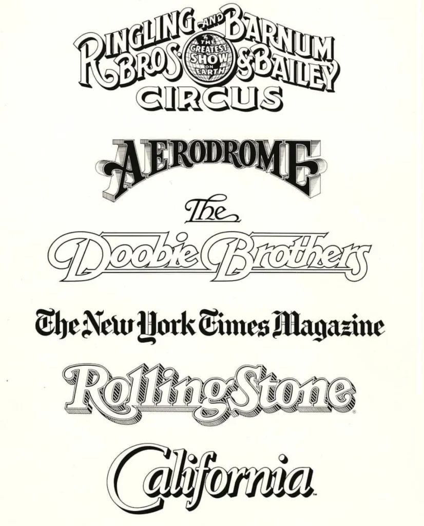
Parkinson’s influence on American visual culture is profound. In an era before digital font editing software became ubiquitous, his ability to manipulate letterforms by hand allowed art directors to inject personality and brand-specific identity into their publications. His portfolio includes the logotypes for the Doobie Brothers and the Ringling Bros. and Barnum & Bailey Circus, as well as editorial work for Rolling Stone, California magazine, and the Los Angeles Times.
His methodology was rooted in a deep understanding of historical styles, yet he possessed the technical agility to modernize these forms for contemporary application. Art directors often sought his services for "refreshes"—the process of updating a publication’s title while maintaining its historical equity. Consequently, his work has appeared on the covers of thousands of periodicals, effectively shaping the visual literacy of the American public throughout the late 20th and early 21st centuries.
The Intersection of Fine Art and Typography
In the latter decades of his life, Parkinson expanded his creative output to include fine art painting. Drawing inspiration from the American West, he focused on the aesthetic of vintage neon signage. These paintings were not merely recreations; they were archival efforts to capture the texture of decay, the structural integrity of glass, and the fading luminescence of an era of American craftsmanship that was rapidly disappearing. By treating signage as a primary subject, Parkinson bridged the gap between commercial design and gallery-level fine art.
Professional Recognition and Community Presence
Beyond his professional output, Parkinson was a central figure in the typographic community. He maintained an open-door policy at his studio, welcoming students, peers, and enthusiasts to inspect his extensive collection of ephemera and original artwork. According to colleagues, he was known for his humility—a trait summarized by his adherence to the philosophy of Margot Fonteyn: "Take your work seriously, but never yourself."
Stephen Coles, a prominent design historian and witness to Parkinson’s career, noted that the designer’s accessibility was as much a part of his legacy as his technical skill. Parkinson’s influence was further disseminated through his active participation in design conferences and his willingness to document his process in various educational forums, including the 2010 video interview series "FontCast."

Institutional Preservation and Future Memoirs
The preservation of Parkinson’s vast archive has been a priority for organizations like the Letterform Archive, which holds significant pieces of his original hand-lettered work. In a move to ensure his narrative remains accessible to future generations, the Letterform Archive has announced plans to publish his memoir in 2026. This document is expected to provide an insider’s perspective on the evolution of American graphic design, detailing the transition from traditional drafting tools to digital workflows.
Broader Implications for the Design Industry
The death of Jim Parkinson marks the end of an era for a specific generation of designers who transitioned from the analog world of hand-inked letters to the digital age of type design. His career serves as a case study in the longevity of foundational skills. While the tools of the trade changed—from the drafting table to the computer screen—Parkinson’s core focus on the anatomy of the letter remained constant.
Analysts in the design field suggest that his body of work will serve as a standard for future typographers. By combining technical mastery with an archival mindset, he ensured that his contributions to the field were both functional and enduring. His ability to navigate the demands of commercial clients while maintaining a personal artistic voice remains a model for freelancers and independent designers today.
Memorial Arrangements
A memorial service for family and friends is scheduled to take place in the autumn of 2025. In recognition of his long struggle with his illness, his family has requested that, in lieu of flowers, donations be directed to the Alzheimer’s Association.
As the design world reflects on his contributions, the consensus among his peers is clear: Jim Parkinson did not merely design letters; he provided the visual language for a significant portion of American popular culture. Through his extensive catalog of typefaces, logos, and paintings, his influence will continue to persist long after his passing, serving as a testament to a life dedicated to the art of the written word.