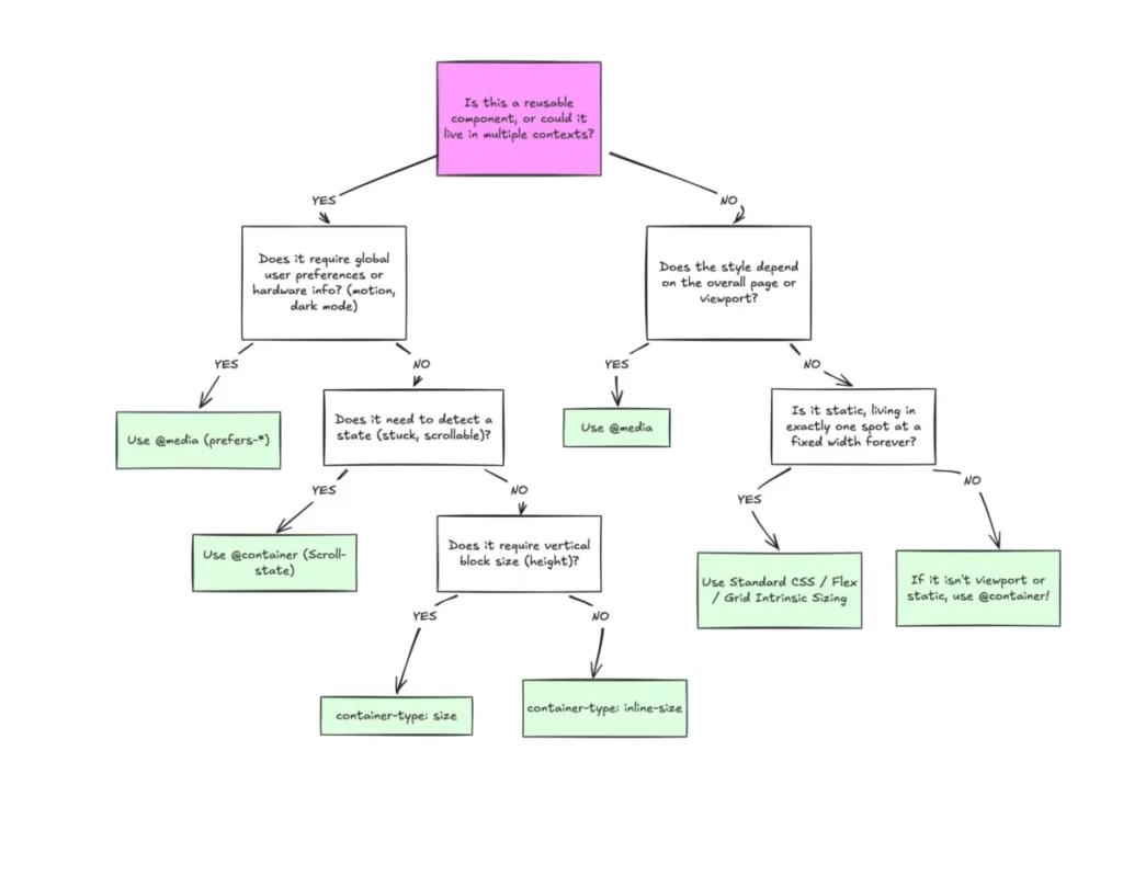

Despite broad browser support, CSS container queries remain a significantly underutilized feature in modern web development, often misunderstood as mere alternatives to traditional media queries. With current adoption rates hovering at roughly 41.4% according to the 2025 State of CSS survey, the industry faces a gap between technical capability and practical application. While media queries have served as the backbone of responsive design since the inception of the mobile web, the evolution of modular, component-based architectures necessitates a shift toward container-based logic to prevent design degradation in complex, multi-context environments.
The architectural history of web responsiveness began with the introduction of Media Queries in CSS3, which allowed developers to tailor site layouts based on the dimensions of the browser viewport. This paradigm, which gained widespread adoption following the 2010 "Responsive Web Design" movement pioneered by Ethan Marcotte, relies on the assumption that the screen width is the primary constraint for layout decisions. However, this assumption has increasingly faltered as web interfaces shifted from static pages to modular components that may inhabit various parts of a layout—such as a sidebar, a main content area, or a small dashboard card—simultaneously.

The development of container queries marks a critical transition in CSS history. The proposal, which sat atop many developer wishlists for years, was formally integrated into browser engines to solve the "viewport proxy" problem. Unlike media queries, which query the global window size, container queries allow a component to query its immediate parent element. This ensures that a component’s internal layout adapts to the specific space it is granted, rather than the arbitrary width of the browser window.
A chronological review of the feature’s deployment reveals a steady trajectory toward ubiquity. Since reaching baseline support across all major browser engines, the feature has achieved approximately 94% global compatibility. Despite this, industry experts, including prominent CSS educator Kevin Powell, have noted that the "macro-to-micro" shift in thinking has been slower than anticipated. Data from the 2025 State of CSS report highlights that while 86% of developers are aware of the technology, the transition to actual implementation remains stagnant. This lag is largely attributed to the syntax, which at a glance mirrors media queries, leading many developers to treat them as synonymous tools rather than distinct architectural solutions.
The technical distinction between these two methods is foundational. Media queries are designed for "macro-layouts"—the high-level orchestration of page structures, such as header placement, footer navigation, and global grid systems. In contrast, container queries are engineered for "micro-layouts." They enable components to maintain their integrity regardless of the parent container’s size. For example, a card component designed to display a title and an image might shift from a stacked vertical layout to a horizontal row when placed in a wide container, regardless of whether the user is browsing on a desktop, a tablet, or a mobile device.

The implications of this shift are profound for both performance and maintainability. Historically, developers relied on complex JavaScript-based resize observers to simulate this behavior, which often introduced layout shifts and increased memory overhead. By moving this logic into the CSS engine, developers can leverage browser-native performance. Furthermore, the introduction of container-relative units, such as cqi (container query inline-size), allows for fluid typography that scales in direct proportion to the component’s size. This prevents the common issue of font sizes becoming disproportionately large or small when a component is moved from a full-width section to a constrained sidebar.
However, the transition is not without its operational challenges. One common pitfall is the attempt to query an element’s own size to determine its layout, which creates an infinite loop in the browser rendering cycle. Developers must ensure a distinct parent-child relationship, placing the container property on a wrapper element that encompasses the component. Additionally, because container queries cannot directly consume CSS custom properties (variables) due to the risk of cyclical dependencies, teams must rethink how they manage design tokens in complex systems.
Fact-based analysis suggests that the industry is currently in a transitionary phase. Large-scale design systems, which emphasize component reusability, are the primary drivers of container query adoption. As organizations move away from monolithic page-level styles toward encapsulated design libraries, the use of container queries is expected to rise. The ability to define the "break" points of a component based on its internal availability, rather than the external viewport, reduces the need for "magic numbers" in CSS and makes codebases more resilient to future layout changes.

Furthermore, the integration of container queries offers a potential solution to the "flex-wrap" problem. Flexbox layouts currently cannot detect when items wrap onto a new line, often leading to broken layouts when content exceeds available space. By wrapping flex items in containers and querying their size, developers can effectively trigger style changes only when the layout density reaches a specific threshold. This capability, which previously required JavaScript, represents a significant leap forward in declarative design.
The broader impact of this technological shift extends to accessibility and inclusive design. By allowing components to remain functional across a wider array of viewports and containers, developers can ensure that users with custom zooming settings, screen magnifiers, or atypical device configurations receive a consistent and readable experience. When a component is "context-aware," it is inherently more flexible, reducing the likelihood of overlapping text or clipped content that frequently plagues sites relying solely on viewport-based media queries.
In conclusion, the industry’s slow adoption of container queries is less a reflection of the technology’s quality and more an indicator of the inertia surrounding legacy CSS patterns. As the web continues to fragment into an ecosystem of over 2,300 unique viewport sizes, the reliance on the viewport as a proxy for design is becoming increasingly obsolete. The future of front-end development lies in "content-driven" layout logic. While media queries will remain essential for page-level structural decisions, container queries provide the necessary tools for robust, reusable, and responsive component design. Developers are encouraged to evaluate their current component libraries to identify instances where viewport-based logic is creating fragile layouts, and to begin the incremental migration toward container-based responsive architectures.