
The contemporary landscape of book production is marked by a profound and often disorienting transition. For centuries, established craft knowledge and trade practices in typography and bookmaking have been steadily eroded, with both commercial and academic publishing houses seemingly intent on marginalizing the very artisans essential to preserving the printed book as a tangible, designed object and to fostering a renewed appreciation for reading as a visceral experience. Typography, far from being a mere sub-discipline of graphic design, is a distinct literary craft with deep historical roots in editing, printing, and publishing. However, contemporary design literature rarely dedicates itself exclusively to typography. When it does, it typically situates the subject within the expansive and ever-evolving realm of new media applications: typography for websites, e-books, software interfaces, motion graphics, wayfinding systems, and environmental design. Type has evolved into a transmedia construct, more an abstract concept than a physical entity, and the book itself appears to be following a similar trajectory. Paradoxically, many of the new platforms designed for textual presentation fall short from a typographer’s perspective, failing to leverage the sophisticated refinements gained over 570 years of the printed codex’s maturation. For those who still consider the traditional book the preeminent and default medium for presenting text, any work that seeks to elucidate and guide its creation warrants significant attention.
Mark Argetsinger’s A Grammar of Typography: Classical Book Design in the Digital Age, published by David R. Godine in 2020, is precisely such a work. Argetsinger, an accomplished typographer and designer, endeavors to equip a new generation of designers with the principles and standards of historical printers, navigating the complexities of the digital age where the composing stick has been replaced by a text frame and the ink stone by a palette of digital swatches. While Argetsinger’s contextual framework is extensive, his stated aim is deliberately focused: to serve as a manual for those committed to producing meticulously crafted, beautiful books in an era that frequently undervalues such an endeavor. In direct contrast to the prevalent technological evangelism in discussions of electronic publishing, Argetsinger’s quiet confidence in the enduring superiority and timeless relevance of his craft offers an inspiring affirmation of bookmaking as a vital cultural pursuit.
Deeper Dive into Execution and Underlying Assumptions
Despite its laudable intentions and the undeniable necessity of its message, A Grammar of Typography presents a more nuanced picture upon closer examination of its execution and underlying assumptions. While the volume is both necessary and commendable, its impact is somewhat diminished by specific details in its production and the conceptual underpinnings of its approach.
The book presents itself as a "comprehensive guide to producing historically informed book designs," suggesting a practical treatise. However, Argetsinger’s contextualization, though rich in scholarship, occasionally threatens to overshadow his instructional content. A significant portion of the book, 135 pages, is dedicated to establishing the philosophical and historical foundations of his typographic approach, leaving only sixty-four pages for the practical application of working with type. Readers seeking to bridge theory and practice, particularly those aiming to translate classical typographic values into digital tools, might find the book’s unique instructional value somewhat diluted by extensive reiterations of context readily available elsewhere. Aspiring designers who seek out such a volume, unless assigned for academic purposes, are likely to possess foundational knowledge of digital typesetting and are looking for expert guidance to refine their technical skills. Argetsinger does provide valuable insights in his chapters on paper selection and binding, but his sections on typography itself tend to dwell on introductory concepts and elementary software tutorials, resembling a "Typography 101" rather than an advanced guide.
Physicality and Typographic Choices: A Deliberate Historicism
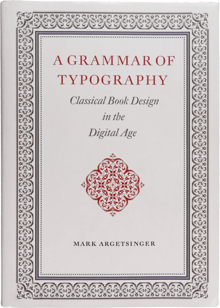
At 514 pages and presented in a format reminiscent of the historical folio size, A Grammar of Typography is a substantial volume, suited for a sturdy desk or a library lectern rather than casual portability. The interior design successfully evokes a historicist aesthetic, channeling the spirit of esteemed scholar-printers from the neoclassical and baroque eras. The typesetting is generally impeccable, as one might expect from such a work. However, subtle inconsistencies do appear. For instance, the proportional spacing of numerals in certain chapters is inconsistent, leading to noticeable gaps between digits. The running heads and folios are rendered in a larger size than the body text, a stylistic choice associated with late-nineteenth-century American printing that clashes with the more continental aesthetic prevalent in other design elements. The use of asterisks as section dividers, rather than a more typographically imaginative ornament, appears to be a vestige of typewriter conventions, a practice that Argetsinger himself cautions against. The dust jacket, with its exuberant ornamentation, communicates little beyond a generalized baroque aesthetic. In contrast, the title page demonstrates a more restrained yet effective use of scale, space, and color to delineate meaning and structure, notably substituting a relevant letterform diagram for the jacket’s generic floral motif.
An Examination of Errors and Omissions
Regrettably, the book is affected by a notable number of typographical errors, averaging approximately one per two pages. Misspellings of names and typefaces are particularly common. Beyond mere typographical slips, a few substantive errors have also made it through the editorial process. For example, a specimen of Garamond Premier is erroneously identified as Adobe Garamond. Similarly, a presentation of Zapfino, intended to illustrate "kerning triumphant," is, in reality, a demonstration of ligatures, as the entire word "Zapfino," with its elaborately swashy initial "Z," is a seven-character ligature or logotype treated as a single glyph.
Errors of omission also warrant attention. The chapter on digital fonts, though useful, is regrettably brief at fourteen pages. It is followed by a showcase of recommended typefaces, highlighting Argetsinger’s preferred digital revivals of historically significant metal text faces. This selection can create the impression that the history of typography effectively concluded around the mid-twentieth century, with subsequent type design activity primarily limited to the revival of classic designs. This approach leans towards a historically bound design rather than merely historically informed design. Many of the most accomplished, aesthetically pleasing, and rigorously engineered serif text faces were developed in the late twentieth and early twenty-first centuries, some employing a typographic idiom significantly distinct from early-twentieth-century designs. Argetsinger’s exclusion of these contemporary works raises questions about what is gained by their omission and how their dismissal serves his design philosophy. Furthermore, even within his chosen framework, the selection of faces feels incomplete. Notable Iberian revivals, such as Mário Feliciano’s Rongel or Cristóbal Henestrosa’s Espinosa Nova, are absent. Equally perplexing is the omission of recent digital revivals of faces favored by Argetsinger, including William Berkson’s Williams Caslon, Sergei Egorov’s Neacademia, Mark van Bronkhorst’s ATF Garamond, and František Štorm’s Jannon series.

The Ambiguity of "Classical" and the Limits of Aesthetic Adherence
The term "classical" in the book’s subtitle does not refer to antiquity, its conventional meaning in the humanities, but rather to the neoclassical and baroque periods, akin to the era of classical music. It is not universally agreed that this period represents the zenith of typographic practice. For instance, design historian Alan Bartram views baroque design as an unfortunate over-complication of High Renaissance design, a movement that might have offered a more intuitive exemplar of typographic purity for Argetsinger. Alternatively, the first half of the twentieth century, a peak period for commercial American book design, could have served as another strong model. The choice of the baroque era appears somewhat arbitrary, perhaps too aesthetically specific to serve as a universally applicable model for book design. The reviewer suggests that instead of merely imitating the forms of books designed by figures like Fournier, Argetsinger might have explored the underlying structural logic of their work and extrapolated a more timeless and aesthetically flexible approach to typography. This line of inquiry leads to a broader consideration of Argetsinger’s design philosophy itself.
There exists a crucial distinction between medium and aesthetic. The continued and commendable use of traditional materials and processes in book design does not necessitate an adherence to four-hundred-year-old aesthetic practices. It is entirely possible to utilize historical tools in novel ways. Argetsinger, however, appears committed to a singular direction: employing new tools in traditional ways. He does not explore the concept of a book design emerging from, being inspired by, or reflecting the intrinsic nature of the book itself. Amidst his cataloging of typefaces, there is limited guidance on how a designer should select among them. This contrasts with designers like Richard Eckersley, who, while capable of executing historically accurate designs, also possessed the ability to deconstruct, parody, and subvert historical conventions in service of postmodern texts. Like Picasso, Eckersley mastered the fundamentals with such speed that he moved beyond them, driven by boredom to create typographic works that redefined the field.
The question arises as to the validity of a designer’s exclusive and wholehearted commitment to a single aesthetic philosophy. Some practitioners argue that a typographer should ideally possess no personal style, as any such style is invariably susceptible to being inappropriate for a given project. Designers, it is suggested, should be well-versed in the history of their craft and possess working aesthetic knowledge that extends from antiquity to the present day. Failure to do so may result in an inability to handle projects that require a different aesthetic language or force designers into a position where they must decline work that does not align with their preferred approach. It is important to note that this limitation extends beyond modern literature; ancient texts also may not conform to Argetsinger’s modus operandi. An edition of an ancient text, such as Robert Bringhurst’s airy translation of Parmenides, would be ill-suited to ornamentation with French fleurons and baroque filigree. Just as contemporary texts can challenge and transcend the traditional aesthetic of the book, so too do ancient texts possess a spirit and a silence that predate the ornate complexities of "classical" typography. The question remains: what of these texts?
A Traditional Artisan in a Postmodern World
Despite these critiques, Argetsinger’s approach is characterized by sincerity and a holistic vision, avoiding the superficial pastiche that sometimes masquerades as historically informed book design. However, his philosophy leaves little room for self-consciousness, irony, or aesthetic experimentation. Argetsinger operates as a traditional artisan within a postmodern context. While there is an understandable yearning for a simpler era where visual beauty was an undisputed and sufficient goal, contemporary designers must acknowledge the increased complexity of the field. The book designs of Richard Eckersley, and the design manuals of Robert Bringhurst and Rich Hendel, offer more pluralistic perspectives, potentially proving more successful in bridging the classical tradition with the fractured philosophy of the postmodern age.
The Enduring Importance of Materiality and Craft
Despite its frustrating aspects, A Grammar of Typography remains a significant contribution. In an era where books are increasingly gravitating towards digital ephemerality, and where trade publishers sometimes produce what are essentially stacks of photocopied pages presented as codices, a book like Argetsinger’s is critically needed. It champions the enduring vitality of the codex as a vessel for human thought and a product of human craft. As cultural critics begin to note a potential backlash against digital reading, this work arrives at a propitious moment. It has the capacity to ignite the interest of young designers seeking materiality and authenticity, and to contribute to a renaissance in bookmaking, not only as a fine art specialty but also as a viable commercial craft.
Argetsinger’s extensive knowledge, passionate and erudite prose, and a commendable, distinctly anti-commercial conviction that the designer should be involved in all facets of book production offer much of value. His devotion to typographic scholarship, his intricate arrangements of printer’s ornaments, and his profound belief in the significance of books provide ample inspiration and joy. However, by establishing a rather narrow definition of classical design, he may inadvertently exclude book designers who aim not only to master historical craft but also to revitalize the tradition, reintroduce high-quality typography to new generations of readers, and, in doing so, potentially contribute to the preservation of the codex itself. A more robust inclusion of practical typographic instruction, enhanced editorial rigor, and a slight expansion of its foundational philosophy would undoubtedly elevate A Grammar of Typography to the spiritual and practical guide for contemporary typographers that it aspires to be.
Joshua Langman, the reviewer, is a typographic designer with extensive training in letterpress printing, monotype casting, and book arts. His experience includes designing and typesetting Babel, a polyglot literary journal, and digitizing Hermann Zapf’s Orbis Typographicus broadsides. Langman is also a theater artist, writer, and educator, and the author of Standby: An Approach to Theatrical Design. His background provides a deep understanding of the craft and history of bookmaking, informing his critical assessment of Argetsinger’s work.