
Jim Parkinson, the esteemed lettering artist, type designer, and painter whose work defined the visual identity of major American media for over half a century, passed away on June 26, 2025, at his home in Oakland, California. His death followed a protracted struggle with Alzheimer’s disease. He is survived by his wife, Dorothy A. Yule, a noted book artist who provided devoted care throughout the progression of his condition. Parkinson leaves behind an unparalleled body of work that spans the transition from traditional analog lettering to the digital era of type design.
A Foundational Fascination with Form
Born in Oakland on October 23, 1941, Parkinson’s early life was marked by an immediate and profound exposure to the mechanics of calligraphy. His childhood home was situated across from the residence of Abraham Lincoln Paulsen, a local artisan known as the "Wizard Penman." Paulsen’s ability to execute complex penmanship—including writing the Gettysburg Address in reverse—served as the catalyst for Parkinson’s lifelong obsession with the craft. During his formative years, he diligently amassed a collection of historical lettering manuals and correspondence-school textbooks, teaching himself the nuanced variations of historical styles that would later become the hallmark of his professional versatility.
Chronology of a Prolific Career
Parkinson’s formal education took place at the California College of Arts and Crafts (CCAC), from which he graduated in 1963. Shortly thereafter, he relocated to Kansas City, Missouri, to accept a position as a staff artist at Hallmark Cards. While his initial tenure involved general illustration, his talent for letterforms quickly became apparent, leading to his reassignment to the company’s specialized lettering department. This period was instrumental in his transition from a general illustrator to a dedicated typographer.
Upon returning to Oakland to launch a freelance career, Parkinson established a professional reputation that would endure for more than 50 years. His career can be segmented into three distinct but overlapping phases:

- 1963–1975: The Formative Years. Developing technical mastery in hand-lettering for commercial applications and refining his ability to mimic and reinvent historical type styles.
- 1975–2000: The Publication Era. Becoming the primary consultant for major magazine and newspaper art directors, redrawing iconic nameplates and creating bespoke logotypes for media titans.
- 2000–2025: The Digital and Fine Art Era. Embracing digital font production while simultaneously pivoting toward fine art, specifically documenting the fading aesthetic of vintage neon signage.
A Legacy of Visual Communication
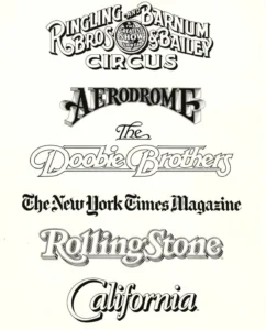
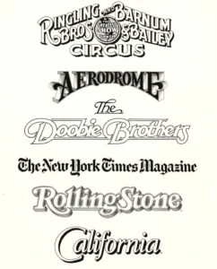
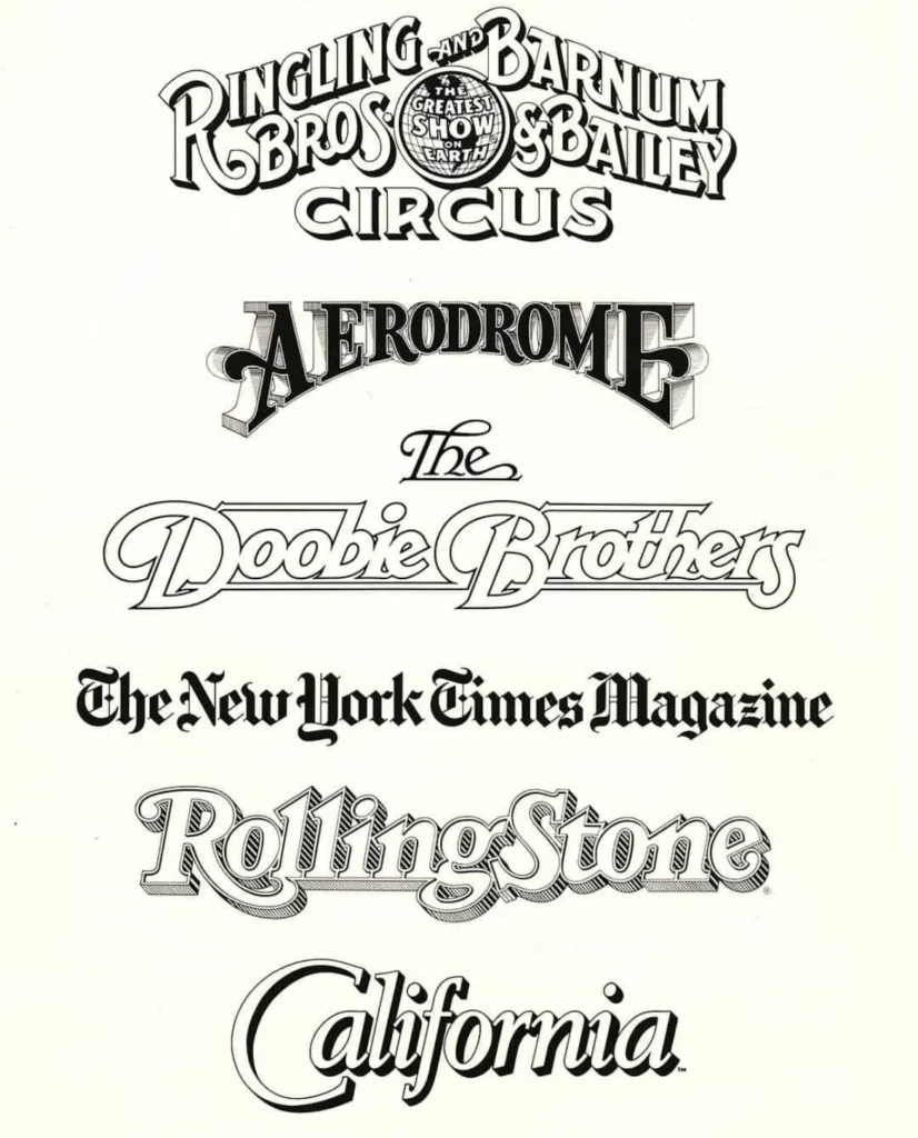
Parkinson’s impact on the American visual landscape is difficult to overstate. He was widely regarded as a "fixer" for art directors seeking to revitalize tired publications. His contributions to the print media sector include the distinctive nameplates for Rolling Stone and the Los Angeles Times, among countless others. Beyond the publishing world, his hand-lettered logos for the Ringling Bros. and Barnum & Bailey Circus and the band The Doobie Brothers remain iconic examples of his ability to imbue brands with a specific, evocative character.
His professional output was not limited to bespoke logotypes. Parkinson also released numerous retail typefaces and custom font families that have been utilized globally. By synthesizing traditional drafting skills with an intuitive understanding of contemporary marketing needs, he navigated the shift from the drafting table to the computer screen with rare consistency.
Beyond the Drafting Table: The Fine Artist
In his later years, Parkinson channeled his technical precision into the medium of painting. His subject matter focused on the American West, specifically the decaying neon signage of roadside culture. These works were not merely nostalgic; they were detailed, structural studies of industrial decay. By capturing the texture of peeling paint and the geometry of broken glass tubes, Parkinson translated his lifelong obsession with lettering into a commentary on the transience of American commercial history. These paintings currently form a significant portion of his private collection, serving as a testament to his evolution from a service-oriented designer to an expressive fine artist.
Professional Influence and Community
Within the typography community, Parkinson was known as much for his humility as for his technical prowess. He was a long-time fixture in the Bay Area design scene, frequently hosting colleagues, students, and enthusiasts at his home to showcase his extensive archive of original sketches, proofs, and ephemera. His willingness to mentor and share his collection helped foster a generation of designers who view typography as a living history rather than a stagnant toolset.
Stephen Coles, a colleague and observer of Parkinson’s career for two decades, noted that Parkinson lived by a philosophy famously attributed to Margot Fonteyn: "Take your work seriously, but never yourself." This attitude allowed him to navigate the high-pressure environment of editorial design without succumbing to the ego often associated with "star" designers. His influence persists through the Letterform Archive, which is scheduled to publish a posthumous memoir of his life and career in 2027.

Implications and Historical Context
The passing of Jim Parkinson marks the end of an era for traditional lettering in commercial journalism. As the industry moves toward automated, algorithmic, and AI-generated typeface solutions, the "Parkinson method"—a process deeply rooted in the physical understanding of how a pen moves across paper—is becoming increasingly rare. His work serves as a vital bridge between the 19th-century traditions of sign painting and the 21st-century requirements of digital branding.
His career also underscores the importance of the individual designer in the creation of corporate identity. Unlike the standardized font libraries that dominate modern digital interfaces, Parkinson’s work was characterized by a distinct "hand" or personality. His ability to tailor a typeface to the specific emotional resonance of a magazine cover or a musical group’s logo remains a case study in effective brand communication.
Tributes and Memorials
In the wake of the announcement of his passing, the design community has begun organizing tributes to honor his impact. The Letterform Archive has encouraged those interested in his life to follow updates regarding the upcoming memoir, which promises to offer a firsthand account of his methodology and the evolution of the field.
While no public service date has been finalized, the family has indicated that a memorial will be held in the fall of 2025. In keeping with the cause of his decline, his family has requested that, in lieu of flowers, donations be directed to the Alzheimer’s Association to support ongoing research and patient care.
The loss of Jim Parkinson is felt profoundly by those who recognize that the logos and headlines we encounter daily are not just functional, but are the result of deep, human dedication. His career stands as a monument to the endurance of the letterform and the necessity of artistic passion in a commercial world. As the industry continues to evolve, the archive of his work—both in print and in the upcoming memoir—will undoubtedly remain a primary resource for designers seeking to understand the craft of communication.