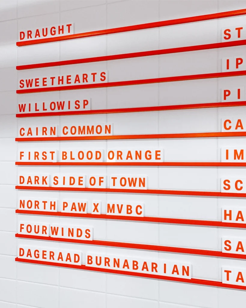

Nestled in the rugged, cinematic landscape of Hope, British Columbia, Mountainview Brewing Co. has emerged as a focal point of both local culture and transit-driven hospitality. Known globally as the filming location for the 1982 Sylvester Stallone classic Rambo: First Blood, the town of Hope has historically been a transient hub for travelers navigating the mountain passes. Mountainview Brewing has capitalized on this unique geographical and cultural positioning, transforming a former automotive repair facility into a cornerstone of the regional craft beer economy. The brewery’s development, characterized by a comprehensive visual identity overhaul by the creative agency Memory, offers a compelling case study in how small-scale industrial heritage can be successfully rebranded for the modern craft consumer.

The Evolution of the Facility
The decision to establish a brewery within a converted mechanic garage is a strategic design choice that leans into the "industrial-rustic" aesthetic popular in the contemporary North American craft beer scene. Historically, the transition from functional, utilitarian spaces to hospitality venues has been a hallmark of urban revitalization. In the case of Mountainview, the transformation involved more than just physical renovation; it required a branding narrative that could bridge the gap between the town’s blue-collar roots and the sophisticated palate of the modern craft beer enthusiast.
The brewery functions as a dual-purpose space. For the local population, it serves as a community anchor—a "third space" outside of home and work. For the thousands of travelers moving through Hope toward the Coquihalla Highway, it functions as a final, high-quality waypoint. This duality necessitated a brand identity that was simultaneously accessible and distinctive.

Strategic Brand Development
The collaboration between Mountainview Brewing and Memory began at the project’s inception, a critical phase for any new enterprise. Early involvement allowed for a holistic design strategy that ensured consistency across all touchpoints. The agency was tasked with creating not just a logo, but a comprehensive brand ecosystem.
The scope of this project included:

- Visual Identity: Establishing a color palette and logo system that reflects the mountainous surroundings without resorting to tired clichés.
- Typography: The selection of Aktiv Grotesk, a sans-serif typeface developed by Dalton Maag, provides a clean, neutral, and highly legible foundation that functions equally well on small-format beer labels and large-scale architectural signage.
- Wayfinding and Signage: Designing the physical environment to guide patrons through the repurposed garage space.
- Packaging and Collateral: Developing a suite of assets including menu systems, tasting flight trays, and merchandise that reinforces the brand’s visual vocabulary.
The use of Aktiv Grotesk is particularly notable. In a market saturated with ornate, hand-lettered beer branding, the choice of a professional, modern typeface signals a commitment to quality and precision. It positions the brewery as a serious producer of craft beverages, distinguishing it from hobbyist operations.
Chronology of the Project
While the exact dates of the brewery’s founding align with the recent surge in British Columbia’s craft beer sector, the development process follows a standard, rigorous trajectory for branding success.

- Conceptual Phase: Identifying the brewery’s core values—community, transit, and quality—and translating them into a design brief.
- Identity Formulation: The drafting of the visual style guide, focusing on the integration of the "Mountainview" name with the topography of the Cascade foothills.
- Application and Prototyping: Iterating through designs for the beer cans and tasting trays to ensure they held up under real-world usage conditions.
- Production Management: Overseeing the fabrication of signage and printed collateral, ensuring color accuracy and material durability.
- Market Launch: The rollout of the full brand suite, coinciding with the brewery’s opening to the public.
The Economics of Craft Beer Branding
The craft beer industry in British Columbia has seen significant growth over the past decade. According to industry reports from the BC Ale Trail, there are now over 200 craft breweries operating across the province. In such a competitive landscape, product differentiation is not merely an aesthetic choice; it is a fundamental business necessity.
Packaging design, in particular, has become a primary driver of shelf-space velocity. With an ever-increasing number of options available to consumers at liquor retailers, the visual impact of a beer can is often the deciding factor in a purchase. By investing in a professional identity early, Mountainview has positioned itself to command shelf space and build brand loyalty more effectively than competitors who rely on ad-hoc design solutions.

Furthermore, the design of the "tasting flight" is an often-overlooked aspect of brewery operations. By commissioning custom trays that align with their brand identity, Mountainview enhances the "experience economy." Patrons are more likely to share photographs of their visit on social media when the presentation is cohesive and visually appealing, providing the brewery with organic, high-value marketing.
Operational Challenges and Solutions
Converting a mechanic garage presents specific challenges, particularly regarding acoustics, lighting, and workflow. The signage and menu systems designed by Memory were created with these challenges in mind. The flexible menu systems allow for the brewery to update its "long tap list"—which features both staples and experimental small-batch brews—without requiring a full redesign of the printed materials. This agility is vital for a business that relies on rotating, seasonal inventory.

The wayfinding signage is also a critical component of the brewery’s operations. By using clear, high-contrast typography, the agency ensured that the flow of traffic—from the order counter to the seating area—is intuitive, even during high-traffic periods when the brewery is serving a mix of locals and highway travelers.
Broader Industry Implications
The success of the Mountainview Brewing identity project underscores a broader trend in rural and semi-rural business development. As small towns increasingly attempt to pivot toward tourism and hospitality, the importance of "placemaking" cannot be overstated. When a business invests in high-quality design, it signals a commitment to the local economy and sets a higher standard for the surrounding business community.

The professionalization of rural breweries like Mountainview helps to destigmatize the "small-town bar" aesthetic, replacing it with a curated, professional experience that appeals to a wider demographic. This shift is essential for attracting a younger, more design-conscious generation of consumers who prioritize brand values and environmental aesthetics.
Conclusion
The collaboration between Mountainview Brewing Co. and Memory serves as a testament to the power of design-led business strategy. By focusing on a cohesive visual identity, a well-defined brand voice, and practical, durable design solutions, the brewery has successfully established itself as more than just a place to drink beer. It has become a destination.

As Mountainview continues to operate in the shadow of the Cascades, its brand identity will remain its most significant asset. It serves as a visual bridge between the town’s industrial history and its future as a vibrant, tourism-oriented community. For other craft breweries looking to establish a foothold in competitive markets, the lesson of Mountainview is clear: quality in design is not an optional expense; it is a strategic investment in the long-term viability of the brand. Through careful consideration of typography, material, and user experience, the brewery has ensured that its identity is as durable and enduring as the mountains that frame its home.