
Nestled in the shadow of the Cascade foothills, the town of Hope, British Columbia, has long been defined by its dramatic topography and its status as a cinematic landmark, most notably as the primary filming location for the 1982 cult classic Rambo: First Blood. It is within this rugged, high-traffic corridor that Mountainview Brewing Co. has established itself not merely as a local craft brewery, but as a strategic commercial anchor. By transforming a converted mechanic garage into a modern taproom, the brewery has successfully bridged the gap between a neighborhood community hub and a essential pit stop for travelers navigating the challenging mountain passes of the Pacific Northwest.

The development of Mountainview Brewing Co. represents a concerted effort to leverage localized hospitality against a backdrop of increasing regional tourism. From its inception, the brewery’s ownership engaged in a comprehensive brand development strategy with the design firm Memory, aiming to create a cohesive visual language that mirrors the stark, industrial utility of their facility while maintaining the approachable warmth of a small-town gathering place.
The Genesis of a Brand: A Chronology of Development
The establishment of Mountainview Brewing Co. followed a rigorous planning phase, intended to capitalize on the unique geographic positioning of Hope, BC. As the gateway to both the interior of the province and the coastal regions, Hope experiences significant seasonal fluctuations in traffic. The brewery was designed to accommodate these shifts through a versatile layout and an expansive, rotating tap list.

The partnership with the design studio began during the pre-launch phase, focusing on creating a brand identity that was both utilitarian and visually distinct. The process followed a structured timeline:
- Foundational Identity Phase: Initial efforts focused on establishing a brand voice that resonated with both local residents—who required a reliable community space—and highway travelers, who sought a high-quality, recognizable destination.
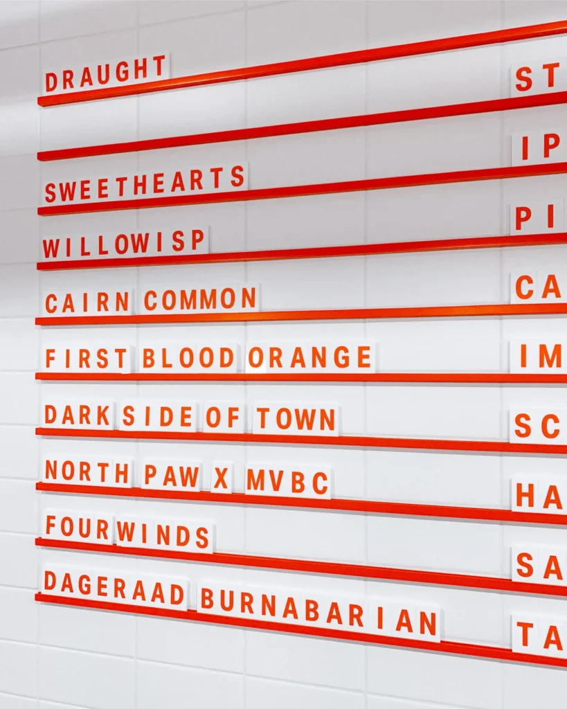
- Architectural and Wayfinding Integration: Designers worked to harmonize the brewery’s interior, which retains the structural bones of its former life as a mechanic’s garage, with new signage and environmental graphics. This phase ensured that the industrial aesthetic was maintained while improving customer navigation.
- Suite Development: The rollout included a full suite of collateral, from custom-designed tasting flight trays to modular menu systems that could easily adapt to the brewery’s experimental, small-batch brewing schedule.
- Packaging and Market Entry: The final stage involved the design of packaging for canned products, utilizing a consistent typographic approach that prioritized readability and visual impact on crowded retail shelves.
The Role of Typographic and Visual Strategy
Central to the brewery’s visual success is the implementation of Aktiv Grotesk, a typeface developed by the renowned foundry Dalton Maag. The choice of a sans-serif, neutral, and highly legible font serves a functional purpose in the brewery’s design system. By utilizing a typeface that avoids unnecessary ornamentation, the brand signals its commitment to the "crushable", straightforward nature of its staple beers, while remaining sophisticated enough to distinguish its more experimental offerings.

The visual identity is characterized by a balance between the industrial grit of the garage space and the refined, contemporary design elements. The use of clear, bold signage and intuitive wayfinding systems is not merely an aesthetic choice; it is a response to the operational demands of a high-volume venue that must serve both regular patrons and first-time visitors efficiently.
Market Context and Industry Implications
The craft beer sector in British Columbia has seen a period of significant maturation. According to industry reports from the BC Craft Brewers Guild, the province boasts one of the highest densities of craft breweries per capita in Canada. In such a saturated market, success is rarely predicated on the quality of the beer alone; it requires a robust brand identity that can command attention in a retail environment and foster loyalty in a physical space.

Mountainview Brewing Co.’s approach—investing heavily in design, interior collateral, and a cohesive brand voice from the outset—is increasingly becoming the standard for modern breweries. This strategy acknowledges that the "taproom experience" is a product in its own right. By managing everything from the shape of their tasting trays to the design of their coasters and merchandise, the brewery ensures that every touchpoint reinforces the brand’s core values.
For travelers, the brewery serves as a critical point of interest in a town otherwise known for passing through. By positioning itself as a "last stop" before the mountain pass, Mountainview Brewing creates a psychological association between their product and the adventure of the journey. For locals, the brewery functions as a third space, distinct from home and work, which is vital for the social infrastructure of smaller communities like Hope.

Operational Success and Design Integration
The integration of the physical space with the digital and print branding has led to a highly functional operating environment. The flexible menu systems, for instance, allow the staff to update their offerings in real-time, reflecting the transient nature of experimental craft brewing. This agility is a key competitive advantage. When a batch of experimental beer is ready, the branding collateral—ranging from posters to digital displays—can be updated with minimal friction.
Furthermore, the design of the packaging for cans has been executed with an eye toward longevity. In a market where craft beer drinkers are increasingly influenced by label aesthetics, the clean, consistent, and bold branding ensures that the product remains shelf-stable in terms of brand recognition. The visual language effectively communicates the brewery’s identity without the need for excessive descriptive copy, relying on the strength of the typography and the clarity of the design.

Broader Economic and Cultural Impact
The establishment of a sophisticated brand like Mountainview Brewing Co. contributes to the revitalization of the commercial sector in Hope. Small-town economic development is frequently bolstered by businesses that can successfully market themselves as regional destinations. By creating a professional, high-end visual presence, the brewery helps to elevate the perception of the local business community, potentially attracting further investment to the area.
Designers involved in the project have noted that the success of the brand lies in its restraint. Rather than attempting to adopt an overly "mountain-themed" or kitschy aesthetic, which is common in tourist-heavy regions, the brewery opted for a design language that feels contemporary and international. This decision allows the brewery to appeal to a broader demographic, ranging from local craft enthusiasts to international tourists familiar with modern, urban design sensibilities.

Conclusion
Mountainview Brewing Co. stands as a case study in the efficacy of early-stage brand development. By prioritizing a clear, consistent, and functional visual identity, the brewery has successfully navigated the challenges of a competitive industry and a unique, high-traffic location. Through their collaboration with Memory, they have built a framework that supports both the operational realities of a busy taproom and the long-term goals of a growing brand.
As the brewery continues to evolve its tap list and expand its presence in the region, the foundational work performed by the design team will remain a critical asset. In an era where consumer loyalty is increasingly driven by the values and the "feel" of a brand, Mountainview Brewing Co. has demonstrated that a strategic approach to design is not a luxury, but a fundamental component of commercial success. The brewery has not only captured the spirit of its location in the Cascades but has also established a blueprint for how a small-town business can punch well above its weight through thoughtful, deliberate, and professional branding.