
Despite broad browser support, CSS container queries remain a significantly underutilized feature in modern web development, frequently misunderstood as mere alternatives to traditional media queries. While media queries have served as the cornerstone of responsive design for nearly two decades, the introduction of container queries represents a fundamental shift in how developers handle layout logic. Currently boasting approximately 94% browser compatibility, the feature allows components to respond dynamically to their immediate surroundings rather than the global viewport, yet industry adoption lags behind expectations. According to the 2025 State of CSS survey, while 86% of developers are aware of the technology, only 41.4% have integrated it into their production workflows. This discrepancy between technical capability and practical application highlights a persistent reliance on viewport-based paradigms that no longer serve the requirements of complex, modular web applications.
The Historical Context of Responsive Design
The evolution of responsive design began in earnest around 2010, popularized by Ethan Marcotte’s seminal work on fluid grids and flexible images. The subsequent widespread adoption of media queries allowed developers to create sites that adjusted their appearance based on the width of the user’s screen. For years, the viewport—the visible area of a web page—served as the only reliable proxy for determining a device’s constraints.

However, as the web moved toward component-based architectures, the limitations of this "macro" approach became evident. A component designed to look optimal on a smartphone might be placed within a sidebar or a multi-column grid on a desktop, where the space available is vastly different from the total screen width. Media queries, being inherently "dumb" in their lack of awareness regarding internal layout shifts, cannot detect these localized constraints. They only perceive the browser window size, often leading to layout deformation, unintended overflows, or cramped UI elements when components are moved outside their intended context.
Chronology of Implementation
The push for a container-based query system began in earnest around 2019, when the CSS Working Group recognized that developers were struggling to manage component reusability. For years, the ability for an element to query its parent container topped various "CSS Wishlists" circulated by industry experts and community leaders. After several years of development, testing, and standardization, the feature was finally shipped across major browser engines.
Despite this, the transition has been slow. At the SmashingConf Amsterdam 2026, industry analyst Kevin Powell noted that the adoption rate of container queries has been unexpectedly poor. This stall in momentum is largely attributed to the visual similarity between the @media and @container syntax. Because they look and function similarly on the surface, many developers have defaulted to their existing knowledge of media queries, failing to grasp the paradigm shift from "page-centric" to "component-centric" styling.

Technical Distinction: Macro vs. Micro Layouts
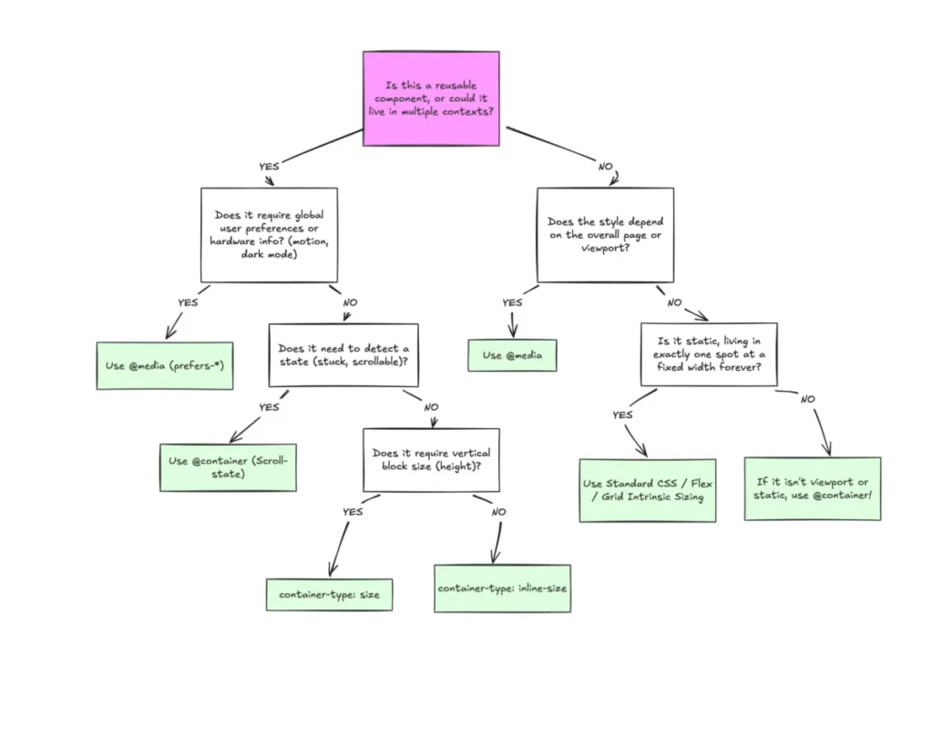
The primary challenge in adopting container queries is recognizing the distinction between macro and micro layouts. Media queries remain the standard for macro-level changes, such as modifying global navigation, adjusting page-wide grid structures, or responding to user system preferences like prefers-color-scheme. These are settings that apply to the entire document structure and are inherently tied to the user’s device.
Conversely, container queries are designed for micro-layouts—the individual components that populate the page. By using the container-type property, a developer can define a parent element as a container, allowing its children to adjust their styles based on the available space within that specific wrapper. This creates a self-contained system where a card component, for instance, can automatically switch from a vertical list layout to a horizontal grid layout simply by detecting it has reached a specific width threshold, regardless of whether it is displayed on a mobile phone or a massive desktop monitor.
Data-Driven Implications and Browser Fragmentation
The necessity for this shift is underscored by the extreme fragmentation of device dimensions. Research indicates that there are over 2,300 unique viewport sizes currently in use on the modern web. Relying solely on a handful of media query breakpoints is increasingly insufficient to account for this variation. When developers rely on static breakpoints, they are essentially guessing at the user’s device profile. Container queries remove this guesswork by allowing the content itself to dictate the layout, fostering a more resilient and flexible design system.

Limitations and Implementation Caveats
While container queries offer superior flexibility, they are not a universal replacement for all responsive logic. Several technical constraints must be observed to avoid common pitfalls:
- Self-Querying Loops: A container cannot query its own dimensions. Attempting to apply a
container-typeto an element and then using an@containerrule on that same element will result in a conflict. A parent-child structure is required, where the parent acts as the container and the child responds to its size. - Height Collapse: Using
container-type: sizecan cause the container to collapse to a height of zero if the browser does not have explicit size constraints, as it ignores the content within when calculating its own dimensions. Developers are encouraged to useinline-sizeunless block-dimension querying is strictly required. - Custom Properties: At present, container queries cannot directly accept CSS custom properties (variables) in their conditions. This is due to the potential for circular dependencies, where a query might trigger a style change that modifies the very variable the query relies upon.
Future Outlook and Conclusion
The industry is currently in a transition period where traditional media queries are being supplemented by container-based logic. The successful adoption of this feature requires a fundamental shift in how developers conceptualize responsive design. Rather than asking how large the screen is, developers must begin asking how much space a component has been allocated.
By delegating responsibility to the container, developers can build components that are truly portable, modular, and resilient to the unpredictable nature of the modern web. While the learning curve and the necessity for structural changes in HTML might seem daunting, the long-term benefit is a more predictable, scalable, and efficient design system. As developers move away from the "one-size-fits-all" viewport approach, the integration of container queries stands to become the new standard for professional front-end engineering, marking a significant step forward in the maturation of CSS as a layout engine.