
Despite broad browser support, CSS container queries remain a significantly underutilized feature in modern web development. Although these tools were designed to solve the long-standing problem of responsive component design, adoption rates remain surprisingly low compared to the industry-wide transition toward modular architecture. With approximately 94% browser compatibility—spanning Chrome, Edge, Firefox, and Safari—the technical barrier to entry has effectively evaporated. Yet, according to data from the 2025 State of CSS survey, while 86% of developers are aware of container queries, only 41.4% have integrated them into their production workflows. This discrepancy between availability and implementation suggests a fundamental misalignment in how developers perceive the relationship between layout, context, and the viewport.
The history of web responsiveness has been dominated by the viewport-centric model. Since the introduction of media queries in the CSS3 specification, developers have relied on the browser window as the primary proxy for device capabilities. By querying the width of the screen, developers could trigger layout shifts—transforming a desktop grid into a single-column mobile view. While this paradigm successfully bridged the gap during the early smartphone era, it has become increasingly brittle in an ecosystem characterized by component-based design. Modern web applications are composed of discrete, reusable elements—such as cards, widgets, and navigation bars—that are frequently moved between varying contexts, from full-width main content areas to narrow sidebars.
The technical limitation of media queries lies in their inherent "blindness." A media query cannot detect the specific constraints of a parent element; it only perceives the dimensions of the browser window. If a developer sets a media query to adjust a card component when the screen width drops below 1024 pixels, the browser will execute that change regardless of whether the card sits in a 1920-pixel wide main container or a cramped 300-pixel sidebar. This often leads to layout deformation, where components appear broken or distorted because the "macro" environment (the screen) does not accurately reflect the "micro" environment (the component’s container).
The industry’s slow pivot toward container queries was underscored during the 2026 SmashingConf in Amsterdam, where developer advocate Kevin Powell remarked that adoption has been substantially lower than predicted. This is paradoxical, given that the ability for components to adapt to their specific parent container has consistently ranked among the top requested features on CSS developer wishlists for over a decade. The slow uptake is largely attributed to a cognitive bias: because container query syntax resembles that of media queries, many developers mistakenly assume they serve the same function.
At its core, the transition from media queries to container queries represents a shift from "outward-looking" to "inward-looking" design logic. To implement a container query, a developer must define a container-name and a container-type (typically inline-size) on the parent element. Once defined, child components can query the available horizontal space of that specific parent. If the parent container is 450 pixels wide, the component reacts to that specific reality. This approach empowers developers to create truly modular systems where a UI element is inherently aware of its own spatial constraints, eliminating the need for hard-coded, device-specific breakpoints.

The implications for fluid typography and design consistency are profound. Traditionally, fluid typography relied on viewport-relative units like vw or vh, which scaled text based on screen size. This often resulted in illegible text when components were placed in unconventional or nested layouts. By utilizing container-relative units (such as cqi, cqw, and cqb) in conjunction with the CSS clamp function, developers can now ensure that typography scales proportionally to the container, not the viewport. This results in superior visual hierarchy and readability across diverse application environments.
Furthermore, container queries provide a functional workaround for complex UI interactions that were previously impossible with CSS alone, such as detecting flexbox wrap states. In a standard flexbox layout, items wrap automatically when space is exhausted, but CSS lacks a native pseudo-class to identify when this "wrap" occurs. By nesting a container query within a flex item, developers can trigger style changes the moment a specific container threshold is met, effectively simulating an event-driven response without the overhead of JavaScript-based ResizeObservers.
However, the implementation of container queries is not without its technical caveats. A primary challenge is the "infinite loop" risk: a container cannot query its own dimensions to modify its own structure. Developers must ensure that the query logic is applied to a descendant of the container, rather than the container itself. Additionally, querying for "size" (block-axis) without providing an explicit height can cause the layout to collapse to zero, as the browser cannot infer the height of a container that is not constrained by its content. Furthermore, current specifications do not support querying against custom properties, as these values are subject to the DOM cascade and could potentially lead to recursive styling conflicts.

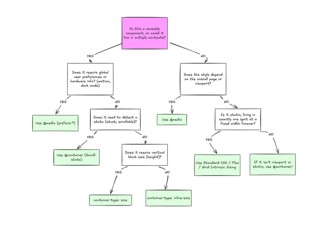
The broader impact of these technical hurdles is that the industry is undergoing a necessary, if difficult, re-evaluation of its responsive design methodology. Media queries are not obsolete; they remain the gold standard for "macro" layout decisions, such as site-wide grid systems, global navigation, and user-preference media features like dark mode. Conversely, container queries are increasingly recognized as the superior choice for "micro" layout decisions, such as the internal structure of widgets, cards, and dynamic UI modules.
With over 2,300 unique viewport sizes currently in circulation according to contemporary web analytics, it is no longer mathematically or logically feasible to maintain responsive designs by targeting individual screen widths. The industry is effectively reaching a point of saturation where device-specific design is becoming a legacy practice. The movement toward container-based responsive design represents a shift toward content-determined layouts, where the UI adjusts based on the available real estate rather than arbitrary device-category definitions.
Ultimately, the adoption of container queries requires a fundamental change in developer intuition. It requires moving away from asking, "How wide is the user’s screen?" and instead asking, "How much space does this specific component have to work with?" As design systems become more complex and modularity becomes the standard for web development, the reliance on container-aware CSS is expected to grow. While the transition may be slow, the benefits—greater code reusability, reduced layout bugs, and a more resilient, context-aware interface—are undeniable. The future of responsive design is not in the viewport, but in the container.