
Despite broad browser support and high levels of awareness among front-end professionals, CSS container queries remain one of the most underutilized features in modern web development. While media queries have served as the cornerstone of responsive design for over a decade, they are increasingly insufficient for the demands of modular, component-based architectures. As the web ecosystem shifts toward reusable design systems, the reliance on viewport-based logic is creating significant friction in how interfaces scale across diverse, fragmented device environments.
The Evolution of Responsive Design
The history of responsive web design is inextricably linked to the introduction of the media query. In 2010, Ethan Marcotte famously synthesized the concepts of fluid grids, flexible images, and media queries into a cohesive design strategy. This approach allowed developers to adapt page layouts based on the width of the browser viewport. For years, this was sufficient; developers would define "breakpoints" (such as 768px for tablets or 1024px for desktops) and shift the global layout accordingly.
However, the modern web has moved beyond the simple "mobile vs. desktop" paradigm. Today, a single web application might feature complex grids, sidebars, modals, and embedded widgets, each containing its own nested components. A component like a product card might exist in a main content area on a large desktop screen, or it might be squeezed into a narrow sidebar. Under the traditional media query model, that card is blind to its actual surroundings. It only knows the width of the entire window, leading to "deformed" or cramped UI elements when the viewport is wide but the specific container is narrow.

Statistical Trends in Adoption
The disconnect between the utility of container queries and their actual implementation is stark. According to the 2025 State of CSS survey, while 86% of developers report awareness of container query specifications, only 41.4% have integrated them into their workflows. This gap suggests a "familiarity bias," where developers default to media queries because they are well-understood, despite the technical superiority of container-based logic for specific use cases.
Furthermore, with over 2,300 unique viewport sizes currently in circulation, attempting to manage layout states through global media queries has become a losing battle. The sheer fragmentation of device screen sizes means that hard-coding breakpoints is no longer a sustainable strategy for responsive, scalable design systems.
Technical Distinction: Macro vs. Micro Layouts
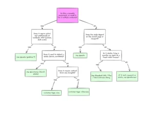
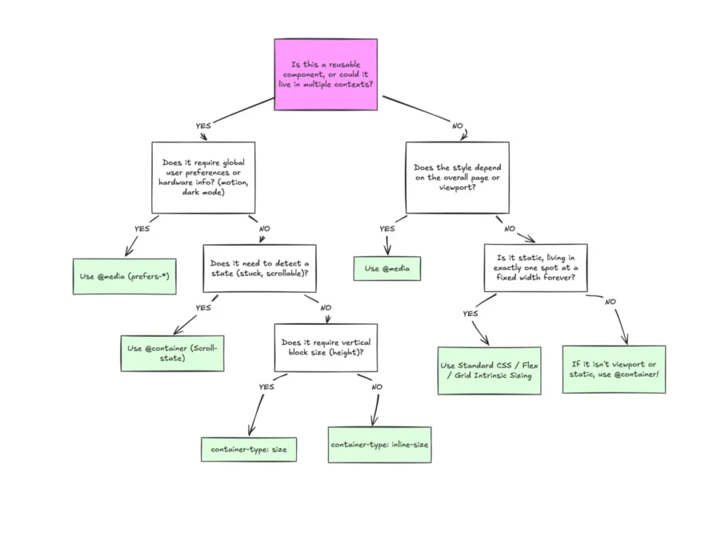
To understand why this shift is necessary, one must distinguish between "macro" and "micro" layouts. Media queries are inherently "macro"—they are designed to observe the global environment. They remain the correct tool for page-level concerns, such as top-level navigation, footer structure, and global design system preferences like prefers-color-scheme or prefers-reduced-motion.
Conversely, container queries represent the "micro" level of design. By utilizing the container-type property—typically inline-size—a component becomes self-aware. It no longer asks, "How wide is the screen?" but rather, "How much space is available within my immediate parent?" This fundamental change allows developers to create truly modular components that behave correctly regardless of where they are placed in the DOM tree.

Overcoming Implementation Challenges
While the benefits are clear, the transition to container queries requires a departure from legacy habits. A primary hurdle is the "self-querying" trap. In CSS, an element cannot query itself for layout changes, as this would create an infinite calculation loop. Developers must implement a wrapper or ensure the container is a distinct parent of the content being adjusted.
Additionally, developers must be cautious when using the size container type. Unlike inline-size, which monitors horizontal space, the size property requires the container to have an explicit height. If the container lacks defined vertical dimensions, the browser will collapse it to zero height, effectively causing the layout to vanish. These technical constraints, while initially perceived as barriers, actually encourage more robust, predictable CSS architecture.
The Role of Container Units
The specification also introduces new relative units: cqi (container query inline-size), cqw (container query width), cqh (container query height), and others. When paired with functions like clamp(), these units enable fluid typography that remains proportional to the component’s container rather than the browser window. This is a significant leap forward for accessibility and design consistency. Previously, fluid text would often grow or shrink disproportionately when moved into a small sidebar, but container-relative units ensure that the text scale remains harmonious with its immediate surroundings.
Addressing Complex Layout Behaviors
One of the most persistent challenges in CSS has been detecting "state changes" within a component, such as when flex items wrap to a new line. Previously, this required JavaScript-based observers like ResizeObserver. Container queries provide a CSS-only workaround. By nesting a container query inside a flex item, developers can trigger style changes the moment the item’s width changes due to the parent flex container’s wrapping behavior. This effectively bridges the gap between layout logic and component state, reducing the reliance on heavy client-side scripts.

Broader Implications and Future Outlook
The under-adoption of container queries is not merely a matter of developer preference; it reflects a broader industry challenge in modernizing CSS knowledge. As design systems become the standard for large-scale web development, the component-first mindset is essential. The industry is currently in a transitionary phase where the "viewport-is-everything" era is clashing with the "component-as-the-source-of-truth" era.
Industry experts, including those presenting at forums like SmashingConf, have highlighted that the failure to adopt container queries leads to "brittle" codebases. When layout logic is tied to the viewport, every new page template requires a review of global CSS files to ensure components don’t break. When layout logic is tied to the container, a component can be moved from a homepage to a dashboard or a sidebar with zero modifications, as it carries its own responsive rules.
While it is unlikely that media queries will disappear—they are essential for global structural changes—the future of responsive design lies in the intelligent delegation of responsibility. By reserving media queries for the global "macro" layout and utilizing container queries for "micro" component behavior, developers can create leaner, more maintainable, and significantly more resilient interfaces.
The path forward requires a shift in education and standard practices. As browser support has reached a mature 94%, the technical hurdle is gone. The remaining challenge is the shift in architectural philosophy: moving away from the global, top-down control of the viewport and toward a local, modular approach where components are masters of their own space. This evolution is the next logical step in the maturity of the web as a platform, ensuring that digital experiences are as fluid and adaptive as the content they contain.