
Despite broad browser support, CSS container queries remain a vastly underutilized tool in the modern web developer’s arsenal, often misunderstood as mere alternatives to traditional media queries. With a 94% adoption rate across major browsers, this technology offers a fundamental shift in how responsive design is architected. Unlike media queries, which rely on the viewport as the primary source of truth, container queries allow components to adapt to their specific parent elements, enabling a truly modular approach to interface design.
A Historical Perspective on Responsive Design
To understand the necessity of container queries, one must look at the evolution of responsive web design. In 2010, Ethan Marcotte coined the term "responsive web design," emphasizing flexible grids and media queries. At that time, the primary challenge was ensuring websites looked consistent across various screen sizes, from mobile devices to desktop monitors. Media queries were the perfect solution for this macro-layout challenge; they allowed developers to rearrange entire page structures based on the total width of the user’s browser window.
However, as the web matured, the industry shifted toward a component-based architecture. Frameworks like React, Vue, and Angular popularized the concept of reusable components—UI elements such as cards, sidebars, and navigation bars that could be dropped into any section of a website. This shift exposed a critical flaw in the reliance on media queries. A card designed to look perfect in a 1000px-wide main content area would often break when placed inside a 300px-wide sidebar, as the media query would still interpret the environment based on the total viewport width rather than the space available to the component itself.

The Rise of Container Queries
The concept of container queries was first proposed as a solution to this "component context" problem years ago. Industry leaders and developers long voiced their frustration on platforms like CSS-Tricks, identifying the inability of a component to "know" its own size as a major missing piece of the CSS specification. After extensive debate and development within the W3C (World Wide Web Consortium), the Container Queries specification was finalized and began rolling out in browsers starting around 2022.
Despite this milestone, adoption has remained stagnant. The 2025 State of CSS survey revealed a significant gap between awareness and implementation: while 86% of developers are aware of the feature, only 41.4% have integrated it into their workflows. During the 2026 SmashingConf in Amsterdam, industry experts like Kevin Powell highlighted that this low adoption rate stems from a persistent misconception that container queries are simply "media queries for elements," leading many developers to attempt to use them for tasks they were never intended to perform, or ignoring them entirely out of perceived complexity.
Technical Distinctions: Macro vs. Micro Layouts
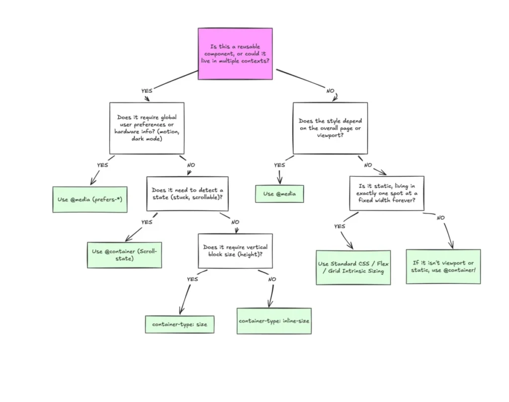
The primary distinction between the two technologies lies in the frame of reference. Media queries are "outward-looking," observing the browser window. They are best suited for macro-layout concerns: global adjustments, color schemes, and system preferences. In contrast, container queries are "inward-looking," focusing on the local context of a specific element.
When a developer uses a container query, they are effectively instructing the browser to monitor the dimensions of a designated parent element. This is achieved through the container-type and container-name properties. By setting container-type: inline-size, the developer enables the element to act as a container, allowing child components to apply styles based on the parent’s width. This solves the "deforming" issue where components overflow their containers because they are locked to the constraints of the overall viewport.

Data-Driven Implications for Web Performance
The proliferation of device screen sizes further justifies the move toward container-based logic. Research indicates there are now over 2,300 unique viewport sizes identified in web traffic. Attempting to account for this fragmentation using traditional media query breakpoints—like 768px for tablets or 1024px for desktops—is increasingly inefficient and error-prone. By relying on container queries, developers create "self-aware" components that function correctly regardless of the specific screen size of the device, reducing the need for extensive, hard-coded breakpoint overrides.
Furthermore, this approach allows for more sophisticated typography management. Using modern CSS units such as cqi (container query inline-size) combined with the clamp() function, developers can create fluid typography that scales proportionally within its container. This prevents text from becoming unreadably large in wide, full-page layouts or unnaturally small when constrained to narrow sidebars, a frequent pain point in previous responsive design iterations.
Addressing Implementation Caveats
Despite the advantages, the implementation of container queries requires a fundamental shift in how developers structure their markup. One of the most common pitfalls is the "infinite loop" error: a container cannot query itself. To successfully apply a container query, developers must ensure that the element being styled is a descendant of the container element, not the container itself. This requires a cleaner separation of concerns between the wrapper and the content.
Another critical consideration involves performance and layout stability. Querying a container’s "size" (its block or vertical height) can lead to unexpected results, such as elements collapsing to a height of 0px because the browser calculates the container’s dimensions independently of its contents. Developers are generally advised to prioritize inline-size queries to avoid these layout collapses. Additionally, the current inability to use custom properties within container queries—due to potential circular dependencies in the CSS cascade—means that developers must rely on hard-coded values or alternative architectural patterns when defining breakpoints.

The Future of Responsive Architecture
The industry is currently at a turning point regarding responsive standards. While media queries remain essential for page-level structural shifts, the long-term trend favors the modular, container-based approach for UI components. As browser support continues to stabilize and documentation improves, the expectation is that the 41.4% adoption rate will climb.
Ultimately, the shift toward container queries represents a maturation of the web. It moves the industry away from the "viewport-as-proxy" mentality and toward a system where components define their own boundaries. For organizations managing large-scale design systems, this represents a significant improvement in code reusability and maintenance. By moving logic closer to the component, developers can ensure that their designs remain robust and consistent, regardless of the device or layout in which they are placed. The future of the responsive web is not found in the dimensions of the browser window, but in the internal logic of the containers that house our digital experiences.