
Naming is an inherently difficult yet critical aspect of digital product development. The language used by designers, developers, and product managers shapes not only internal communication but also the conceptual architecture of the products themselves. Misaligned terminology—often resulting from the clash between a designer’s visual vocabulary and a developer’s functional syntax—leads to significant technical debt, confusion in component libraries, and ultimately, poor user adoption. As software complexity grows, the necessity for a standardized, scalable, and intuitive naming taxonomy has transitioned from a best-practice recommendation to a prerequisite for successful digital scaling.

The Cognitive Cost of Ambiguous Nomenclature
In the early stages of product design, naming is often treated as a peripheral task. However, research into cognitive load in software engineering suggests that ambiguous or overly generic names (such as "Box1" or "Container_Final") force developers and designers to spend additional cognitive energy to parse meaning. Conversely, names that are too specific—such as "BlueButtonWithRoundedCorners"—preclude flexibility, as the component’s visual identity may evolve while its functional role remains static.
Industry standards now emphasize a shift toward "intent-based" naming. Instead of describing what a component looks like, naming conventions are increasingly focused on what a component does or the role it plays within the broader system. This shift reduces the frequency of refactoring cycles, as the underlying code remains relevant even when the brand’s visual design system undergoes a theme update.

Establishing a Taxonomy: From Primitives to Pages
A robust naming architecture typically follows a hierarchical structure, moving from abstract primitives to specific page-level implementations. The Vodafone UK Design System team serves as a high-profile case study in this approach. By utilizing a "Variables Taxonomy Map," they successfully categorized tokens into four distinct layers:
- Brand Tokens: Foundational values such as color palettes, typography scales, and spacing units that define the core identity.
- Primitive Tokens: Raw, non-contextual values that represent specific attributes (e.g., "blue-500").
- Semantic Tokens: Contextual values that define usage (e.g., "button-primary-background").
- Component/Page Tokens: Highly specific implementations that map tokens to specific UI elements or page layouts.
This layered approach, heavily influenced by the work of design systems architect Nathan Curtis, ensures that teams can update a "brand" token without breaking the "semantic" references used across various applications. When an organization scales to support multiple brands or themes, this system allows for a "theming" engine that can swap underlying values while keeping the component architecture intact.

Resources for Standardizing UI Vocabulary
For teams struggling to establish a consistent lexicon, several industry-standard resources have emerged to bridge the gap between creative and technical departments.
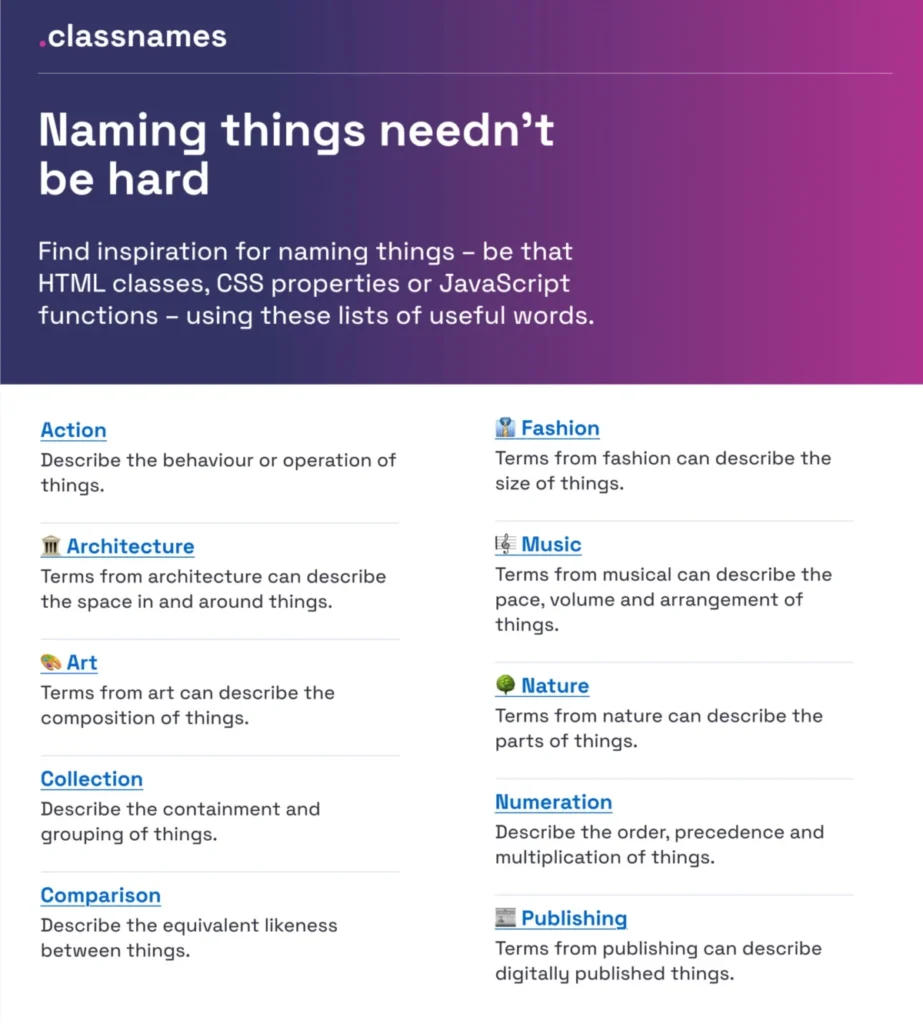
- Classnames (paulrobertlloyd.com): This tool provides thematically grouped lists of words categorized by behavior, likeness, and association. It encourages developers to move away from repetitive, generic naming patterns toward more descriptive, semantic terminology derived from architecture, music, and publishing.
- Color Parrot (parrot.color.pizza): Managing color nomenclature is a notoriously difficult task. This repository provides over 30,000 unique names for specific color hex codes, sourced from community contributions. By moving away from numerical naming (e.g., "color-1") to descriptive identifiers, teams can communicate visual changes more effectively.
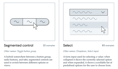
- The Component Gallery (component.gallery): Managed by Iain Bean, this resource serves as an inventory of over 50 common UI components. It offers a comparative analysis of how different design systems—such as those from Google, Shopify, or IBM—name their components. This is a critical resource for teams looking to align their internal naming with industry standards to reduce the learning curve for new developers.
The Impact of Naming on Feature Adoption
A frequently overlooked consequence of poor naming is low feature adoption. If a feature is named using internal jargon rather than the language of the user, its discovery rate often plummets. UX researcher Erin Gannon has documented that naming is a primary driver of feature discoverability. When a feature is named according to the "job-to-be-done"—the underlying task the user is attempting to accomplish—the interface becomes self-documenting.

For example, a feature titled "Advanced Data Export Querying" is significantly less discoverable than "Download Report." The latter focuses on the outcome, whereas the former focuses on the mechanism. Organizations that conduct user testing to capture the specific vocabulary of their customers and integrate that language into the UI often see a measurable increase in interaction rates.
Chronology of Best Practices in Design Systems
The evolution of naming conventions has mirrored the maturation of the design system discipline itself:

- 2010–2015: The "Bootstrap Era." Naming was largely driven by CSS frameworks, often resulting in highly visual and specific class names (e.g.,
btn-large-blue). - 2016–2019: The "Atomic Design Era." Led by Brad Frost’s methodology, teams began organizing names around "Atoms, Molecules, and Organisms." This brought structure but often led to over-engineering.
- 2020–Present: The "Tokenization Era." With the rise of design-to-code tools like Figma Variables and Style Dictionary, the industry has moved toward a multi-tier token taxonomy that separates design intent from visual implementation.
Official Responses and Industry Consensus
Professional bodies in the design space, including the Interaction Design Association (IxDA), have emphasized that naming is a collaborative act. In recent symposia regarding design operations, the consensus has been that naming should be a "shared language" exercise involving stakeholders from engineering, product, and design.
"The goal of a naming system," notes one industry lead, "is not to create a rigid set of rules, but to create a shared mental model." When developers and designers share the same mental model, the time required to translate a design file into a functional component is reduced by an average of 15–20%.
Broader Implications for Technical Debt
Failure to implement a cohesive naming system is a leading cause of "ghost components"—duplicate elements that serve the same purpose but exist under different names in the codebase. Over time, these duplicates inflate the bundle size, increase maintenance costs, and make accessibility auditing significantly more difficult.
Organizations that invest in a "Design Token Naming Guide," such as the one developed by Romina Kavcic, report a reduction in onboarding time for new developers. By providing a clear source of truth for naming conventions, organizations ensure that the system remains sustainable as the team grows.

Conclusion: Moving Toward a Unified Vocabulary
The challenge of naming is, at its core, a challenge of communication. As digital products become more complex, the need for a standardized nomenclature becomes paramount. By utilizing resources like the Component Gallery or the Onym repository for branding, and by adopting a multi-tiered token taxonomy, teams can eliminate the "dialect barriers" that frequently cause friction between departments.
Effective naming reduces ambiguity, accelerates development, and ensures that the end-user finds the interface intuitive. Whether it is the naming of a button, a color variable, or a complex new feature, the choice of words directly influences the long-term health and success of the product. Teams are encouraged to treat their naming conventions as living documentation—continuously refined, rigorously audited, and always centered on the needs of the user.