
Mountainview Brewing Co. stands as a cornerstone of the craft beer industry in the Fraser Valley, occupying a unique geographic and cultural space at the threshold of the Cascade foothills. Located in the town of Hope, British Columbia—a municipality globally recognized for its role as the primary filming location for the 1982 Sylvester Stallone classic Rambo: First Blood—the brewery has successfully leveraged its rugged, cinematic surroundings to cultivate a distinct brand identity. By transforming a former automotive garage into a modern taproom, the establishment serves a dual purpose: acting as a community hub for local residents and functioning as a vital rest stop for travelers navigating the challenging mountain passes of the Coquihalla Highway.

The Genesis of a Brand Identity
The inception of Mountainview Brewing Co. was not merely a venture in production brewing but a comprehensive exercise in place-branding. From its earliest planning phases, the brewery’s founders sought to ensure that every consumer touchpoint—from the structural signage on the building’s exterior to the tactile experience of a tasting flight tray—aligned with a unified visual language.

The design process, spearheaded by the creative agency Memory, prioritized a minimalist yet functional aesthetic. This approach was heavily influenced by the adoption of Aktiv Grotesk, a sans-serif typeface developed by Dalton Maag. The choice of this font serves to ground the brand in a contemporary, clean-cut industrialism that contrasts effectively with the wild, untamed backdrop of the surrounding mountain ranges. This visual strategy was designed to communicate reliability, precision, and an approachable, “crushable” quality that appeals to both the casual tourist and the discerning craft beer enthusiast.

Chronology and Operational Development
The evolution of the brewery follows a structured timeline of growth and brand integration. Initially established to revitalize a derelict mechanic garage, the site required extensive interior renovation to transition from an industrial automotive space into a hospitality-focused environment.

- Phase One: Conceptualization and Foundation: During this period, the agency and brewery founders established the brand voice. The focus was on creating a system that could accommodate both staple, high-volume offerings and the brewery’s experimental, limited-batch releases.
- Phase Two: Exterior and Interior Wayfinding: The implementation of custom signage was critical. Because the brewery sits near a major highway transit point, the signage had to be highly visible and legible, reflecting the industrial history of the building while signaling a modern, high-quality product.
- Phase Three: Full Brand Suite Rollout: This phase involved the design and production of collateral materials, including menus, custom tasting flight trays, coasters, and merchandise. Each item was calibrated to maintain the brand’s color palette and typographic standards, ensuring that a patron holding a glass in the taproom experiences the same visual cues as someone purchasing a four-pack of cans from a local retailer.
Data-Driven Design and Consumer Experience
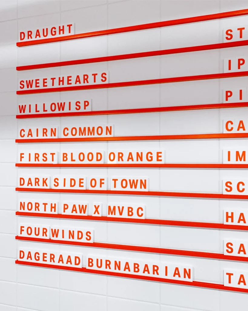
The design choices at Mountainview Brewing are not purely aesthetic; they are rooted in operational efficiency. For instance, the creation of "flexible menu systems" allows the brewery to adjust its offerings in real-time based on fermentation cycles and ingredient availability. In the craft beer sector, where consumer loyalty is often tied to the novelty of rotating seasonal taps, the ability to update a menu without compromising the visual integrity of the brand is a significant competitive advantage.

Furthermore, the physical design of the custom tasting flight trays and merchandise is a study in "lifestyle branding." By creating high-quality, branded physical objects, the brewery converts its patrons into brand ambassadors. The use of durable materials for these items ensures that they withstand the heavy foot traffic of a busy taproom, further reducing the overhead costs associated with the frequent replacement of inferior, non-branded equipment.

The Role of Location in Modern Craft Brewing
The location of the brewery in Hope, BC, is perhaps its most significant marketing asset. The town has long been a waypoint for travelers entering the interior of British Columbia. By situating the brewery at the literal gateway to the mountains, the business captures a captive audience of travelers.

From an economic perspective, this is a strategic play. Data from the craft brewing industry indicates that taproom sales represent the highest profit margins for independent breweries, as they eliminate the middleman and allow for direct interaction between the producer and the consumer. By optimizing the "last pit stop" experience, Mountainview Brewing creates a high-conversion environment where the brand identity acts as a physical manifestation of the mountain lifestyle that travelers are currently traversing.

Official Design Philosophy and Agency Perspective
Designers from Memory have noted that the project was intended to be "in-depth" rather than merely superficial. The goal was to build a brand that feels as if it has always been a part of the Hope landscape, despite its relatively recent establishment. The integration of the brand into the brewery’s wayfinding—directing guests through the space in a way that feels intuitive—demonstrates a sophisticated understanding of spatial psychology.

The brand voice is characterized as being unpretentious yet deliberate. It avoids the hyper-masculine tropes often associated with mountain-themed brands, opting instead for a clean, accessible, and sophisticated aesthetic. This neutrality allows the brand to appeal to a wider demographic, including the demographic of highway travelers who may be looking for a high-end experience that feels grounded in local geography.

Broader Implications and Industry Impact
The success of the Mountainview Brewing identity serves as a case study for small-town businesses looking to compete on a national scale. In a saturated market, where the number of craft breweries has seen unprecedented growth over the last decade, a product’s quality alone is often insufficient for long-term survival.

The broader implications of this approach include:

- The Normalization of Professional Design in Rural Markets: As the craft beer market matures, even businesses in smaller towns are finding that they must invest in high-level branding to survive against larger, regional competitors.
- The Importance of Cohesive Collateral: The industry is moving toward an "ecosystem" approach, where the design of a business card or a coaster is given as much attention as the formulation of an IPA. This consistency builds brand equity that pays dividends in repeat customer loyalty.
- Geographic Identity as a Pillar: By anchoring the brand to the geography of the Cascade foothills, the brewery creates a sense of place that cannot be replicated by urban competitors.
Conclusion
Mountainview Brewing Co. represents a successful intersection of industrial history, geographic prestige, and modern design principles. By meticulously curating every aspect of its visual identity—from the specific utility of its menu boards to the architectural signage that greets travelers—the brewery has established a presence that feels both permanent and evolving. As the craft beer industry continues to navigate a challenging economic landscape, the strategies employed by Mountainview suggest that a brand built on a strong, consistent, and well-integrated visual identity is better equipped to capture market share and foster deep, lasting connections with its local and transient customer base. The partnership between the brewery and its design team has not only created a series of products but has solidified a brand that serves as a modern monument to the spirit of the Cascade region.