
Jim Parkinson, the seminal lettering artist, type designer, and painter whose work shaped the visual identity of American media for over half a century, passed away on June 26, 2025, at his home in Oakland, California. He was 83. His death followed a protracted battle with Alzheimer’s disease. Parkinson is survived by his wife, Dorothy A. Yule, a noted book artist who provided dedicated care throughout his final years. His departure marks the end of an era for the American graphic design industry, as Parkinson was widely considered one of the most prolific and influential typographic masters of the post-war period.
A Legacy in Ink and Neon
Parkinson’s career spanned the transition from the analog era of physical pen-and-ink lettering to the digital revolution of font design. His influence is nearly ubiquitous; it is estimated that millions of Americans encounter his work daily, whether through the mastheads of national newspapers, the logos of iconic rock bands, or the visual branding of global entertainment franchises. His ability to synthesize historical lettering styles with modern design sensibilities allowed him to remain at the forefront of the industry from the mid-1960s until his retirement.
Chronology: From Oakland to the World Stage
Born in Oakland on October 23, 1941, Parkinson’s fascination with typography began in childhood. His early exposure to the craft came from his neighbor, Abraham Lincoln Paulsen, a renowned penman known as the “Wizard Penman.” Paulsen’s ability to perform complex calligraphic feats left a lasting impression on the young Parkinson, who began collecting vintage lettering manuals and correspondence textbooks shortly thereafter. This early immersion in historical styles became the foundation of his career.
Following his graduation from the California College of Arts and Crafts in 1963, Parkinson relocated to Kansas City, Missouri, to join the creative staff at Hallmark Cards. While his initial tenure involved general illustration, his talent for formal lettering soon became apparent to his superiors. He was transferred to the company’s dedicated lettering department, a move that would define his professional trajectory.
In the decades that followed, Parkinson returned to the San Francisco Bay Area, establishing a freelance practice that would span over 50 years. His portfolio includes iconic contributions such as:

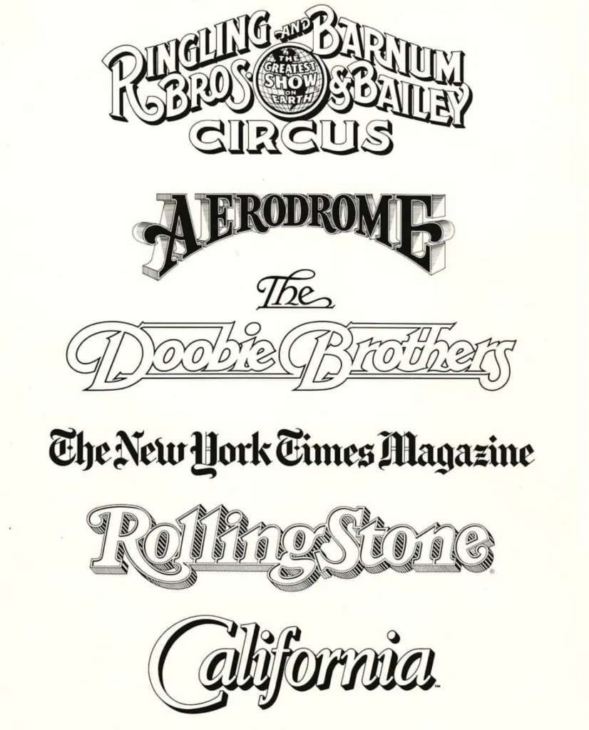
- Publication Design: The mastheads for Rolling Stone and the Los Angeles Times, among dozens of other magazines and newspapers.
- Corporate and Entertainment Branding: The legendary logo for the Ringling Bros. and Barnum & Bailey Circus and the distinct typographic mark for the rock band The Doobie Brothers.
- Typeface Development: A vast collection of bespoke and retail typefaces that continue to be used by designers globally.
Analysis: The Impact of a Prolific Career
The significance of Parkinson’s work lies in his versatility. While many designers specialized in either corporate branding or editorial design, Parkinson’s expertise bridged these gaps. He functioned as a "visual editor" for many publications; when art directors sought to refresh the aesthetic of a magazine, they frequently turned to Parkinson to redraw or modernize their nameplates.
His methodology—which involved an obsessive study of historical letterforms combined with a practical understanding of how those forms functioned in a printed environment—set a standard for the industry. His work was not merely decorative; it was functional, legible, and structurally sound. This balance of artistry and utility ensured that his designs remained relevant even as publication trends shifted from high-contrast ink printing to modern digital-first formats.
Beyond the Page: Fine Art and Preservation
In his later years, Parkinson pivoted toward the fine arts, focusing his energy on capturing the decaying beauty of mid-century American neon signage. His paintings, which documented the peeling paint and broken glass of vintage roadside attractions, serve as a testament to his obsession with the intersection of typography and architecture.
Colleagues and historians often noted that Parkinson was as much an archivist as he was an artist. His Oakland home served as a private repository for decades of ephemera, type books, and original sketches. This collection, which he frequently shared with students and fellow designers, provided a living history of 20th-century graphic design.
Stephen Coles, a typographer and close associate who knew Parkinson for two decades, highlighted the artist’s humility. "He truly lived Margot Fonteyn’s mantra: ‘Take your work seriously, but never yourself,’" Coles remarked. This ethos defined Parkinson’s approach to his community; he was a frequent presence at design gatherings, known for his willingness to mentor younger designers and his lack of pretension regarding his considerable achievements.
Official Responses and Future Memoirs
The design community has reacted to the news with an outpouring of tributes, recognizing Parkinson as a foundational figure in American typography. His influence is expected to be codified in the coming year; the Letterform Archive, an institution dedicated to the preservation of graphic design history, has announced that it will publish Parkinson’s memoir in 2026. This forthcoming work is anticipated to provide invaluable insight into the techniques and experiences of a man who helped build the visual language of modern journalism and entertainment.

Broader Implications for the Design Industry
Parkinson’s passing serves as a moment of reflection for the design industry at large. As digital tools continue to automate aspects of typeface creation, the manual rigor and historical literacy that defined Parkinson’s work are increasingly recognized as essential foundations for design education.
The shift toward AI-generated imagery and algorithmic type design highlights the rarity of practitioners like Parkinson, whose work was rooted in deep, tactile experience. His career demonstrates the value of the "human touch" in graphic design—the nuanced decisions that only a seasoned eye can make regarding kerning, stroke weight, and letterform anatomy.
Memorial Information
The family of Jim Parkinson has announced that a memorial service will be held in the autumn of 2025. In keeping with his legacy and his family’s experiences during his final years, his survivors have requested that, in lieu of flowers, donations be directed to the Alzheimer’s Association to support ongoing research and care initiatives.
As the design world looks back on his half-century of contributions, Parkinson’s legacy remains secure. Through the mastheads on newsstands, the fonts embedded in digital software, and the personal accounts of the many artists he mentored, Jim Parkinson’s voice will continue to speak through the letters he spent his life perfecting. He remains, as many of his contemporaries described him, a "master of the craft" who preferred to let his work stand as his most enduring monument.