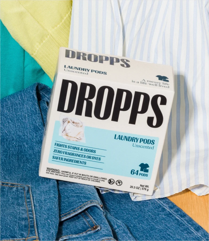

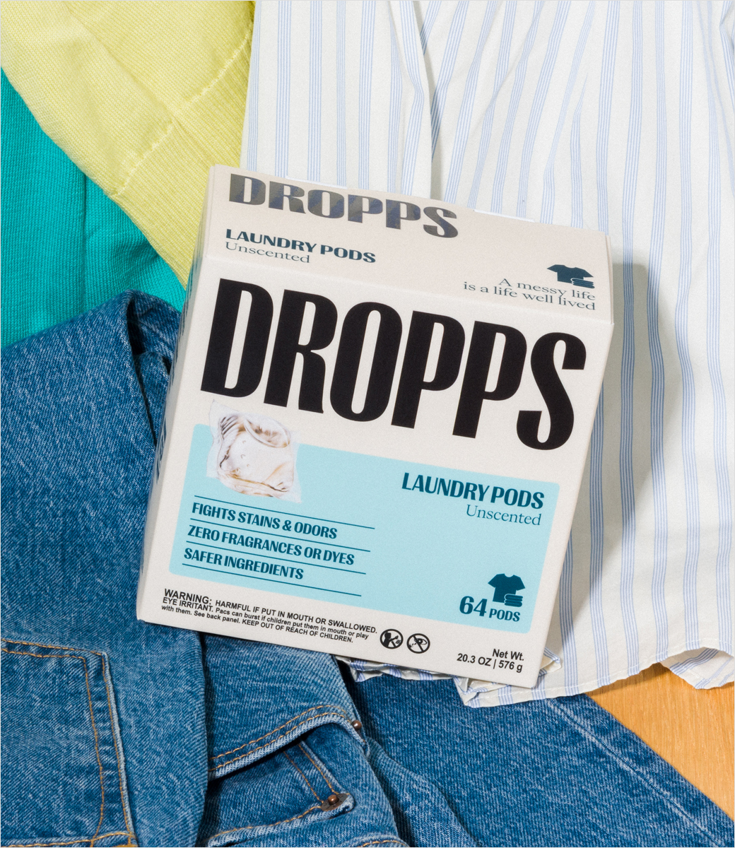
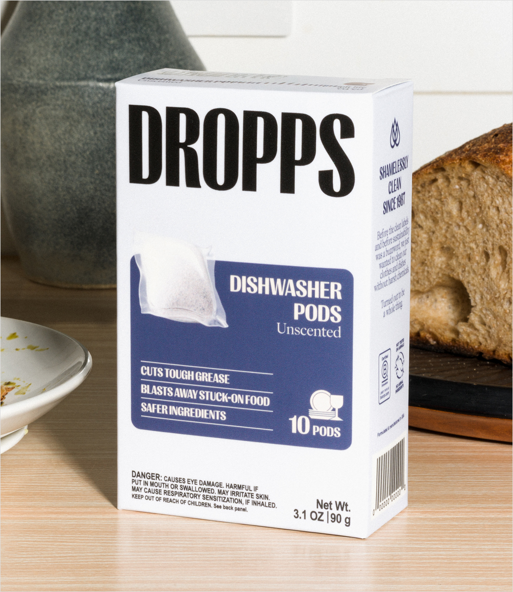
American home care innovator Dropps has officially unveiled a comprehensive corporate rebrand, introducing a refreshed logo, contemporary packaging, a redesigned digital storefront, and a streamlined product architecture. Headquartered in Chicago, Illinois, the company has positioned this visual and structural evolution as a major milestone in its ongoing corporate journey. The overarching objective of the multi-channel update is to project a warmer, bolder persona while reaffirming the brand’s core mission of delivering effective, bio-based cleaning solutions that do not compromise environmental integrity.
The comprehensive rollout touches nearly every consumer touchpoint, featuring vibrant new packaging materials, a modernized website interface, a newly established Instagram presence, and a sharply focused product portfolio. Moving forward, Dropps will concentrate its commercial efforts on its flagship product categories: high-efficiency laundry pods and specialized dishwasher pods. By pruning peripheral offerings, the company aims to provide a cleaner, more intuitive shopping experience that underscores its technical expertise in sustainable home care.
Core Messaging and Strategic Rationale
At the heart of the rebrand is a new, evocative tagline: "Messy Life. Kind Ingredients. Actually Clean." According to company executives, this positioning statement captures the duality of modern household management—acknowledging the predictable messes of daily life while offering reassurance through transparent, plant-based formulations. The updated visual identity is engineered to communicate a sophisticated shift toward wellness-centric household care, placing heightened emphasis on the scientific rigor behind Dropps’ bio-based formulas and newly acquired third-party certifications.
The Chicago-based enterprise explained that its newly crafted creative world has been intentionally designed to feel premium and efficacious, yet thoroughly approachable and colorful. Rather than adopting the sterile, clinical aesthetic traditionally associated with eco-friendly cleaning brands, Dropps has chosen to anchor its visual language in the authentic, lived-in routines of real households.
Emily Culp, Chief Executive Officer of Dropps, emphasized the alignment between the company’s internal culture and its outward-facing aesthetic. "This new wellness-first identity matches the energy of our community and the ambition of the brand, giving us a clearer, more memorable way to show up in culture and build deeper connections with consumers," Culp stated. By aligning its visual presentation with contemporary consumer expectations around holistic wellness, Dropps seeks to cement its loyalty among an increasingly discerning customer base.
Background Context and Market Evolution
The launch of this new brand identity arrives against a backdrop of significant transformation within the consumer packaged goods (CPG) sector, particularly concerning sustainable and direct-to-consumer (DTC) cleaning products. Over the past decade, consumer demand for eco-friendly household goods has surged, driven by heightened awareness of single-use plastic waste, synthetic chemical exposure, and the carbon footprint associated with traditional liquid detergents packaged in heavy jugs.
Founded with a pioneering focus on pre-measured detergent pods designed to reduce water waste and eliminate shipping inefficiencies, Dropps was an early entrant into the sustainable laundry space. The brand initially gained traction by challenging conventional detergent manufacturing norms, championing water-soluble polyvinyl alcohol (PVA) pods and biodegradable ingredients delivered directly to consumer doorsteps in minimalist, recyclable cardboard packaging.
However, as the green-cleaning market matured, the competitive landscape grew increasingly crowded. Legacy household giants and nimble DTC startups alike began flooding the market with similar eco-friendly claims, biodegradable formulations, and minimalist branding. In this hyper-competitive environment, maintaining distinct brand equity required more than just functional efficacy; it demanded a powerful, emotionally resonant visual identity capable of cutting through the noise of digital and retail shelves.
Dropps’ decision to rebrand in 2026 reflects a strategic maturation. Having established its foundational credibility over many years in operation, the company is now leaning into a more definitive lifestyle positioning. By emphasizing third-party certifications and transparent bioscience, Dropps is actively addressing consumer skepticism around "greenwashing"—a pervasive issue in the cleaning product industry where brands exaggerate their environmental benefits.
Chronology of the Rebrand Implementation
The rollout of the new Dropps identity represents the culmination of months of behind-the-scenes strategic planning, consumer research, and creative development. While the official unveiling took place in mid-September 2026, the groundwork for this transition was laid well in advance.
During the preliminary phases, Dropps executive leadership and creative teams conducted extensive audits of consumer sentiment, analyzing how digital shoppers interacted with their existing platform and packaging. Feedback indicated that while customers consistently praised the product performance and eco-conscious mission, the brand’s visual identity occasionally blended into the broader landscape of sustainable startups.
Throughout the spring and summer of 2026, the company finalized its streamlined product architecture, phasing out auxiliary SKUs to concentrate resources on its core laundry and dishwasher pods. Concurrently, design agencies and internal brand strategists developed the new color palettes, typography systems, and packaging templates that embody the "wellness-first" ethos.
On September 16, 2026, Dropps officially pulled back the curtain on the project. The launch deployed simultaneously across multiple channels:
- Digital Infrastructure: The brand’s primary e-commerce website underwent a total overhaul to improve user experience, feature the new typography, and highlight the science behind the bio-based formulas.
- Social Media Integration: A newly launched Instagram account was deployed to establish a fresh narrative feed, utilizing vibrant imagery and relatable content aligned with the "Messy Life" campaign.
- Packaging Distribution: Updated shipping boxes and pod pouches began entering the supply chain, replacing legacy designs with the bolder, warmer aesthetic intended to stand out in both home delivery unboxing experiences and potential retail environments.
Analysis of Implications for the Industry and Consumers
From a market analysis perspective, Dropps’ comprehensive rebrand carries several noteworthy implications for both the company and the broader sustainable home care sector.
First, the streamlining of the product catalog indicates a disciplined approach to inventory management and consumer clarity. In the direct-to-consumer space, brands frequently fall into the trap of SKU proliferation—expanding into too many product categories too quickly, which can dilute brand focus and confuse buyers. By deliberately narrowing its focus to laundry and dishwasher pods, Dropps is doubling down on its areas of maximum manufacturing expertise and proven consumer demand. This laser-like focus allows the company to optimize supply chain efficiencies while messaging its core competencies with absolute clarity.
Second, the emphasis on rigorous third-party certifications signals an industry-wide pivot toward verifiable accountability. As regulatory bodies and consumer watchdogs scrutinize environmental claims more closely, aesthetic appeal alone is no longer sufficient to win consumer trust. By pairing a warmer, more approachable visual style with explicit scientific backing, Dropps is attempting to bridge the gap between emotional brand affinity and rational consumer reassurance.
Finally, the rebrand underscores the evolving definition of wellness in the post-pandemic consumer era. Wellness is no longer restricted to personal care items, ingestible supplements, or fitness gear; it increasingly encompasses the domestic sphere. Consumers view the products they use to clean their living spaces—and the chemical residues left on their clothes and dishware—as direct extensions of their personal health and family well-being. By framing its cleaning products through a wellness-first lens, Dropps positions itself adjacent to premium lifestyle brands rather than conventional utility-driven household goods.
Looking Ahead
As Dropps implements this new visual and strategic framework throughout the remainder of 2026 and beyond, industry observers will be watching closely to evaluate how the refreshed identity resonates with both loyal brand advocates and new demographic segments.
By successfully marrying bold, modern design with a renewed commitment to transparent science and sustainable efficacy, Dropps has established a robust platform for its next chapter of commercial growth. Whether this vibrant aesthetic and streamlined product focus will enable the Chicago-based brand to capture an even larger share of the expanding eco-friendly home care market remains to be seen, but the foundational elements for a compelling brand evolution are firmly in place.