
Widely regarded as a master of the craft, Parkinson’s career spanned the transition from manual, analog typesetting to the digital era. His influence remains embedded in the logos of iconic publications and global brands, leaving behind a legacy that bridges historical calligraphic traditions with the demands of modern graphic design.
A Life Defined by Letters: Chronology and Career
Born in Oakland on October 23, 1941, Parkinson’s fascination with typography was sparked early by proximity. As a child, he lived across from Abraham Lincoln Paulsen, a renowned "Wizard Penman" celebrated for his ability to execute complex calligraphic feats, including writing the Gettysburg Address in reverse and upside down using only the numeral "2." This childhood exposure to the rigors of penmanship instilled in Parkinson an early appreciation for the structural mechanics of letterforms.
Parkinson formally pursued his education at the California College of Arts and Crafts, graduating in 1963. Shortly thereafter, he relocated to Kansas City, Missouri, to begin his professional tenure at Hallmark Cards. While he initially struggled with the company’s requirements for whimsical illustration, he quickly found his professional home within their lettering department. This period proved formative, cementing his resolve to specialize in the technical and artistic nuances of letter design.
Returning to the San Francisco Bay Area, Parkinson launched a freelance career in the late 1960s that would endure for more than 50 years. During this time, he became a fixture in the publishing world, serving as the primary consultant and designer for art directors tasked with refreshing high-profile magazine and newspaper nameplates.
A Prolific Portfolio: The Anatomy of an Icon
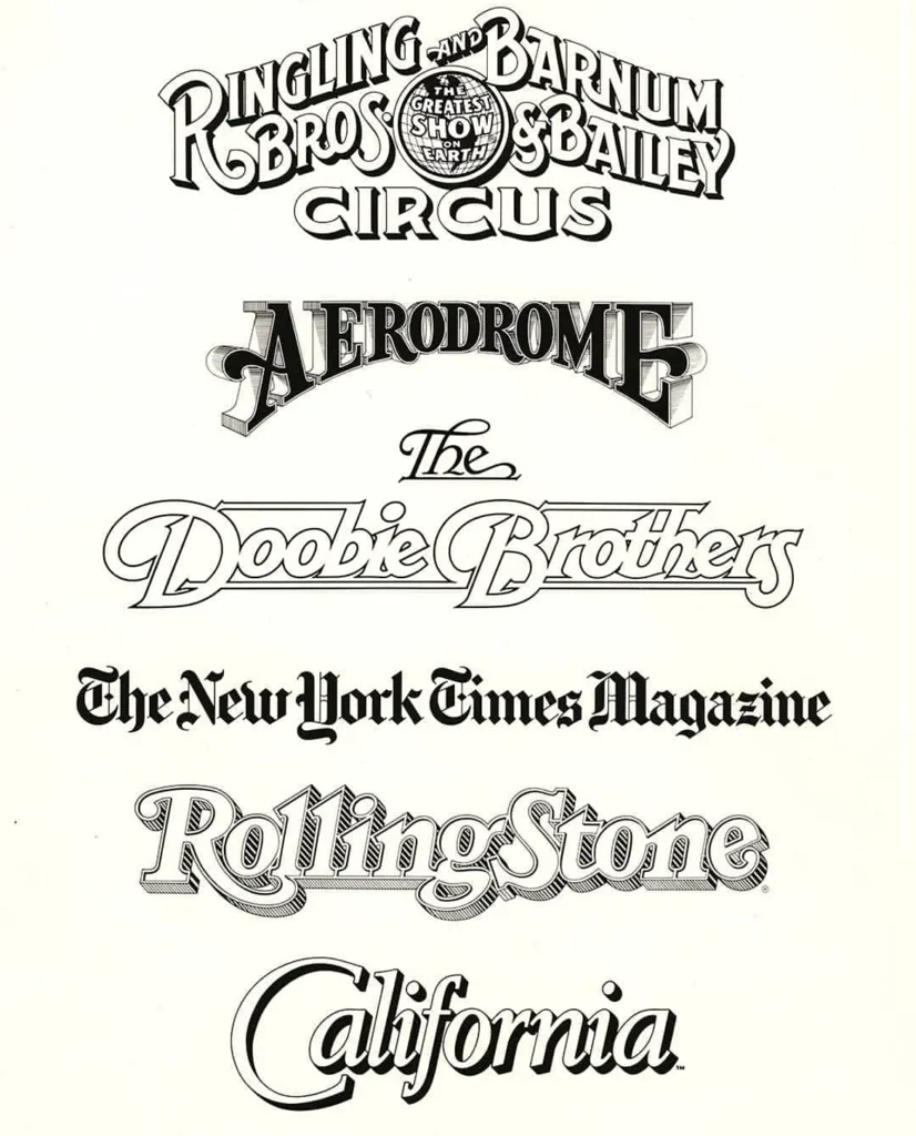
Parkinson’s impact on visual communication is quantifiable by the sheer volume of his work. His contributions transcended mere typography; he was an architect of corporate and editorial identity. His hand-lettered logos—often characterized by a meticulous blend of classical serif precision and modern flair—became the industry standard for publications seeking to modernize their mastheads.

His professional output includes, but is not limited to:
- Editorial Design: Numerous nameplates for major newspapers, including the Los Angeles Times, and magazines such as Rolling Stone.
- Entertainment Branding: Iconic logos for musical acts like The Doobie Brothers and commercial entities such as the Ringling Bros. and Barnum & Bailey Circus.
- Typeface Development: A robust library of both bespoke and retail typefaces that continue to be licensed and utilized by designers worldwide.
His methodology was rooted in the study of historical manuals and archival typography. By sourcing vintage styles and refining them for contemporary applications, Parkinson ensured that his work remained timeless. This versatility allowed him to remain relevant across five decades of technological shifts, from the drafting table to the screen.
Artistic Evolution and Later Life
In his later years, Parkinson shifted his creative focus toward the documentation of American visual history. He developed a deep interest in vintage neon signage, traveling extensively throughout the American West to photograph decaying storefronts and illuminated marquees. These photographs served as the foundation for a series of fine-art paintings, which captured the aesthetic decay and structural beauty of mid-century signage. His work in this medium served as a bridge between his professional life as a typographer and his personal interest in the cultural landscape of the United States.
The Preservation of a Legacy
Parkinson was more than an artisan; he was a mentor and a historian of his field. His residence in Oakland served as a living archive, where he maintained a vast collection of type books, ephemera, and original design proofs. His willingness to open this collection to fellow designers and students made him a central figure in the typographic community.
His pedagogical influence is further preserved through his long-term partnership with the Letterform Archive, an institution dedicated to the study and preservation of graphic design history. The Archive has announced that it will publish Parkinson’s memoir in 2026, a project that promises to provide a first-hand account of the evolution of the graphic design industry from the mid-20th century to the present.
Industry Reflection and Broader Implications
The loss of Jim Parkinson represents the conclusion of an era in American graphic design. Colleagues and peers in the design industry have noted that his work ethic was defined by a rare combination of humility and excellence. He embodied the ethos of "taking the work seriously, but never the self," a mantra that allowed him to navigate the high-pressure environment of editorial design with grace.

From a technical perspective, Parkinson’s career serves as a case study in the longevity of foundational skills. While the tools of the trade transitioned from physical pens to vector-based software, his understanding of stroke weight, kerning, and legibility remained constant. His ability to adapt to new technologies without compromising the integrity of his craft remains a benchmark for contemporary typographers.
The implications of his passing are felt deeply within the design community, particularly regarding the preservation of analog knowledge. As digital design tools become increasingly automated, the loss of practitioners who possess a deep, tactile understanding of how letters are formed—and how they function in a commercial environment—is a significant concern for design historians and educators.
Memorial and Contributions
A memorial service for Parkinson is planned for the autumn of 2025. In recognition of the challenges he faced in his final years, his family has requested that donations be directed to the Alzheimer’s Association in lieu of flowers.
Parkinson’s life remains a testament to the power of craftsmanship. Through his logos, his typefaces, and the thousands of pages of design work that pass through the hands of readers every day, his influence will persist. As the industry looks back on his career, it is clear that Parkinson did not simply design letters; he designed the visual language of the American public consciousness, ensuring that his mark will be felt for generations to come.
Further details regarding his forthcoming memoir and upcoming memorial arrangements will be disseminated via the Letterform Archive’s official channels in the coming months. The design community continues to reflect on a career that was as prolific as it was humble, noting that the "Wizard Penman" of our time has left behind a roadmap for future generations of artists to follow.