
Jim Parkinson, a towering figure in the world of graphic design whose hand-drawn lettering and custom typefaces defined the visual identity of iconic American publications and brands for over half a century, passed away on June 26, 2025, at his home in Oakland, California. He was 83. His death follows a prolonged struggle with Alzheimer’s disease, a condition managed with profound dedication by his wife, the noted book artist Dorothy A. Yule.
Mr. Parkinson’s career spanned the transition from the analog era of manual drafting to the digital revolution of type design, a shift he navigated with a rare combination of technical precision and artistic fluidity. His work, ranging from the mastheads of major national newspapers to the logos of legendary rock bands, left an indelible mark on the American aesthetic landscape.
A Life Defined by Letterforms
Born in Oakland on October 23, 1941, Mr. Parkinson’s early environment was uniquely suited to his future vocation. His childhood home was located directly across the street from Abraham Lincoln Paulsen, a celebrated penman known as the “Wizard Penman.” Paulsen’s ability to execute complex calligraphy, including writing the Gettysburg Address upside down and backward, served as the catalyst for Parkinson’s lifelong obsession with the structure and history of letters.
By his teenage years, Parkinson had begun accumulating a private library of historical lettering manuals and correspondence-school textbooks. This deep-rooted knowledge of historical styles—ranging from Victorian-era flourishes to early 20th-century sign painting—became the cornerstone of his professional versatility. He viewed the history of typography not as a stagnant archive, but as a living vocabulary from which he could derive fresh, contemporary solutions.

Chronology of a Prolific Career
Mr. Parkinson’s formal education took place at the California College of Arts and Crafts (CCAC), where he honed his skills in painting and design, graduating in 1963. Shortly thereafter, he relocated to Kansas City, Missouri, to join the creative staff at Hallmark Cards. While the position initially involved illustrative work, he soon transitioned to the company’s lettering department, discovering that his aptitude for formalizing character shapes was his greatest professional asset.
Upon returning to the San Francisco Bay Area, he established a freelance practice that would endure for over five decades. Key milestones in his professional timeline include:
- 1963: Graduation from the California College of Arts and Crafts.
- 1963–1970s: Formative period at Hallmark Cards, where he solidified his expertise in professional-grade lettering.
- 1970s–1980s: Emergence as a premier freelance designer in Oakland, securing contracts for high-profile magazine mastheads.
- 1990s–2010s: Successful transition into digital type design, releasing both bespoke fonts for clients and retail typefaces for foundries.
- 2025: Passing of Mr. Parkinson; announcement of the upcoming publication of his memoirs by the Letterform Archive.
The Breadth of an Illustrious Portfolio
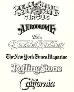
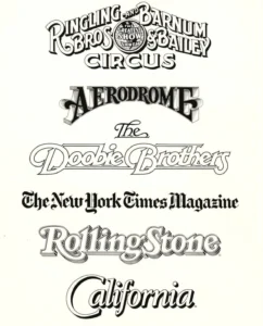
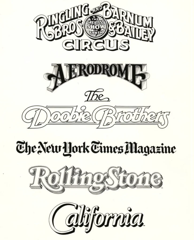
Mr. Parkinson’s work was defined by its ubiquity; it is difficult to navigate a newsstand in the United States without encountering his handiwork. He was frequently commissioned by art directors to "refresh" or completely redesign the title treatments of major publications. His client list reads like a history of modern American media and culture, including the Rolling Stone nameplate, the Los Angeles Times logo, and the iconic branding for the Ringling Bros. and Barnum & Bailey Circus.
Beyond publications, he was instrumental in shaping the visual identity of music culture, most notably through his work for The Doobie Brothers. Whether creating custom lettering for a singular logo or designing a full alphabet for retail use, Mr. Parkinson maintained a standard of craftsmanship that prioritized legibility alongside artistic character. His ability to evoke specific eras and moods through line weight, serifs, and spacing made him a primary choice for high-stakes editorial projects.
The Artistic Pivot: Capturing the Neon Landscape
In his later years, Mr. Parkinson expanded his creative output beyond the page, turning his attention to the fine arts. His interest in vintage signage—specifically the decaying neon of the American West—led to a series of large-scale paintings. These works were not merely depictions of signs, but detailed, atmospheric studies of urban decay, texture, and light. He documented his subjects through extensive road trips, using his own photography as a base for paintings that captured the "ghosts" of mid-century commerce. These works reflect his broader philosophy: that letters are not just communicative tools, but objects of physical beauty that exist within a specific historical and geographical context.

Legacy and Industry Impact
The impact of Mr. Parkinson’s work extends far beyond his immediate client list. As a mentor and a prominent member of the Bay Area design community, he played a critical role in preserving the history of typography. His home and personal archive served as a sanctuary for younger designers, who often visited to inspect his collection of original art, flat files, and ephemera.
Industry observers note that Mr. Parkinson’s legacy lies in his ability to bridge the gap between traditional craftsmanship and modern technology. While many designers struggled with the shift from pens and ink to the Adobe Creative Suite, Mr. Parkinson treated digital tools with the same reverence and rigor as his manual drafting equipment. He was, as colleagues often remarked, a practitioner of "serious work" who never allowed himself to be constrained by ego, adhering to the principle of taking one’s craft seriously while maintaining a sense of humor about oneself.
Memorials and Archival Preservation
In recognition of his contributions to the field, the Letterform Archive is scheduled to publish Mr. Parkinson’s memoir in 2026. The work is expected to provide an invaluable primary-source account of the evolution of American graphic design in the late 20th century.
A memorial service for family and friends is planned for the autumn of 2025. In accordance with his family’s wishes, those who wish to honor his memory are encouraged to contribute to the Alzheimer’s Association, an organization dedicated to the research and support of patients and families navigating the complexities of the disease that eventually claimed his life.
As the design community reflects on his passing, the consensus remains that Jim Parkinson was not merely a designer of letters, but a master of communication whose influence is woven into the fabric of the American experience. His work continues to live on in the mastheads that greet readers every day and in the typefaces that continue to be used by designers across the globe, serving as a testament to a career defined by precision, passion, and an enduring love for the craft.