
Jim Parkinson, an influential figure in American graphic design whose hand-lettered logos and bespoke typefaces defined the aesthetic of major publications and global brands for over half a century, passed away on June 26, 2025, at his home in Oakland, California. His death, confirmed by colleagues and industry peers, follows a protracted battle with Alzheimer’s disease. He was 83. Parkinson is survived by his wife, book artist Dorothy A. Yule, who provided dedicated care for him throughout his final years.
A Legacy Carved in Ink: The Career of Jim Parkinson
Parkinson’s career was defined by an extraordinary versatility that allowed him to transition seamlessly from hand-rendered calligraphy to the digital precision of contemporary type design. Born in Oakland on October 23, 1941, his initial exposure to the craft was unconventional. As a youth, he lived across the street from Abraham Lincoln Paulsen, a renowned penman known as the “Wizard Penman,” whose ability to execute complex lettering—including the Gettysburg Address rendered upside down—left an indelible impression on the young Parkinson.
This early fascination with the mechanics of the alphabet led him to pursue formal training at the California College of Arts and Crafts (CCAC), where he graduated in 1963. His professional trajectory began in Kansas City, Missouri, at Hallmark Cards. While his initial assignment in illustration proved less than ideal, his transfer to the lettering department proved foundational. There, he refined the technical discipline that would become the hallmark of his half-century freelance career.
Chronology of a Prolific Design Career
The breadth of Parkinson’s output is staggering, spanning the analog era of the 1960s to the digital revolution of the 21st century. His work functioned as the visual heartbeat of American newsstands, with his custom lettering gracing the covers of numerous high-profile magazines and newspapers.
- 1963: Graduated from the California College of Arts and Crafts and relocated to Kansas City to join the creative team at Hallmark Cards.
- Late 1960s – 1970s: Returned to Oakland to establish a freelance practice, quickly becoming a preferred specialist for art directors seeking unique, custom logotypes.
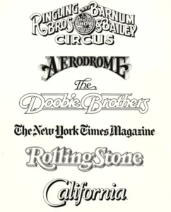
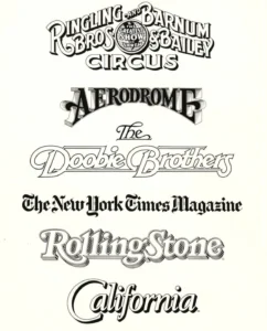
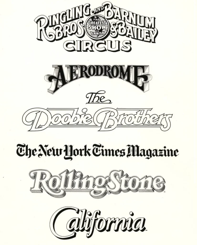
- 1980s – 1990s: Expanded his influence by creating custom typefaces and magazine nameplates, including iconic work for Rolling Stone and the Los Angeles Times.
- 2000s – 2010s: Transitioned into digital type design while maintaining his passion for hand-lettered signage, eventually pivoting toward fine art painting focusing on vintage neon signs.
- 2025: Passed away in Oakland, California, following a career that effectively bridged the gap between traditional penmanship and modern digital typography.
Industry Impact and Contributions
Parkinson’s impact on the design world was not merely in the volume of his work, but in the enduring quality of his aesthetic choices. He was frequently commissioned by art directors to modernize publication titles, a task requiring a delicate balance between retaining a publication’s historical brand identity and introducing contemporary legibility.

His client list serves as a historical document of mid-to-late 20th-century culture. Beyond magazine mastheads, his portfolio included logos for high-profile musical acts such as the Doobie Brothers and commercial entities including the Ringling Bros. and Barnum & Bailey Circus. His ability to render any letter style by hand meant that he was rarely constrained by the limitations of existing font libraries; he was a creator of original visual forms.
In addition to his commercial success, Parkinson was a significant figure in the archival community. He maintained an extensive collection of type ephemera and personal design records, which he frequently opened to students and fellow designers. His commitment to the history of the trade served as a bridge for younger generations of designers interested in the lineage of typographic craft.
Transitioning to Fine Art and Narrative
In his later years, Parkinson shifted much of his creative energy toward documenting the vanishing vernacular of the American West. His series of paintings depicting vintage neon signage were not merely hobbyist exercises; they were technical studies in light, texture, and decay. By capturing the weathered surfaces and broken glass of aging signs, he elevated commercial ephemera to the status of fine art.
Furthermore, Parkinson was a natural storyteller. Recognizing the importance of his unique position within the industry, he spent his final years documenting his experiences in a memoir. Letterform Archive, a leading institution in the study of graphic design history, has announced that it will publish this memoir in 2026. The work is expected to provide essential context for his design processes and a firsthand account of the evolution of the American lettering industry.
Analysis: The Shift from Analog to Digital
The career of Jim Parkinson provides a compelling case study on the endurance of the "lettering artist" in an era of rapid technological displacement. While many of his peers struggled to adapt as phototypesetting and later desktop publishing software (such as Adobe Illustrator) became the industry standard, Parkinson integrated these tools into his workflow without losing the artisanal quality of his work.
His success was predicated on his foundational knowledge of historical letterforms. By referencing lettering manuals and textbooks that were often decades old, he was able to interpret historical styles through a modern lens. This methodology proved to be his competitive advantage: while many digital-first designers lacked the deep historical understanding of stroke contrast and kerning developed through physical practice, Parkinson possessed an intuitive grasp of these principles.

Reflections and Future Memorials
The design community has reacted to the news of his passing with profound respect for both his craft and his character. Colleagues have frequently cited his humility, often noting his adherence to the mantra: "Take your work seriously, but never yourself." This perspective allowed him to remain a collaborative, approachable figure despite his status as a titan of the design industry.
The Letterform Archive and other design institutions have acknowledged his death as a significant loss for the global design community. His influence remains embedded in the visual identity of numerous brands and publications that still utilize the lettering he created.
A memorial service is being planned by his family for the fall of 2025. In keeping with his life and his struggle with Alzheimer’s, his family has requested that, in lieu of flowers, donations be made to the Alzheimer’s Association to support ongoing research into the condition that claimed his life.
Broader Implications for Design Education
The passing of Parkinson leaves a void in the mentorship landscape of the Bay Area. His home-based archives and his willingness to engage with students served as an informal, yet highly effective, education center. As the industry moves further toward automation and generative AI, the loss of practitioners who possess a deep, manual understanding of letter construction highlights the importance of preserving the foundational skills that Parkinson championed.
His upcoming memoir will likely serve as a critical text for design historians, offering insight into the collaborative relationships between letterers and art directors during the peak of print media’s influence. By documenting his own life and work, Parkinson ensures that his methodology—a blend of historical reverence and creative innovation—remains available to future generations.