
Jim Parkinson, the esteemed lettering artist, type designer, and painter whose work defined the visual identity of iconic American publications and brands for over half a century, passed away on June 26, 2025, at his home in Oakland, California. His death follows a prolonged battle with Alzheimer’s disease. He was 83. Parkinson is survived by his wife, the acclaimed book artist Dorothy A. Yule, who served as his devoted partner and primary caregiver throughout the final years of his struggle with the condition.
A Foundational Influence in Oakland
Born in Oakland on October 23, 1941, Parkinson’s early environment was uniquely suited to spark an interest in the graphic arts. He grew up across the street from the residence of Abraham Lincoln Paulsen, a renowned figure known as the "Wizard Penman." Paulsen was locally legendary for his ability to write the Gettysburg Address both upside down and in reverse, utilizing only the numeral "2" to construct the forms. This childhood exposure to the mechanical and artistic precision of lettering left an indelible mark on Parkinson, who began sourcing antique lettering manuals and correspondence-school textbooks to teach himself the fundamentals of the craft. These historical references would become the bedrock of his aesthetic, allowing him to synthesize vintage styles into modern, functional designs.
Professional Chronology and Hallmark Roots
Parkinson pursued formal training at the California College of Arts and Crafts, graduating in 1963. Following his studies, he relocated to Kansas City, Missouri, to accept a position at Hallmark Cards. Initially assigned to general illustration, he soon discovered that his temperament and skill were better suited to the rigors of typography than to the whimsy of greeting card illustration. His transition to the company’s lettering department proved to be a career-defining pivot.
By the time he returned to the San Francisco Bay Area to establish his freelance practice, Parkinson had refined his technique to a level of mastery that allowed him to command a wide range of projects. His career spanned five decades, during which he functioned as both an independent artisan and a sought-after consultant for major editorial art directors. His professional trajectory can be categorized into three main phases: the formative years of learning and Hallmark service (1963–1968); the middle period of explosive commercial success and high-profile branding (1969–2000); and the later years of refined retail font design and fine art painting (2001–2025).

A Portfolio of National Recognition
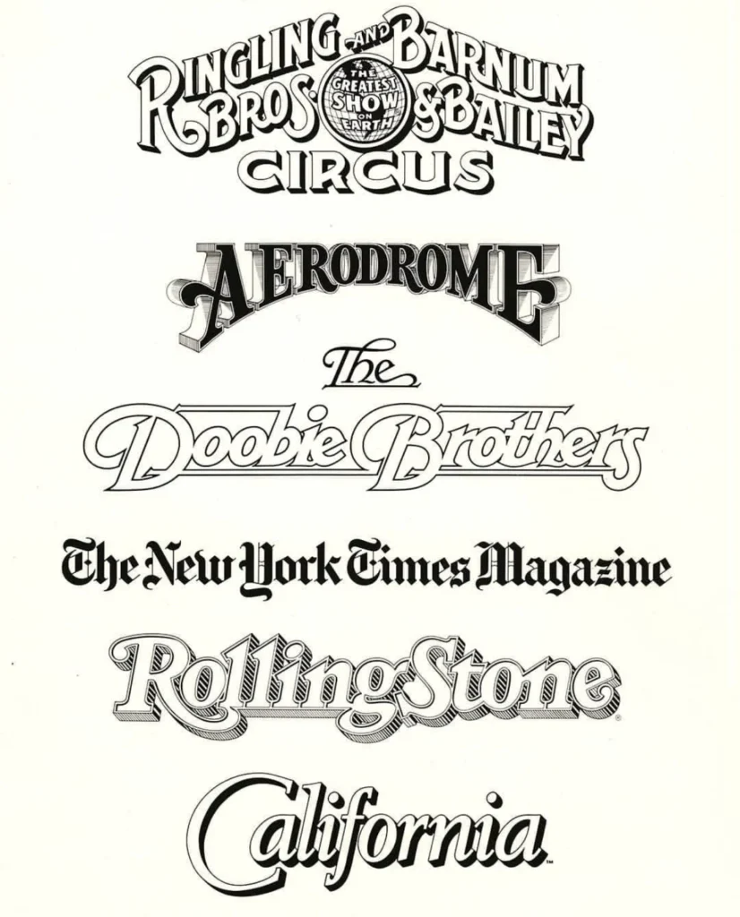
Parkinson’s impact on American visual culture is arguably unparalleled in the field of hand-lettered mastheads. His work appeared on the covers of the most influential magazines in the United States, often redrawn and refreshed under his hand as publications evolved to meet changing consumer tastes. Notable contributions include the logotypes for Rolling Stone and the Los Angeles Times, alongside iconic work for the Ringling Bros. and Barnum & Bailey Circus and the rock band The Doobie Brothers.
Data from the Letterform Archive, which houses much of his original artwork, indicates that Parkinson’s prolific output extended to dozens of bespoke and retail typefaces. While he was a master of the digital transition, his work maintained a "human" quality that distinguished his typefaces from the rigid, algorithmic designs that began to dominate the industry in the 1990s. His website, which he secured in the early days of the commercial internet, serves as a digital repository of this vast catalog, showcasing his ability to pivot between Victorian-era ornamentation and clean, modernist sans-serifs.
Artistic Evolution: From Type to Neon
In his later years, Parkinson shifted his focus toward the preservation of a dying American aesthetic: vintage neon signage. Unlike his commercial design work, which was dictated by the needs of clients, his painting was a personal exploration of decay and light. He traveled extensively throughout the American West, photographing derelict signage. He translated these images into large-scale paintings that documented the peeling paint, rusted metal, and shattered glass of mid-century commercial architecture. These works have been praised for their photographic realism and their role in preserving a visual history of American roadside commerce that is rapidly disappearing.
Professional Impact and Industry Standing
Colleagues and historians in the field of typography often describe Parkinson as an "artist’s artist." Unlike many of his contemporaries who sought to build large corporate agencies, Parkinson remained a dedicated, solitary practitioner. This approach allowed him to maintain a high degree of control over his output, leading to a body of work that is remarkably consistent in quality.
Stephen Coles, a prominent writer and friend of Parkinson, noted that his success was rooted in a lack of ego that is rare in the high-pressure world of graphic design. Following the principle of "taking the work seriously, but never oneself," Parkinson was a fixture in the Oakland design community. He opened his home and his personal archives to students and fellow designers, fostering a culture of mentorship that influenced a generation of type designers currently working in the field.

Broader Implications for Design History
The death of Jim Parkinson marks the end of an era for hand-lettering in editorial design. As digital font libraries and generative AI tools become the standard for media production, the tactile, iterative process that defined Parkinson’s career—where a letterform was adjusted by hand until it reached a state of visual perfection—is becoming increasingly rare.
The publication of his memoir by the Letterform Archive, slated for 2026, is expected to provide essential historical context for future researchers. By documenting his own life, Parkinson has ensured that the "why" and "how" of his process will remain available to those who did not have the benefit of his personal mentorship. The book is anticipated to be a primary resource for design historians looking to understand the transition from the analog craft of the 1960s to the digital era of the 21st century.
Official Responses and Memorial Details
In the wake of his passing, the design community has expressed widespread grief. Organizations such as the Type Directors Club and various design publications have begun coordinating tributes to recognize his contributions. The family has requested that, in lieu of flowers, donations be directed toward the Alzheimer’s Association, emphasizing the importance of research into the condition that defined his final years.
A formal memorial service is being planned for the autumn of 2025. The event is expected to draw designers, illustrators, and archivists from across the country to celebrate a man whose letters essentially mapped the face of American media. As the industry reflects on his passing, the focus remains on his dual legacy: the enduring power of his letterforms, which continue to grace newsstands, and his unwavering commitment to the community that nurtured his craft.
Parkinson’s life stands as a testament to the idea that professional excellence is not measured solely by the breadth of one’s portfolio, but by the integrity of the process and the generosity shown to those following in one’s footsteps. While the man himself is gone, the typography he created remains embedded in the visual consciousness of the American public, ensuring that his influence will persist for decades to come.