
Jim Parkinson, the seminal American lettering artist, typeface designer, and painter whose work defined the visual identity of major publications and global brands for over half a century, passed away on June 26, 2025, at his home in Oakland, California. He was 83 years old. His death followed a protracted struggle with Alzheimer’s disease, a battle during which he was supported by his wife, the noted book artist Dorothy A. Yule.
Mr. Parkinson’s career spanned the transition from the analog era of hand-drawn lettering to the digital revolution in typography. His output was prolific, characterized by a versatility that allowed him to pivot seamlessly from the high-energy aesthetics of rock and roll to the stoic, authoritative mastheads of the American press.
Formative Years and the Roots of a Craft
Born in Oakland on October 23, 1941, Parkinson’s interest in the mechanics of the written word was sparked early in life. His childhood was marked by a unique proximity to Abraham Lincoln Paulsen, a local figure known as the "Wizard Penman." Paulsen’s ability to execute complex calligraphic feats, including writing the Gettysburg Address in reverse and upside down using only the numeral "2," provided a formative lesson for the young Parkinson. This early exposure to the precision and performance of lettering instilled a lifelong fascination with the craft.
Parkinson formally refined his skills at the California College of Arts and Crafts, graduating in 1963. His professional trajectory took a definitive turn shortly thereafter when he moved to Kansas City, Missouri, to join the creative staff at Hallmark Cards. While his initial assignment involved illustration, his aptitude for lettering became quickly apparent. The transition to the company’s lettering department served as a crucible, where he honed the technical discipline required to render letterforms with both speed and absolute accuracy.

A Chronology of a Prolific Career
The mid-1960s marked the beginning of a freelance career that would endure for more than 50 years, establishing Parkinson as an essential resource for art directors worldwide. His professional timeline can be segmented by the distinct sectors he served:
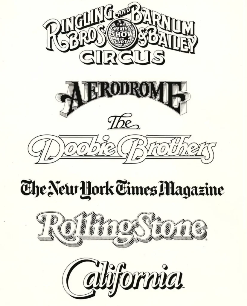
- 1960s–1970s: Corporate and Commercial Branding. Parkinson became a sought-after specialist for custom logo design, creating iconic marks such as the branding for the Doobie Brothers and the Ringling Bros. and Barnum & Bailey Circus.
- 1980s–1990s: Magazine and Newspaper Mastheads. During the height of print media’s dominance, Parkinson became the "go-to" designer for publication refreshes. His work appeared on the covers of Rolling Stone, the Los Angeles Times, and countless other periodicals. He possessed a rare ability to respect the historical integrity of a publication’s brand while subtly modernizing its letterforms.
- 2000s–2020s: Digital Transition and Fine Art. As the industry shifted toward desktop publishing, Parkinson adapted by digitizing his hand-drawn aesthetics, releasing both custom and retail typefaces. Concurrently, he pivoted toward fine art, documenting the vanishing Americana of vintage neon signage through large-scale paintings.
Supporting Data: The Scale of Influence
Parkinson’s impact on the visual landscape of the 20th and 21st centuries is difficult to quantify, yet its ubiquity is evident. An analysis of his contributions reveals a designer who did not merely follow trends but created the visual language of the institutions he served. His portfolio, preserved in part by the Letterform Archive, contains thousands of individual sketches, proofs, and finished masterworks.
For many publications, Parkinson was not a one-time contractor but a long-term partner. He was frequently retained to redraw existing mastheads over several decades, a testament to his ability to evolve alongside the brands he helped build. His work was not confined to a single aesthetic; he moved fluidly between the ornate, the austere, and the playful, often within the span of a single week of commission work.
Analysis: Implications for Modern Typography
The loss of Jim Parkinson represents a significant closing of a chapter in graphic design history. As one of the last masters of the pre-digital era who successfully bridged the gap to the computer-aided design age, his work offers a case study in the evolution of visual communication.
His methodology—which involved a deep, almost archaeological study of historical lettering manuals—ensured that his work carried a sense of permanence. In an era where digital design is often criticized for a lack of "human touch," Parkinson’s work stood as a reminder of the value of the hand-drawn mark. His legacy serves as an indicator of the importance of archival practices in design; by documenting his own process and maintaining an extensive collection of ephemera, he provided a bridge for future designers to understand the transition from ink-on-paper to vector-based typography.

Official Responses and Future Memoirs
The creative community has responded to the news with an outpouring of tributes, noting both his technical brilliance and his humility. Colleagues often cited his adherence to the philosophy often attributed to Margot Fonteyn: "Take your work seriously, but never yourself." This ethos informed his interactions with the next generation of designers, whom he frequently welcomed into his studio to share his archives and his expertise.
In a move intended to preserve his insights for posterity, the Letterform Archive has confirmed that it will publish Parkinson’s memoir in 2026. The manuscript, completed before the onset of his illness, is expected to provide a firsthand account of the golden age of American lettering. This document will likely become a primary source for design historians, offering a unique look into the life of an artist who chose to remain behind the scenes while his work sat in the hands of millions of readers daily.
Broader Impact and Memorial Arrangements
Parkinson’s influence extended beyond the printed page. His transition into painting—specifically his focus on the decaying neon signs of the American West—demonstrated a deep appreciation for the physical life of letters. By capturing these elements in fine art, he elevated commercial signage to a subject of preservation and artistic merit.
A memorial service for Mr. Parkinson is scheduled for the fall of 2025. His family has requested that those wishing to honor his memory consider directing donations to the Alzheimer’s Association, a reflection of the challenges he faced in his final years.
As the design community processes the loss of such a foundational figure, the consensus remains that Jim Parkinson’s influence will continue to be felt every time a reader opens a newspaper or engages with a well-crafted logo. His career was a testament to the idea that lettering is not merely a tool for communication, but a profound and enduring form of cultural expression. He leaves behind a body of work that serves as a permanent, indelible imprint on the history of American design.