

A groundbreaking exploratory user research study has unveiled unique insights and practical UX recommendations derived from participants with cognitive disabilities, highlighting their invaluable contribution to enhancing digital product usability for all. The findings challenge conventional UX research methodologies, advocating for the systematic inclusion of this often-overlooked demographic to uncover a broader spectrum of usability issues and drive more inclusive design.
The Genesis of Inclusive Research: A Fable Initiative
The impetus for this pivotal study emerged in the summer of 2024 with the formation of a specialized working group at Fable, a leading accessibility platform. The group, co-chaired by the company’s VP of Innovation, brought together expert researchers with a singular mission: to define the most effective methods for conducting accessibility testing with individuals possessing cognitive disabilities. This initiative was rooted in a deep understanding of cognitive disability as an umbrella term encompassing various conditions that impair information processing, memory, focus, and learning.
Cognitive disability is not merely a niche concern; it is the most prevalent disability in the United States, affecting 13.9% of the population, according to the Centers for Disease Control (CDC). Furthermore, recent studies, including one from Yale, indicate a rapid increase in cognitive disability prevalence, underscoring the growing imperative for digital products to cater to this expanding user base. Recognizing this demographic shift, the Fable working group set forth four strategic goals:
- To establish robust best practices for recruiting and interviewing individuals with cognitive disabilities, ensuring ethical and effective engagement.
- To develop specialized research tools and methodologies uniquely tailored to capture the distinct experiences and challenges faced by this demographic.
- To quantitatively assess and compare the unique insights gained from cognitive testers against those from the general population, validating their research value.
- To create comprehensive documentation and training materials to promote wider adoption of cognitive inclusive research across the industry.
The working group commenced its efforts by developing a targeted screener to recruit participants who self-identified with challenges in memory, focus, and learning. Concurrently, they conducted an extensive review of existing published studies involving cognitive testers to synthesize best practices. This foundational research culminated in a pilot study involving an initial group of 25 testers. Through an iterative refinement process, the team fine-tuned their approach, leading to the creation of a comprehensive guide for conducting user interviews with cognitive testers and a specialized survey designed to quantify their experiences with digital products. The insights and methodologies developed during this pilot phase were meticulously documented, laying the groundwork for the subsequent, more extensive study.
Following the pilot, a strong hypothesis emerged: participants with cognitive disabilities would likely uncover more usability insights than general population (gen pop) user research participants. This hunch, driven by anecdotal observations during the pilot, propelled the researchers to design a formal study to validate this crucial assumption.
The Cognitive Usability Study: Methodology and Execution
To test this hypothesis, a joint study was initiated in collaboration with partners at the University of California, Irvine, notably Syed Fatiul Huq, and supported by Fable researchers Pranav Pidathala, Ali Brown, and Michael Fagan. The study aimed to systematically compare the types and volume of usability insights generated by cognitive participants versus gen pop participants.
For the study, three distinct websites were generated using an AI prototyping tool, each designed to present different user goals, content types, and task complexities. This variety ensured a broad assessment of usability challenges across diverse digital experiences:

- Strong Snacks: A minimalist website focused on three-ingredient, high-protein recipes. Its design was simple, brutalist, and bright, with numerous pictures. Key functionalities included filtering by category (vegan, muscle building) and newsletter subscription. Tasks involved browsing recipes and subscribing.
- Turning Pages: A more complex e-commerce site for a curated bookstore. Characterized by a moody, classic, dark aesthetic with many book cover images, it featured extensive filtering, a book-swiping feature for profile building, custom book lists, a shopping cart, and checkout. Tasks included finding specific books, adding them to a cart, and using the book-matching feature.
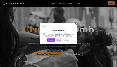
- Crown & Comb: A sophisticated hair salon website offering online appointment booking and consultations. Its design was bold, clean, black and white with bursts of color. It included a VIP program and various special packages. Tasks involved booking appointments and finding specific service packages, with one task intentionally designed to be difficult.
Participant recruitment utilized a single screener with questions assessing memory, focus, and learning challenges. Based on their self-identification, participants were segmented into two groups: those with cognitive challenges and those from the general population. It is important to note that the definition of cognitive disability for this study was inclusive, encompassing neurodiversity—an umbrella term for individuals whose brains process information and learn differently, commonly including those with learning disabilities (e.g., Dyslexia), ADHD, and Autism.
The study involved 30 user interviews, with 10 participants assigned to each website. Crucially, each website group maintained an even 50/50 split between cognitive and gen pop participants. Each session involved a participant completing all assigned tasks for one website during a facilitated online user interview. To standardize usability evaluation, all participants completed the Accessible Usability Scale (AUS) survey—a free, Creative Commons-licensed 10-question tool designed to assess the usability of digital products—at the conclusion of their session.
Data Analysis: A Meticulous Approach to Uncovering Issues
The data analysis phase was rigorous and systematic. The lead researcher meticulously reviewed all study recordings and transcripts, documenting every instance where a participant expressed a concern, asked a question, encountered a difficulty, or sought clarification on functionality. These instances were collectively categorized as "issues." Furthermore, any instance where a participant missed a critical element or step of a task, even if unacknowledged by the participant, was also recorded as an issue. Beyond identifying problems, every suggestion for improvement offered by participants was carefully noted.
Examples of issues identified across the study included:
- Confusing navigation paths, leading to disorientation and difficulty locating desired content or features.
- Ambiguous button labels or links that failed to clearly communicate their intended function, causing hesitation or incorrect actions.
- Overwhelming amounts of text or visual clutter on a page, making it difficult to scan for key information or understand the content hierarchy.
- Inconsistent interaction patterns across different sections of a website, leading to unpredictable behavior and a breakdown of mental models.
- Difficulty understanding complex terminology, jargon, or overly technical language used within the content.
- Visual elements, such as continuously looping animations or poorly designed icons, that were distracting or lacked clear meaning, hindering comprehension.
- Problems with form completion due to unclear instructions, insufficient error messaging, or complex input requirements.
Conversely, participants offered numerous constructive suggestions, such as:
- Simplifying language and adopting plain English to ensure content is accessible to a wider audience.
- Providing clearer, more descriptive labels for buttons and links, enhancing predictability and reducing cognitive load.
- Breaking down large blocks of text into smaller, digestible chunks, utilizing headings, bullet points, and white space to improve readability.
- Offering visual cues or progress indicators for multi-step processes, helping users understand their current position and what to expect next.
- Ensuring consistent design patterns and predictable interactions across the entire website, fostering familiarity and ease of use.
- Allowing users to customize display settings (e.g., text size, contrast, dark mode) to suit individual preferences and accessibility needs.
- Providing immediate, specific, and helpful feedback for user actions or errors, guiding users toward successful task completion.
Each issue and suggestion was counted once per participant, even if mentioned multiple times by the same individual. However, the recurrence of similar issues and suggestions across different participants was considered a significant indicator, signaling universal challenges that warranted prioritization in design improvements. This methodology ensured a robust and consistent evaluation of user feedback.
Findings: The Undeniable Value of Cognitive Inclusion
The study’s findings unequivocally supported the initial hypothesis: participants with cognitive disabilities identified significantly more usability issues and offered more suggestions for improvement than their general population counterparts. Across the three websites tested, cognitive participants identified a total of 197 usability issues, compared to 113 identified by gen pop participants—a striking 1.8 times more issues. Similarly, cognitive participants made 93 suggestions for improving the user experience, versus 54 from gen pop participants, again representing a 1.8-fold increase.
A deeper dive into the data for each website revealed nuanced differences:

Strong Snacks: Simplicity and Hidden Complexities
This website, with its straightforward design and content, yielded the fewest overall issues and the highest median AUS scores.
- Gen Pop: 32 total issues (6.4 average), 13 total suggestions (2.6 average), 90.5 average AUS.
- Cognitive: 49 total issues (9.8 average), 24 total suggestions (4.8 average), 76.8 average AUS.
On Strong Snacks, cognitive participants found 3.4 times more issues and made 2.2 times more suggestions on average. Their average AUS score for the overall experience was 13.7 points lower than that of gen pop participants, indicating a less favorable perception of usability despite the site’s apparent simplicity.
Turning Pages: Feature Richness and Interaction Challenges
As the website with the most varied functionality and the highest number of tasks (four), Turning Pages predictably saw the highest volume of issues.
- Gen Pop: 55 total issues (11 average), 26 total suggestions (5.2 average), 78.0 average AUS.
- Cognitive: 86 total issues (17 average), 42 total suggestions (8.4 average), 60.8 average AUS.
Here, cognitive participants identified 6 more issues and made 3.2 more suggestions on average. They also rated the overall experience 17.2 points lower on the AUS than gen pop participants, reflecting significant friction with the site’s complex interactions.
Crown & Comb: Intentional Difficulty and Unexpected Perceptions
This website was intentionally designed with complexity, particularly Task 3 (finding the bridal package), which was meant to be exceptionally challenging.
- Gen Pop: 26 total issues (5 average), 15 total suggestions (3 average), 49.5 average AUS.
- Cognitive: 62 total issues (12 average), 27 total suggestions (5.4 average), 63.8 average AUS.
On Crown & Comb, cognitive participants found 7 more issues and made 2.4 more suggestions on average. Interestingly, their average AUS score for the overall experience was 14.3 points higher than gen pop participants. This unexpected inversion in scores between Turning Pages and Crown & Comb suggests that while cognitive participants found more issues on Crown & Comb, the nature of these issues or their ability to eventually complete the difficult task might have influenced their overall perception of usability differently compared to gen pop users. It implies that for cognitive users, predictability and clear affordances, even within a complex task, might be weighted differently than for gen pop users who might be more frustrated by the sheer difficulty. The study suggests that challenging interactions on Turning Pages were a more significant impediment than visual element issues on Crown & Comb for cognitive users.
Qualitative Insights: Beyond the Numbers
Qualitative analysis revealed distinct trends in the types of issues highlighted by each group.
Cognitive participants consistently identified issues related to:
- Content: Overly complex language, lack of clear hierarchy, difficulty understanding instructions.
- Buttons and Links (Affordances and Function): Ambiguous labels, inconsistent behavior, unclear interactive states.
- Icons or Visual Elements: Distracting animations, unclear iconography, overwhelming visual clutter.
- Media: Video or animation that auto-plays, is difficult to control, or is not clearly explained.
General population participants, while also identifying issues, tended to focus more on:
- Navigation: Inefficient pathways, difficulty finding specific sections.
- General flow: Minor friction points in task completion.
When categorized, issues with content, buttons and links, icons or visual elements, and media surfaced significantly more often with cognitive participants. Navigation issues were nearly tied between both groups (45 for gen pop vs. 46 for cognitive), suggesting that while basic navigation challenges are universal, cognitive participants dive deeper into the minutiae of how elements function and communicate.
The profound impact of usability issues on cognitive participants was starkly illustrated by their qualitative feedback. For instance, comparing the lowest-scoring participants from each group on the Crown & Comb website (AUS scores of 27.5 for gen pop, 38 for cognitive), the difference in their descriptions of the experience was telling. A gen pop participant articulated frustration with repeated services and a lack of engagement, stating, "As soon as you have a name of a treatment and a little explanation and like the duration and the price, as soon as you click onto that, it should be that you can interact with that service straight away. And I feel like if you’re seeing a service repeated on a page multiple times and you’re still not able to select it, it’s really, really frustrating. This feels not particularly engaging."
In contrast, a cognitive participant described a deeper, more pervasive sense of exhaustion: "For example, like, the mental energy aspect of it, like, sometimes there’s, like, okay, cookies, and then ads, pop-ups, or maybe the website or service has too many options to look through, and maybe I just want something that I already know. I have to go through a lot of stuff. It makes me, like, feel drained and less able to focus." This quote powerfully conveys how usability issues for cognitive users can transcend mere frustration, leading to a significant drain on mental energy and impacting overall well-being.
The Broader Impact: How Cognitive Inclusion Benefits All

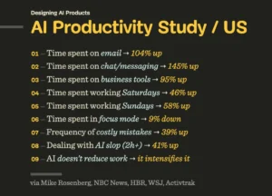
The study conclusively demonstrates that cognitive inclusion in UX research is not merely an act of compliance or niche consideration; it is a strategic imperative that yields superior research outcomes and ultimately leads to better products for everyone. The issues consistently surfaced by cognitive participants—particularly those related to cognitive load—have far-reaching implications beyond the disability community. These insights benefit:
- Older Adults: As the population ages, cognitive decline becomes a universal experience. By 2060, the U.S. Census projects that one in four Americans will be 65 or older, up from 17% currently. Designing for cognitive accessibility proactively addresses the needs of this rapidly growing demographic.
- Individuals with Temporary Disabilities: People recovering from injury, illness, or medical procedures often experience temporary cognitive impairments. Designs that reduce cognitive load enhance their ability to interact with digital services during recovery.
- Users Under Stress or Distraction: In today’s fast-paced world, many users interact with digital products while multitasking, under time pressure, or in noisy environments. Clear, predictable interfaces minimize cognitive burden in these scenarios.
- Novice Users: Individuals new to a product, service, or technology benefit immensely from simplified interfaces, clear instructions, and intuitive flows that reduce the learning curve.
- Users with Limited Digital Literacy: For those less familiar with digital conventions, reducing cognitive friction makes technology more approachable and empowering.
Consider the specific insights gleaned from each website and what would have been missed without cognitive participants:
Strong Snacks: Building Trust and Readability
Cognitive participants highlighted critical issues on Strong Snacks that would have been overlooked by gen pop users. These included:
- Difficulty understanding that the site’s recipes were all three-ingredient, high-protein, leading to a lack of trust in the content.
- Continuous animation that caused distraction and made it harder to focus on recipe details.
- Challenges distinguishing different types of content (e.g., recipes vs. blog posts) due to a lack of clear visual hierarchy.
These insights point to fundamental design best practices: avoiding distracting elements, ensuring content clarity, and using layout to guide attention. Addressing these issues not only builds user trust but also improves readability and scannability for all users, leading to higher engagement and satisfaction.
Turning Pages: Ensuring Predictable Interactions and Revenue Streams
On the more complex Turning Pages site, cognitive participants surfaced subtle yet crucial issues with confusing interactions. They struggled with the "Add to book bag" button’s functionality and were unclear about the origin of reviews and recommendations. Both issues could significantly erode user trust. While all participants found the book-matching feature hard to locate, cognitive participants emphasized a deeper problem: the site’s interactions did not consistently behave in predictable and understandable ways, leading to decreased confidence.
For any e-commerce platform, a clear, unambiguous purchase flow is paramount. A lack of clarity in adding items to a cart or completing checkout will inevitably lead to abandoned carts and lost revenue. By addressing these cognitive load issues, the website ensures a smoother, more trustworthy experience for all users, translating directly to improved conversion rates and customer loyalty.
Crown & Comb: Transforming Barriers into Business Opportunities
The Crown & Comb website particularly underscored the unique value of cognitive participants, who raised concerns about:
- Unclear pricing structures for services, creating ambiguity and hesitation.
- Visual clutter from excessive iconography and decorative elements, hindering information processing.
- Inconsistent navigation patterns that made it difficult to predict where to find specific information.
- The overwhelming cognitive load involved in finding complex packages, such as the bridal package.
While gen pop participants might "muddle through" these challenges, they are more likely to abandon the task if a competitor offers a clearer experience. Customer loyalty is increasingly tied to positive user experiences, not just brand recognition. When usability issues, particularly those creating high cognitive load, become so severe that they prevent task completion, they transform into accessibility barriers. This study vividly illustrated how the combination of unclear content, visual clutter, and inconsistent navigation can create an overwhelming experience for some users, effectively locking them out. Addressing these issues broadens the customer base and strengthens retention.
Key Takeaways and Future Implications
The study offers several critical takeaways for UX professionals and businesses:
- Enhanced Insight Volume: Participants with cognitive disabilities consistently identify a significantly higher volume of usability issues and generate more actionable suggestions for improvement.
- Identification of Cognitive Load Issues: This demographic excels at surfacing issues related to cognitive load, clarity, and predictability—problems that impact a much broader user base.
- Improved Product Quality for All: Designing for cognitive accessibility inherently leads to more intuitive, less frustrating digital experiences that benefit older adults, novice users, and those under stress or distraction.
- Strategic Advantage: Incorporating cognitive users into research is a powerful way to make UX research more efficient, create clearer content, simplify flows, and ultimately ship better products.
As the global population ages, and with the U.S. Census projecting that by 2060, one in four Americans will be an older adult, the importance of cognitive inclusion will only escalate. This demographic shift means that cognitive decline will become a more universal human experience. Companies that proactively build for these complex user needs will gain a significant competitive advantage.
Cognitive accessibility offers a natural and impactful entry point into broader inclusive research. The issues identified by cognitive participants are often familiar to UX teams, making this an easier initial step compared to immediately diving into research with users of assistive technologies like screen readers or magnifiers. By focusing on cognitive load, clarity, and predictability, organizations can build robust research foundations that facilitate future work on all aspects of accessibility. As a UX Manager at Bell Media aptly put it, "2 sessions with cognitive users feel like 200 because of the volume of insights we get."
This exploratory study, despite its limitations, underscores a powerful truth: cognitive inclusion in UX research is not optional. It is a fundamental strategy for creating digital products that are not only accessible but also superior in design, functionality, and user satisfaction for everyone.
Study Limitations and Future Research
While the findings are compelling, it is important to acknowledge the study’s limitations. The relatively small sample size means the findings are more qualitative in nature and should be interpreted as strong indicators rather than quantitatively validated conclusions. Further large-scale studies are warranted to generalize these findings.
Additionally, the testing was conducted across two different platforms: Fable Engage for cognitive participant sessions and UserFeel for gen pop sessions. The distinct characteristics of these platforms and their respective participant panels could potentially influence the quality of insights and participants’ comfort levels. It is also noted that different researchers facilitated the user interviews. To mitigate potential bias, all sessions adhered to the same task structure and discussion guide template, and the issue and suggestion counts were meticulously performed by a single researcher to ensure consistency. The lead researcher’s affiliation with Fable is disclosed, noting the choice of platform was partly for affordability, enabling more participants at a lower cost.
Despite these limitations, this pioneering study provides a compelling case for the immediate and strategic incorporation of cognitive insights into mainstream UX research, setting a new benchmark for inclusive design practices.
Resources
To aid organizations in embarking on their cognitive inclusion journey, a compilation of useful resources is available, providing guidance and tools for implementing these vital practices.


