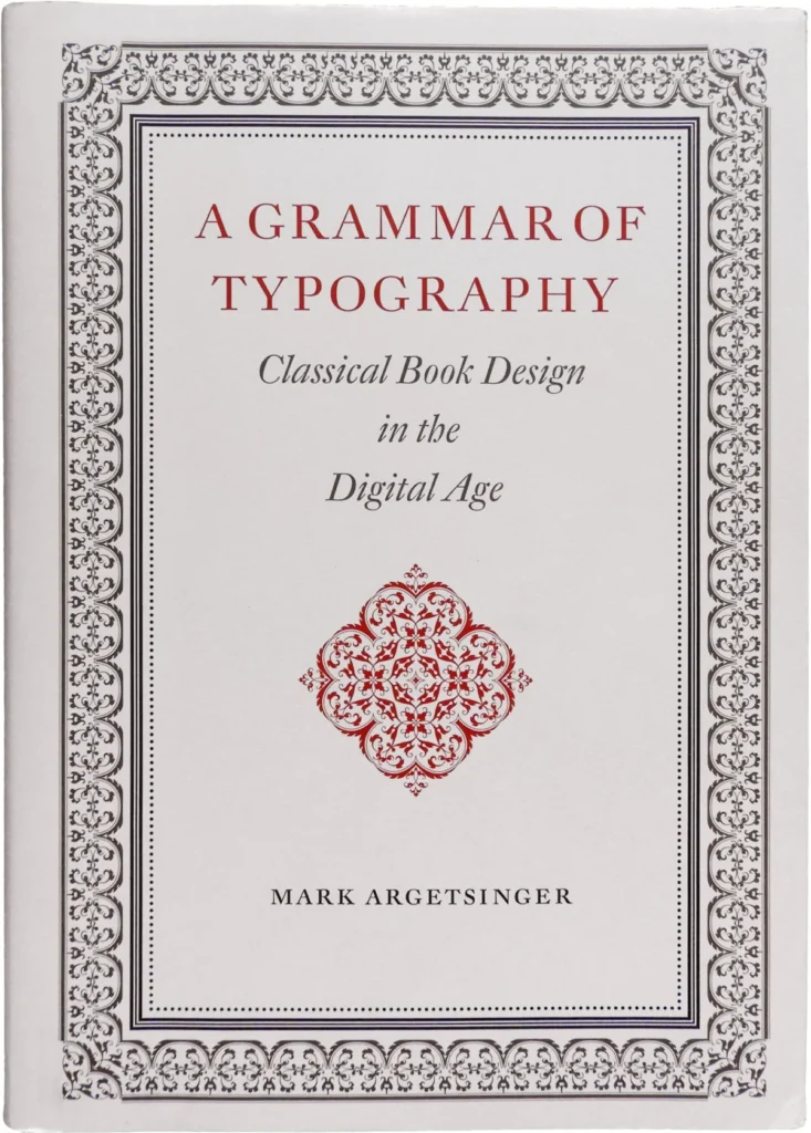

In an era where digital interfaces increasingly dominate textual presentation, the enduring craft of bookmaking faces both obsolescence and a potential resurgence. Mark Argetsinger’s comprehensive volume, A Grammar of Typography: Classical Book Design in the Digital Age, emerges as a critical examination and a passionate defense of traditional typography, challenging contemporary design practices and offering a pathway to preserving the book as a designed object. Reviewed by Joshua Langman and published by David R. Godine in 2020, the book endeavors to equip a new generation of designers with the principles and standards of historical printing, even as the tools of their trade have migrated from composing sticks to digital text frames.
The publication arrives at a pivotal moment in the history of the printed word. Craft knowledge and time-honored trade practices are rapidly being jettisoned by both trade and academic publishers, who, according to critics like Langman, seem intent on marginalizing the very craftspeople essential to maintaining the printed book’s integrity as a designed artifact and fostering a deeper, more visceral engagement with reading. While typography is often relegated to a sub-discipline within graphic design, Argetsinger, and by extension Langman’s review, posits it as a distinct literary craft with deep historical ties to editing, printing, and publishing. This distinction is crucial in a landscape where most contemporary design books address typography within the broad context of digital applications—websites, ebooks, software interfaces, and motion graphics—rendering type a "transmedia construct" rather than a tangible entity. The book itself, as a physical object, appears to be on a similar trajectory, yet the platforms enabling its digital dissemination often fall short of the nuanced standards developed over 570 years of the printed codex’s maturation. Argetsinger’s work, therefore, is presented as a vital contribution for those who continue to recognize the traditional book as the preeminent medium for textual presentation.
A Manifesto for Classical Book Design
A Grammar of Typography is framed as a manual for producing beautiful, meticulously crafted books in an era that frequently undervalues such an endeavor. Argetsinger’s approach is characterized by a quiet confidence in the timeless relevance and inherent superiority of his craft, a stark contrast to the prevailing technological evangelism surrounding electronic publishing. The book is thus positioned as a defiant affirmation of bookmaking as a significant cultural undertaking.
However, Langman’s review reveals that while the book’s thesis is laudable and necessary, its execution and underlying assumptions present a more complex picture. Despite its ambition to serve as a practical treatise for historically informed book design, the volume’s extensive contextualization, spanning 135 pages dedicated to philosophical and historical groundwork before reaching the 64 pages on working with type, risks overshadowing its instructional core. Readers seeking advanced, nuanced technical skills, rather than introductory concepts of digital typesetting, might find the book’s unique instructional content diluted by reiterations of widely available historical context. While Argetsinger excels in providing valuable guidance on paper selection and binding, the chapters on typography itself are criticized for leaning heavily towards foundational "Typography 101" assertions and elementary software tutorials, failing to fully bridge the gap between classical values and digital tools as effectively as the book’s premise suggests.
The Physicality and Finer Points of Execution
The physical attributes of A Grammar of Typography also draw attention. At 514 pages and formatted in a substantial, almost folio-like size, it is a volume intended for a desk or lectern rather than for easy portability. Its interior design successfully evokes the aesthetic of neoclassical and baroque scholar-printers, contributing to its historicist ambiance. The typesetting is generally of high quality, as expected, but not without occasional imperfections. Langman notes instances of non-proportionally spaced numerals, creating awkward gaps, and a design choice of oversized running heads and folios that clashes with the book’s predominantly continental flavor. The use of asterisks as section dividers is cited as a regression to typewriter-era conventions, contradicting Argetsinger’s own recommendations against such practices. The review posits that the more restrained title page, with its elegant use of scale, space, and color to convey meaning, is more successful than the "ecstatic ornamentation" of the dust jacket, which relies on a generalized baroque aesthetic without specific communicative purpose.
Navigating Typographical Errors and Omissions
A significant concern raised in the review is the presence of numerous typographical errors throughout the book, averaging approximately one per two pages. Names of individuals and typefaces appear particularly susceptible to misspellings. Beyond minor errors, substantive inaccuracies have also been identified. For instance, a specimen of Garamond Premier is incorrectly labeled as Adobe Garamond. Similarly, a demonstration intended to showcase "kerning triumphant" with Zapfino is, in fact, an illustration of "ligature triumphant," as the word "Zapfino" itself is presented as a seven-character ligature or logotype, setting as a single glyph.
Errors of omission are also noted, particularly in the brief chapter on digital fonts. The subsequent showcase of recommended typefaces, focusing on digital revivals of historically significant metal text faces, creates a disconcerting impression that typography’s historical trajectory concluded in the mid-20th century, with subsequent activity limited to revivals. Langman argues that this approach represents "historically bound" design rather than merely "historically informed" design. He contends that many of the most sophisticated and aesthetically refined serifed text faces were designed in the late 20th and early 21st centuries, employing an idiom distinct from earlier periods. The exclusion of these contemporary designs, and the dismissal of digital faces without metal antecedents, is questioned for its impact on the book’s relevance and its author’s design work. Furthermore, the selection of typefaces is deemed incomplete, with notable omissions including Iberian revivals like Mário Feliciano’s Rongel and Cristóbal Henestrosa’s Espinosa Nova, as well as significant modern revivals of Argetsinger’s preferred historical faces, such as William Caslon Text, Neacademia, ATF Garamond, and the Jannon series.

The Interpretation of "Classical" and Aesthetic Philosophy
The subtitle’s use of "classical" is clarified to refer not to antiquity, but to the neoclassical and baroque periods. Langman questions this choice, noting that the baroque era is not universally considered the zenith of typographic practice, with some historians viewing it as an overcomplication of High Renaissance design, a period that might have been a more intuitive exemplar of typographic purity. An alternative consideration for a high point in typographic practice could have been the first half of the 20th century, a period of significant achievement in commercial American book design. The baroque era, as an aesthetic model, is deemed too specific to offer broad utility. The review suggests that instead of merely imitating the forms of books from eras like Fournier’s, Argetsinger might have benefited from identifying the underlying structural logic of such works and extrapolating a more timeless and flexible typographic approach.
This leads to a broader discussion of Argetsinger’s design philosophy. Langman draws a distinction between medium and aesthetic, arguing that the continued use of traditional bookmaking materials and processes does not necessitate adherence to four-hundred-year-old aesthetic practices. He suggests that it is possible to employ new tools in innovative ways, whereas Argetsinger appears committed to using new tools in outdated ways. The book, it is noted, lacks discussion on how book designs should organically emerge from, be inspired by, or reflect the nature of the book itself, nor does it offer substantial guidance on typeface selection. This is contrasted with designers like Richard Eckersley, who, while capable of historical accuracy, also engaged in dissection, parody, and refutation of historical conventions for postmodern texts, pushing the boundaries of typographic expression.
The question of a singular, exclusive aesthetic philosophy is raised. Some practitioners argue that typographers should avoid a personal style altogether, as any given style might be unsuitable for a particular project. A typographer’s knowledge base, it is contended, should extend beyond antiquity to encompass contemporary practices. Failing this, designers may either be ill-equipped for projects requiring a different aesthetic language or compelled to decline such work. This limitation extends to both modern and ancient texts. An edition of an ancient text, for example, might be ill-suited to ornate baroque ornamentation, just as contemporary texts can challenge and transcend traditional book aesthetics.
A Necessary Contribution, Albeit Imperfect
Despite these criticisms, Langman concludes that Argetsinger’s approach is sincere and holistic, avoiding superficial pastiche. However, it leaves little room for self-consciousness, irony, or aesthetic experimentation. Argetsinger is characterized as a traditional artisan operating in a postmodern world. While a yearning for a simpler era where visual beauty was an uncontested goal is understandable, contemporary designers must acknowledge the increased complexity of their field. The work of designers like Richard Eckersley and the manuals of Robert Bringhurst and Rich Hendel are cited as examples of a more pluralistic approach, effectively bridging the classical tradition with postmodern philosophy.
A Grammar of Typography is ultimately deemed a frustrating yet important book. In an era of increasing digital ephemerality and the production of poorly conceived printed materials, Argetsinger’s work serves as a vital affirmation of the codex’s vitality as a conduit for human thought and a product of human craft. As cultural critics begin to anticipate a backlash against digital reading, this book arrives at an opportune moment. It has the potential to ignite interest among young designers seeking materiality and authenticity, and to contribute to a renaissance in bookmaking, not only as a fine art but as a viable commercial craft.
Argetsinger’s contributions are manifold, including his passionate and learned prose, his commitment to anti-commercial principles that advocate for designer involvement in all aspects of production, and his deep conviction in the significance of books. His dazzling arrangements of printer’s ornaments and his erudite typographic scholarship are sources of inspiration. However, by narrowly defining "classical" design, he risks alienating designers who aim not only to master historical craft but to revitalize the tradition, reintroduce high-quality typography to new audiences, and potentially safeguard the future of the codex. A more robust emphasis on practical typographic instruction, enhanced editorial diligence, and a broadened philosophical scope would have elevated A Grammar of Typography to the status of the comprehensive spiritual and practical guide for contemporary typographers that it aspires to be.
Joshua Langman, the reviewer, brings a wealth of experience to his critique. A typographic designer, Langman has honed his skills through intensive study and practice, including letterpress printing at the Wells College Book Arts Institute and Monotype casting and typesetting at the Press and Letterfoundry of Michael and Winifred Bixler. His academic background also includes printmaking and book arts at Sarah Lawrence College. For three years, he served as the designer and typesetter for Babel, a multilingual literary journal. With encouragement from renowned type designer Hermann Zapf, Langman digitized Zapf’s Orbis Typographicus broadsides, making them accessible online. His multidisciplinary expertise also extends to theater arts, writing, and education, evidenced by his authorship of Standby: An Approach to Theatrical Design.