
Ashton, the pioneering Canadian restaurant chain that first introduced poutine to the nation in 1969, has launched a comprehensive brand and experience overhaul aimed at revitalizing its image and expanding its reach. Under new ownership since 2022, the beloved Quebecois institution is undertaking a significant transformation to address challenges including stagnant sales, aging infrastructure, an aging customer base, and the need to attract a younger workforce. This strategic repositioning, spearheaded by a partnership with branding agency LG2, seeks to blend nostalgic charm with contemporary appeal, ensuring Ashton’s enduring relevance in the competitive Canadian food landscape.
A Legacy in Need of a Refresh
Founded over half a century ago, Ashton holds a unique place in Canadian culinary history as the first chain dedicated to poutine. For decades, it served as a go-to destination for the iconic dish. However, as time progressed, the brand’s visual identity and the physical state of its 23 locations began to reflect a bygone era. This stagnation led to declining sales figures and an increasingly aged demographic, posing significant hurdles for future growth.
The turning point arrived in 2022 when Émilie Adam and Jean-Christophe Lirette assumed leadership from Ashton Leblond. Their acquisition marked the beginning of a new chapter, driven by a clear vision: to not only preserve Ashton’s heritage but also to modernize its appeal and foster expansion. Recognizing the urgency, the new owners identified the critical need to revitalize both the brand’s image and the overall customer experience. This was paramount to attracting a new generation of diners and employees while retaining the loyalty of its established customer base.

Strategic Revitalization: The LG2 Partnership
To achieve its ambitious goals, Ashton collaborated with LG2, a renowned branding and marketing agency, to reimagine its entire brand experience. The initial phase of this collaboration focused on one of Ashton’s flagship restaurants, serving as a testing ground for a holistic redesign. The objective was to simplify the brand’s essence and transform it into an exportable model that could be replicated across its network and potentially beyond.
The revitalization strategy centered on striking a delicate balance between honoring Ashton’s rich history and embracing modern design principles. The aim was to create an environment that resonated with both long-time patrons and a younger demographic seeking authentic yet contemporary dining experiences. This involved a meticulous examination of every customer touchpoint, from interior design and signage to packaging and merchandise.
Reimagining Nostalgia: A Modern Twist on Classic Codes
LG2’s approach to redesigning Ashton’s brand experience was deeply rooted in understanding and celebrating its heritage. The agency sought to infuse a sense of nostalgia, but with a contemporary flair that would appeal to a broader audience. This led to the integration of classic diner aesthetics, reinterpreted through a modern lens.
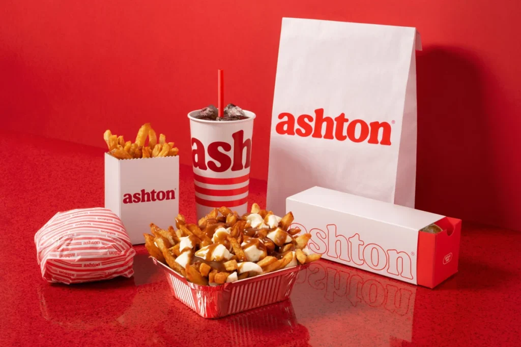
A key element of this reimagining was the development of a customized typographic signature. This new typeface was specifically crafted to evoke the generous and indulgent nature of Ashton’s poutine and other menu offerings. Complementing this, the brand’s signature red color was updated, retaining its iconic status while being refined for a more contemporary feel.

Nostalgia was further woven into the brand’s fabric through new merchandise. These items feature illustrations that pay homage to Ashton’s earliest logos, serving as subtle yet effective reminders of its historical roots. The color palette was enriched, with a prominent use of deep reds and warm tones, creating a sense of comfort and familiarity. Curved edges became a recurring design motif, softening the overall aesthetic and contributing to a more inviting atmosphere.
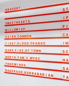
A particularly distinctive design element is the "triple red line," inspired by the chain’s iconic neon signage of yesteryear. This graphic motif is now a consistent thread running through every aspect of the brand’s visual system, from the redesigned food packaging and menus to the subtle details like stripes on branded socks. This recurring element acts as a unifying visual cue, reinforcing Ashton’s identity across diverse applications.
Crafting an Immersive Local Atmosphere
The physical transformation of Ashton’s restaurants was a crucial component of the revitalization project. The design concept aimed to create an atmosphere as comforting and inviting as the food itself, drawing inspiration from the brand’s origins. This commitment to local resonance is evident in the design choices, which evoke the spirit of Ashton’s first 1969 food truck.
Key architectural and interior design features include pervasive curves, a deliberate integration of neon lighting, and the prominent use of red tin roofing elements, all echoing the visual language of the original food truck. These elements are not merely decorative; they are intended to transport diners back to a simpler time while providing a fresh and engaging environment.

Inside the dining room, a monochrome red border elegantly frames the space, guiding the eye and enhancing the visual flow. The iconic banquettes, a signature feature of Ashton’s dining experience, remain prominently positioned in the center of the restaurant. This layout is not only aesthetically pleasing but also designed for ease of reproduction, facilitating the rollout of the new design across the entire chain in the coming years. The emphasis on reproducible design elements underscores the strategic intent to scale the revitalized brand effectively.
Quantifiable Success: The Impact of the Redesign
The immediate impact of the revitalized flagship restaurant has been overwhelmingly positive, with tangible results observed within the first 30 days of its reopening. These metrics provide compelling evidence of the success of Ashton’s strategic overhaul:
- 35% Increase in Traffic: The renovated location saw a significant surge in customer visits, indicating a renewed interest in the brand.
- 34% Increase in Sales: This growth in traffic directly translated into a substantial increase in sales, demonstrating the commercial viability of the new experience.
- 40% Increase in Website Visits: The online presence of Ashton also experienced a notable boost, suggesting that the brand’s revitalization efforts are successfully capturing the attention of a wider audience, including those researching dining options online.
These figures underscore Ashton’s ability to achieve its core objectives: securing the loyalty of its long-standing clientele while simultaneously attracting new patrons, particularly younger demographics keen on experiencing a blend of retro charm and contemporary dining.
A Recipe for Future Growth
The success of this initial phase positions Ashton for significant future expansion. The revitalized brand offers a compelling and replicable model that can be implemented across its existing 23 locations and beyond. The strategic infusion of nostalgia, combined with modern design and a focus on the core poutine experience, appears to have struck a chord with consumers.

The implications of this revitalization extend beyond mere aesthetic improvements. By addressing critical business challenges such as stagnant sales and an aging customer base, Ashton is not only preserving a piece of Canadian culinary heritage but also positioning itself for sustained growth in an increasingly competitive market. The successful integration of brand identity with customer experience demonstrates a forward-thinking approach that could serve as a benchmark for other heritage brands seeking to evolve.
The partnership with LG2 has been instrumental in translating Ashton’s historical significance into a relevant and appealing contemporary brand. The focus on creating an "exportable entity" suggests an ambition to grow Ashton’s footprint, potentially even beyond Quebec and Canada, leveraging its unique story and its status as the originator of a beloved national dish. The data-driven success of the flagship renovation provides a strong foundation for this expansion, demonstrating that Ashton has indeed found the perfect recipe for a thriving future.
Analysis of Implications
The Ashton revitalization project offers a compelling case study in how heritage brands can successfully navigate the complexities of modernization. The strategy employed by Ashton and LG2 highlights several key takeaways for businesses facing similar challenges:
- Authenticity as a Foundation: The success hinges on a deep understanding and respectful integration of the brand’s historical roots. Attempts to modernize without acknowledging heritage often fall flat. Ashton’s emphasis on nostalgic elements, such as the food truck inspiration and vintage logo references, grounds the new identity in its established legacy.
- Targeted Modernization: The revitalization was not a complete overhaul but a strategic infusion of contemporary design elements. The updated color palette, customized typography, and refined interior design create a fresh appeal without alienating existing customers. This balanced approach is crucial for retaining loyal patrons while attracting new ones.
- Customer Experience as a Differentiator: In the food service industry, the dining experience is as critical as the food itself. Ashton’s focus on creating a comforting and inviting atmosphere, directly linked to its origin story, provides a unique selling proposition. The design elements are not just about aesthetics but about creating an emotional connection with the customer.
- Data-Driven Decision Making: The immediate and significant increase in traffic, sales, and website visits after the flagship renovation provides concrete evidence of the strategy’s effectiveness. This data not only validates the approach but also informs future rollout plans, ensuring that expansion is based on proven success.
- Attracting a New Workforce: While not explicitly detailed in terms of workforce metrics, a modernized and appealing brand image is inherently more attractive to younger job seekers. This revitalization effort is likely to play a crucial role in Ashton’s ability to recruit and retain a new generation of employees who can contribute to its future growth.
The long-term implications for Ashton are significant. If the expansion strategy can replicate the success of the flagship location, the chain could experience a substantial resurgence in popularity and market share. Furthermore, the successful rebranding could pave the way for broader market penetration, potentially establishing Ashton as a prominent player in the casual dining sector across Canada and even internationally. The project demonstrates that even deeply rooted, traditional brands can achieve remarkable success by embracing innovation while remaining true to their heritage.