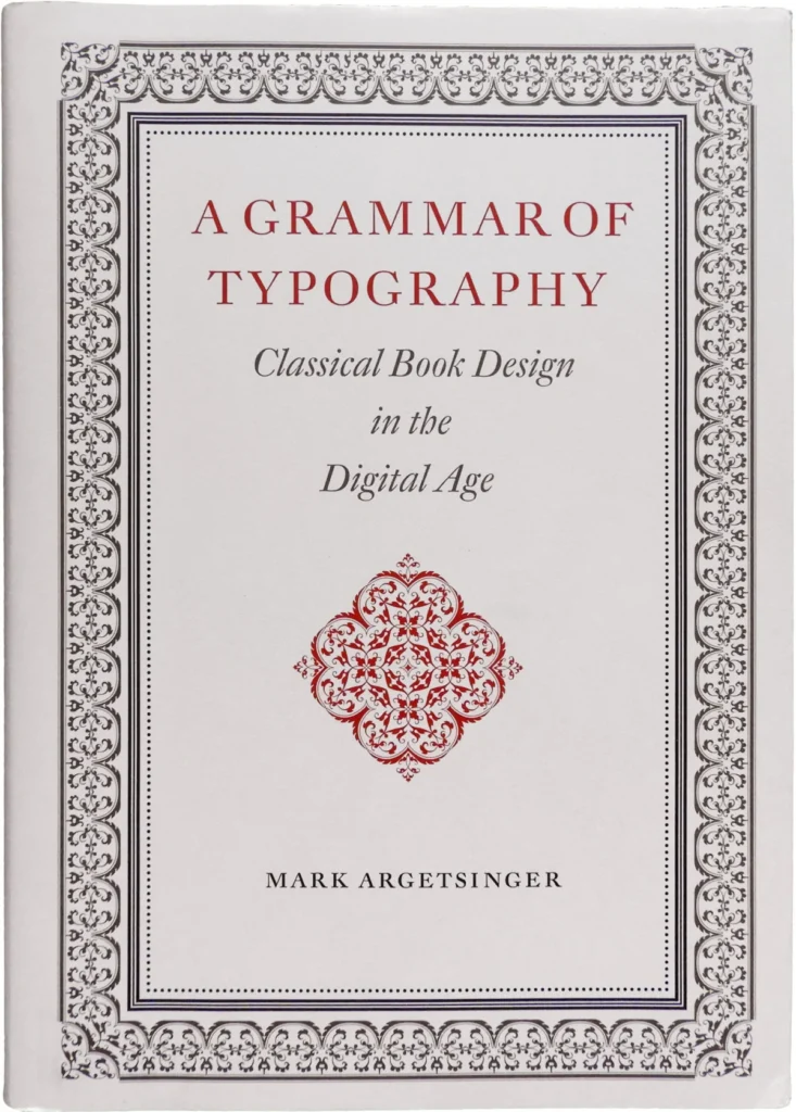

The release of this work coincides with a pivotal era in publishing history. As academic and trade publishers increasingly pivot toward digital-first strategies—often prioritizing cost-efficiency over the tactile quality of the printed codex—Argetsinger’s volume arrives as a deliberate, if rigid, defense of the physical book. The book aims to bridge the gap between historical printing practices and the modern digital landscape, where the "composing stick" has been replaced by the software interface.
The Historical Context of the Codex
To understand the significance of Argetsinger’s work, one must acknowledge the 570-year history of the printed codex. Since the mid-15th century, the structure of the book has undergone various iterations, yet the fundamental principles of legibility, hierarchy, and spatial arrangement have remained surprisingly resilient.
In the late 20th and early 21st centuries, the rise of digital publishing tools—such as Adobe InDesign and various font-management software—democratized book design but also led to a perceived degradation in quality. Industry experts argue that the ease of digital typesetting has removed the "friction" that once forced printers to consider the mechanical limitations of the press, resulting in a loss of the nuance that characterized the work of master typographers like John Baskerville or Giambattista Bodoni. Argetsinger’s manual seeks to reintroduce these constraints and standards to a generation of designers who may never have worked with physical type.
Structural Analysis and Instructional Content
The book is divided into two primary segments: a substantial 135-page exploration of the historical and philosophical underpinnings of typography, followed by a 64-page practical section on technical application. This weighting has become a primary point of critique among design professionals.
While the scholarship is widely regarded as thorough, critics observe that the instructional portion—intended to guide designers in applying classical principles to modern digital workflows—is somewhat underdeveloped. The manual covers essential topics such as paper selection and binding techniques with high competence; however, the chapters on core typography often lean toward introductory tutorials. For the target audience—likely professional designers or students already familiar with software basics—the lack of advanced, nuanced technical guidance represents a missed opportunity to synthesize theory with modern execution.
Typographic Execution and Technical Oversight
Physically, the book is an ambitious object. Its large format suggests a reference text meant for a permanent place on a professional’s desk. However, the execution contains inconsistencies that some industry analysts find ironic given the book’s stated commitment to perfection.
Data points regarding the book’s production reveal a frequency of typographical errors averaging roughly one every two pages. For a volume dedicated to the meticulous art of typesetting, these oversights are notable. Specific errors include:

- Identification Errors: A specimen of Garamond Premier is mislabeled as Adobe Garamond.
- Ligature Confusion: A demonstration intended to highlight "kerning" actually showcases the use of a seven-character ligature (a single glyph representing multiple letters).
- Formatting Inconsistencies: The use of proportional numerals versus lining figures is inconsistent across chapters, and the application of large, 19th-century-style running heads conflicts with the book’s otherwise neoclassical aesthetic.
Philosophical Implications and the Limits of "Classical" Design
Argetsinger’s definition of "classical" is rooted primarily in the neoclassical and baroque periods of European printing. This choice creates a distinct aesthetic boundary for the reader. By centering his methodology on the works of 17th- and 18th-century printers, the author intentionally ignores the evolution of typography in the late 20th and early 21st centuries.
From a broader industry perspective, this "historically bound" approach invites debate regarding the role of a designer. Does a commitment to craft necessitate an adherence to historical aesthetics, or should the "structural logic" of the past be used to inform modern, experimental design?
Critics of the work, such as designer Joshua Langman, have pointed out that by excluding contemporary typefaces and focusing exclusively on historical revivals, the book fails to engage with the breadth of modern typography. The omission of significant digital-age type designs—such as those by Mário Feliciano or Cristobal Henestrosa—suggests that the manual is less of an open-ended guide and more of a manifesto for a specific, historically restricted style.
Broader Industry Impact
Despite its technical flaws and narrow philosophical scope, the importance of A Grammar of Typography should not be discounted. In the context of a modern publishing industry that is increasingly "trending toward digital ethereality," the book serves as a necessary anchor.
There is an emerging movement among both cultural critics and independent publishers to re-examine the printed book as a "visceral experience." Recent market trends show a surprising resilience in the physical book sector, particularly in the fine-press and artisanal segments. Argetsinger’s contribution provides a rallying point for this segment of the industry. His insistence that a designer should be involved in every facet of the production process—from the choice of paper to the selection of typeface—is a call to return to the concept of the "book-maker" rather than merely the "layout artist."
Conclusion: The Future of the Craft
The legacy of this volume will likely be defined by its tension between high-minded traditionalism and the practical requirements of the modern era. While it serves as a robust defense of the codex as a cultural artifact, its utility as a practical manual is hampered by its rigid adherence to a specific historical era and a lack of editorial rigor.
For the aspiring designer, the book offers a deep, if occasionally exclusionary, immersion into the traditions of the trade. For the professional, it functions as a prompt to evaluate one’s own philosophy regarding the intersection of history and innovation. As the industry continues to reconcile the convenience of digital tools with the demand for physical quality, works like A Grammar of Typography—flawed as they may be—remain essential components of a larger, ongoing dialogue about the preservation of human craft in the digital age. The book successfully articulates why the printed page matters, even if it leaves the reader to determine how, exactly, to carry that legacy forward into the future.