
Jim Parkinson, the influential lettering artist, type designer, and painter whose work defined the visual identity of some of the most recognizable publications and brands in the United States, passed away on June 26, 2025, at his home in Oakland, California. His death followed a protracted struggle with Alzheimer’s disease. He is survived by his wife, Dorothy A. Yule, a noted book artist who served as both his partner and caregiver during his final years.
A Legacy Carved in Ink and Type
Parkinson’s career spanned more than five decades, during which he became an indispensable figure in the world of graphic design. His work was characterized by a rare technical versatility, enabling him to transition seamlessly between intricate hand-lettered logotypes and the rigorous structural demands of font design. Whether he was crafting a custom typeface or refining the masthead of a major newspaper, Parkinson maintained a standard of excellence that set him apart in an industry that underwent a radical transformation from manual drafting to digital production during his tenure.
Born in Oakland on October 23, 1941, Parkinson’s fascination with letterforms began in childhood. He lived across the street from Abraham Lincoln Paulsen, a legendary penman known as the "Wizard Penman." Paulsen’s ability to perform feats of calligraphy, such as writing the Gettysburg Address in reverse, sparked a lifelong obsession in young Parkinson. Throughout his youth, he meticulously collected historical lettering manuals and correspondence-school textbooks, building a deep knowledge of typographic history that would eventually become the foundation of his design philosophy.
Chronology of a Prolific Career
Parkinson’s professional trajectory began following his graduation from the California College of Arts and Crafts in 1963. His first major stop was at Hallmark Cards in Kansas City, Missouri. While initially hired for general illustration, his talent for lettering was quickly recognized by the company’s art directors. This period served as his apprenticeship, where he honed the discipline required to translate creative vision into commercial success.
Upon returning to the San Francisco Bay Area, Parkinson transitioned to a freelance career that would last half a century. His output was vast and varied:

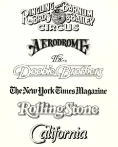
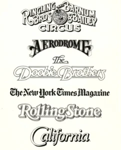
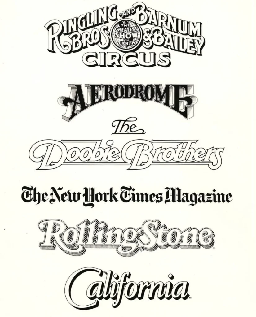
- 1970s–1980s: Parkinson established himself as a primary resource for magazine design, creating nameplates and logotypes for publications including Rolling Stone, the Los Angeles Times, and California magazine.
- 1990s: As the industry shifted toward desktop publishing, Parkinson successfully adapted his manual skills to digital font production, releasing both bespoke typefaces and commercially available retail fonts.
- 2000s–2015: He remained active as a consultant for high-profile redesigns and continued his work as a fine artist, documenting vintage neon signage through large-scale paintings.
Impact on Media and Design
Parkinson’s influence on the American visual landscape cannot be overstated. By the height of his career, his work appeared on newsstands across the country and abroad, often gracing multiple covers simultaneously. His methodology involved a deep respect for the historical origins of letterforms, which he then adapted to suit the contemporary needs of his clients.
Beyond magazines, his portfolio included iconic work for the music and entertainment industries, such as the logotype for The Doobie Brothers and the enduring branding for the Ringling Bros. and Barnum & Bailey Circus. His ability to evoke specific eras and moods through typography made him the "go-to" designer for art directors tasked with refreshing aging publication brands.
A Professional’s Perspective: Mentorship and Archives
Throughout his life, Parkinson was deeply involved in the design community. He opened his home and his personal archive of ephemera and original artwork to students, colleagues, and historians. His peers frequently noted his lack of ego; he famously subscribed to the mantra of ballerina Margot Fonteyn: "Take your work seriously, but never yourself."
The Letterform Archive, an institution dedicated to the preservation of graphic design history, has confirmed that it will publish Parkinson’s memoir in 2026. This forthcoming work is expected to provide a detailed account of his life and his methodologies, ensuring that his technical knowledge is preserved for future generations of designers.
The Broader Implications of His Work
The passing of Jim Parkinson marks the end of an era that bridged the gap between the analog traditions of the mid-20th century and the digital precision of the 21st. As a transitionary figure, he demonstrated that the core principles of typography—readability, character, and historical context—remain constant, regardless of the tools used to produce them.
Design historians note that Parkinson’s work serves as a masterclass in "brand identity through typography." Before the era of algorithmic font matching, Parkinson was creating bespoke solutions that gave publications a unique visual "voice." His death prompts a broader conversation in the design world about the importance of preserving the personal, artisanal touch in an increasingly automated creative field.

Official Responses and Memorial Details
The design community has begun to express its collective grief, with tributes appearing across various professional design platforms. Those who knew him recall his wit, his wisdom at local community picnics, and his unwavering commitment to his craft.
In an official statement, colleagues at the Letterform Archive highlighted his contributions to the history of the written word. "Jim was more than just a designer; he was a bridge between the masters of the past and the digital artists of the present," a spokesperson noted.
A memorial service for Parkinson is planned for the fall of 2025. His family has requested that, in lieu of flowers, donations be directed to the Alzheimer’s Association to support ongoing research and care initiatives.
Analysis: A Life of Consistency
From an analytical standpoint, Parkinson’s career stands out for its remarkable consistency. In an industry often marked by volatile trends and rapid turnover, he remained a steady force. His ability to pivot from drawing logos for circus acts to designing complex digital font families underscored a rare intellectual flexibility.
By grounding his work in the history of lettering, Parkinson ensured that his designs possessed a "timelessness" that allowed them to remain effective for decades. His legacy is not merely found in the logos he drew or the fonts he released, but in the standard of professional conduct and creative curiosity he modeled for his peers and successors. As digital archives continue to curate his work, it is certain that Parkinson’s influence will continue to shape the typographic landscape for years to come.