
Jim Parkinson, the preeminent American lettering artist, type designer, and painter, passed away on June 26, 2025, at his home in Oakland, California, following a protracted battle with Alzheimer’s disease. He was 83. His death marks the conclusion of a singular career that spanned over five decades, during which he fundamentally shaped the visual identity of American print media, corporate branding, and popular culture. He is survived by his wife, the book artist Dorothy A. Yule, who provided dedicated care throughout the final, challenging years of his life.
A Legacy in Ink: The Career of a Master Craftsman
Born on October 23, 1941, in Oakland, California, Parkinson’s trajectory was influenced early by the environment of the mid-20th-century Bay Area. His childhood exposure to the work of Abraham Lincoln Paulsen—a local calligrapher famously known as the "Wizard Penman"—served as the foundational spark for his lifelong obsession with letterforms. Parkinson did not rely on modern digital tools in his formative years; instead, he methodically curated a personal archive of historical lettering manuals and correspondence-school textbooks. This deep immersion in the history of typography allowed him to bridge the gap between classic calligraphic traditions and the demands of modern commercial design.
After graduating from the California College of Arts and Crafts in 1963, Parkinson relocated to Kansas City, Missouri, to join the design staff at Hallmark Cards. His tenure there proved to be a pivotal professional transition. While initially assigned to general illustration, his aptitude for the nuanced geometry of lettering soon became evident. Recognizing that his true proficiency lay in the structural beauty of alphabets rather than figurative illustration, Hallmark shifted him into their specialized lettering department. This move effectively launched a career defined by precision, versatility, and an encyclopedic knowledge of type styles.
Chronology of an Influential Career
Parkinson’s professional life can be viewed as a narrative of evolution, moving from the hand-rendered requirements of mid-century print media to the digital font revolution of the late 20th century.

- 1963: Graduated from the California College of Arts and Crafts.
- 1964–1968: Worked as a staff artist for Hallmark Cards in Kansas City, refining his skills in professional lettering.
- 1969: Returned to the San Francisco Bay Area to establish a freelance practice, beginning a five-decade career of independent design.
- 1970s–1990s: Became the definitive "go-to" designer for major American publications. His hand-lettered mastheads for Rolling Stone and the Los Angeles Times redefined the visual authority of those institutions.
- 2000s: Pivoted toward the development of retail and custom fonts, adapting his hand-drawn mastery into the burgeoning digital font market.
- 2010s–2025: Shifted focus toward fine art, specifically the documentation and painting of vintage neon signage, while continuing to consult on type design projects.
The Breadth of an Archive: From Magazines to Rock Bands
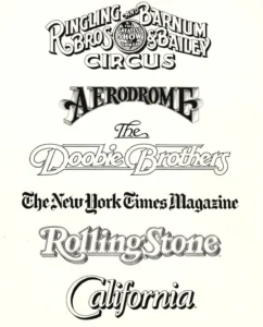
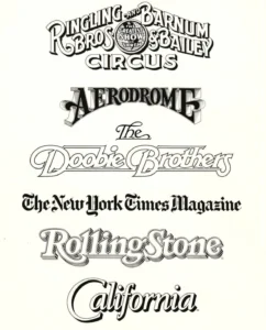
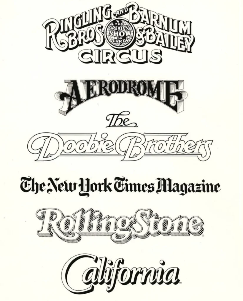
Parkinson’s impact on the visual landscape of the United States is arguably unmatched by his contemporaries. His work was not confined to a single medium; he was equally adept at crafting the rugged, high-energy logo for the Doobie Brothers as he was at redesigning the sophisticated, legacy-driven nameplates of major newspapers.
His portfolio includes:
- Editorial Design: Mastheads for Rolling Stone, California magazine, and the Los Angeles Times.
- Corporate and Entertainment Identity: Logos for the Ringling Bros. and Barnum & Bailey Circus, among many others.
- Typographic Collections: An extensive library of both bespoke custom fonts and commercially available retail typefaces.
His methodology was rooted in the philosophy that a logo or typeface must be more than a decorative element; it must be a functional tool for communication. Because of this, art directors frequently commissioned him to "refresh" existing publications, trusting his ability to modernize a brand’s identity while respecting its historical heritage.
The Shift to Fine Art and Later Years
In his later years, Parkinson pivoted away from the rigid constraints of commercial type design to explore the intersection of typography and fine art. He became a chronicler of the American West’s vanishing neon culture. His paintings of vintage signs were not merely aesthetic; they were rigorous, detailed examinations of decay and craftsmanship. By capturing the texture of peeling paint and the structural collapse of glass neon tubes, he elevated commercial signage to the status of fine art. These works, which filled his Oakland home, stand as a testament to his obsession with the lifecycle of letters in the physical world.
Industry Impact and Professional Context
The design community has noted that Parkinson’s influence extends far beyond his output. Stephen Coles, a fellow typographer and long-time friend, described Parkinson as a "fixture" of the design scene, noting that he was exceptionally generous with his time and resources. Parkinson’s home served as a hub for young designers and students, who were invited to study his vast, hand-cataloged collection of ephemera and original artwork.

His approach to work—characterized by a high degree of seriousness toward the craft, combined with a profound lack of self-importance—mirrored the advice of ballet legend Margot Fonteyn: "Take your work seriously, but never yourself." This attitude allowed him to navigate the high-pressure world of professional design with a rare, disarming humility.
A Final Contribution: The Upcoming Memoir
Recognizing the importance of documenting such a prolific life, the Letterform Archive has announced that they will publish Parkinson’s memoir in 2026. This forthcoming work is expected to provide a primary source account of the transition from manual lettering to digital design, offering a roadmap for future generations of typographers. The project ensures that his narrative voice will survive, providing context to the vast collection of logos and fonts he leaves behind.
Broader Implications of his Passing
The passing of Jim Parkinson represents the loss of a vital link to the analog era of graphic design. As the industry becomes increasingly automated through artificial intelligence and algorithmic typeface generation, the loss of a practitioner whose work was defined by the tactile, human touch of the pen and brush is particularly poignant. Parkinson’s career serves as a case study in the value of deep, specialized expertise. He demonstrated that even in a rapidly shifting technological landscape, there remains an enduring demand for the nuanced, idiosyncratic quality that only a master of the craft can provide.
A memorial service for Parkinson is planned for the autumn of 2025. In accordance with his family’s wishes, and in recognition of the illness that marked his final years, supporters are encouraged to direct donations to the Alzheimer’s Association in lieu of flowers. His life remains a benchmark for the industry, a standard of excellence that will continue to inform the work of designers for decades to come. Through his retail typefaces, his iconic mastheads, and his upcoming memoir, Jim Parkinson’s influence on the visual history of the United States remains firmly established and effectively permanent.