
Jim Parkinson, an influential figure whose hand-drawn lettering and custom typefaces defined the visual identity of American media for over half a century, passed away at his home in Oakland, California, on June 26, 2025. His death, following a prolonged struggle with Alzheimer’s disease, marks the end of a prolific career that bridged the gap between traditional manual sign painting and the digital era of typography. He is survived by his wife, Dorothy A. Yule, a noted book artist who provided devoted care throughout his illness.
A Foundational Fascination with Form
Born in Oakland on October 23, 1941, Parkinson’s trajectory was influenced early on by his proximity to the legendary calligrapher Abraham Lincoln Paulsen, known as the "Wizard Penman." Paulsen’s ability to execute complex lettering—such as transcribing the Gettysburg Address in reverse and upside down—served as the spark for Parkinson’s lifelong obsession with the architecture of the alphabet.
Parkinson formally refined his craft at the California College of Arts and Crafts, graduating in 1963. His professional journey began in the Midwest, where he joined the staff of Hallmark Cards in Kansas City, Missouri. It was here that he underwent a pivotal shift in focus; recognizing that his talents were ill-suited for illustration, he pivoted to the company’s specialized lettering department. This transition proved to be the catalyst for a career that would ultimately see his work appearing on the covers of the world’s most recognizable publications.
Chronology of a Prolific Career
Parkinson’s body of work spans more than fifty years of American visual culture. His professional timeline reflects a constant adaptation to the shifting needs of editorial and commercial design:
- 1963: Graduates from the California College of Arts and Crafts and begins his career at Hallmark Cards in Kansas City.
- Late 1960s – 1970s: Returns to Oakland to establish a freelance practice, quickly becoming a sought-after specialist for art directors looking to refresh publication mastheads.
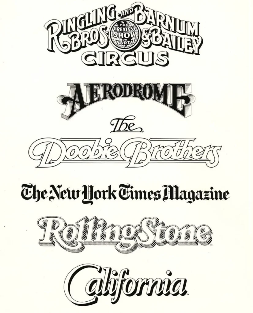
- 1980s – 1990s: Reaches the height of his influence in magazine design. His work appears regularly on newsstands globally, including redesigns for major titles such as Rolling Stone and the Los Angeles Times.
- 2000s: Continues his prolific output while expanding into retail typeface design, sharing his knowledge through mentorship and public exhibitions.
- 2010 – 2025: Transitions into semi-retirement, focusing on fine art painting and cataloging his vast archive of ephemera and original lettering work.
An Unrivaled Impact on Editorial Identity
Parkinson’s influence on the American typographic landscape cannot be overstated. By the late 20th century, he had become the "go-to" designer for art directors tasked with the delicate balance of rebranding a publication while maintaining its historical integrity. His work on nameplates for the Los Angeles Times and Rolling Stone showcased an ability to modernize classic letterforms without sacrificing their established character.

Beyond magazines, his commercial work for organizations such as the Ringling Bros. and Barnum & Bailey Circus and the band The Doobie Brothers demonstrated his versatility. Whether creating bespoke logotypes or comprehensive retail font families, Parkinson’s work was characterized by a distinct "hand-drawn" quality that provided warmth and personality in an increasingly automated design environment.
Fine Art and the Preservation of Craft
In his later years, Parkinson channeled his technical precision into the fine arts, specifically through a series of paintings depicting vintage neon signage. These works were not merely representations of signs; they were meticulous studies of decay, light, and history. By capturing the weathered surfaces and broken glass tubes of the American West, he extended his typographic interests into the realm of nostalgia and preservation.
His home in Oakland became a de facto archive of the history of lettering. He maintained an extensive collection of type manuals, correspondence-school textbooks, and original sketches, which he generously opened to students and fellow designers. His commitment to the craft was not restricted to his output; it was an act of constant stewardship of the history of the written word.
Industry Recognition and Memorialization
The design community has begun to respond to the news of his passing, citing not only his technical mastery but his humility. Colleagues often pointed to his adoption of the mantra "Take your work seriously, but never yourself," a philosophy that allowed him to remain approachable and grounded despite his professional stature.
Stephen Coles, a longtime friend and industry colleague, noted that Parkinson’s influence extended well beyond his professional portfolio. "He was a fixture at our gatherings, radiating joy and wisdom," Coles observed, highlighting the designer’s "casual silliness" as a defining trait that endeared him to multiple generations of typographers.
Broader Implications: The Transition of Archival Memory
The loss of a designer of Parkinson’s caliber emphasizes the importance of preserving the "analogue" history of graphic design. Much of the work produced by designers of his generation exists primarily in physical form—sketches, paste-ups, and early proofs. The announcement that the Letterform Archive intends to publish his memoir in 2026 is a significant development, ensuring that his perspective on the evolution of 20th-century design is not lost.

This memoir is expected to provide an essential primary source for design historians, detailing the methodologies behind the creation of iconic logos and the transition from manual drafting to digital typeface production. For those in the field, Parkinson’s legacy serves as a reminder that the tools of the trade—whether a pen or a software suite—are secondary to the designer’s fundamental understanding of balance, proportion, and historical context.
Legacy and Public Tribute
As the design world mourns, the focus turns to the institutional preservation of his work. Parkinson’s vast archive, which contains the original artwork for some of the most recognizable logos in American history, will serve as a permanent record of his contributions.
A memorial service for family and friends is planned for the autumn of 2025. In keeping with the family’s wishes, those who wish to honor his memory are encouraged to donate to the Alzheimer’s Association, supporting the research and care efforts for the disease that affected his final years.
As the industry moves forward, the "Parkinson style"—defined by his deep respect for historical precedent coupled with an intuitive, modern sensibility—will continue to influence designers. He remains a seminal example of the "complete designer," a craftsman who could operate at the intersection of commercial demand and fine art with equal proficiency. His career serves as a roadmap for future generations, proving that sustained excellence is achieved through a combination of rigorous study, adaptability, and an enduring, infectious love for the letterform.