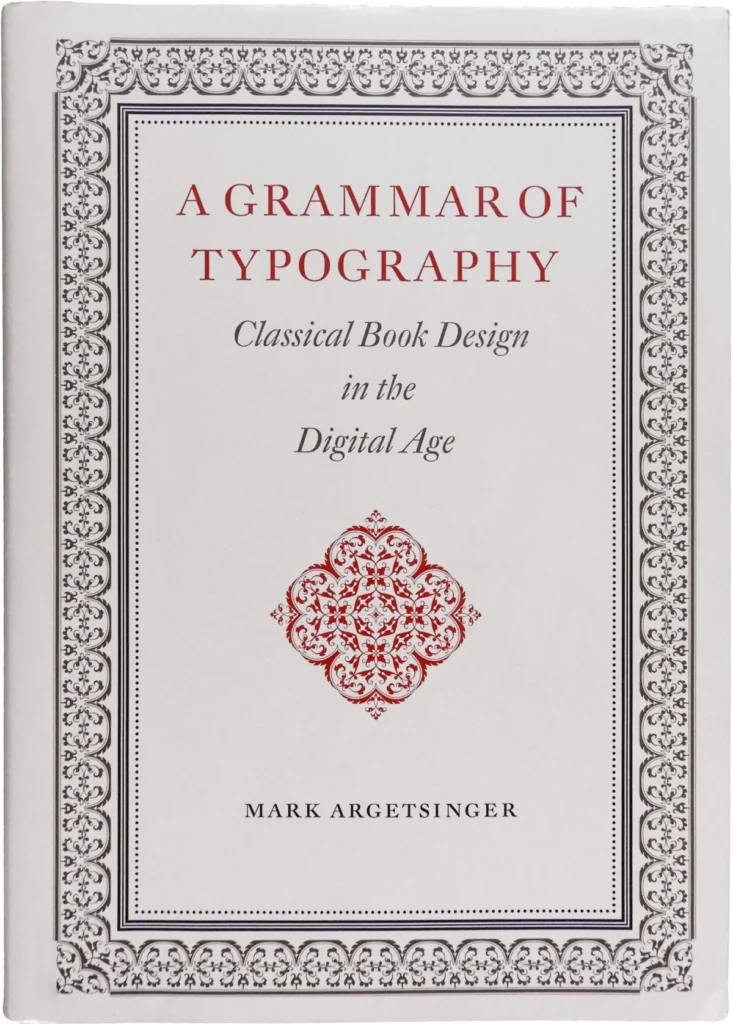

In an era defined by the rapid digitalization of media and the systematic erosion of traditional publishing crafts, the publication of A Grammar of Typography: Classical Design in the Digital Age, authored by Mark Argetsinger and released by David R. Godine in 2020, represents a significant, albeit controversial, intervention in the discourse of book production. At a moment when trade and academic publishers increasingly prioritize expediency over the tactile quality of the printed codex, Argetsinger’s work serves as both a manual for practitioners and a polemic against the perceived degradation of the book as a physical object.
The Context of a Declining Craft
The history of the book is currently undergoing a period of profound disorientation. For centuries, the disciplines of editing, printing, and typography were inextricably linked, forming a holistic craft that prioritized the reader’s experience. However, the rise of "transmedia" publishing—where text is treated as a fluid, platform-agnostic construct designed for websites, software interfaces, and e-readers—has decoupled typography from its origins in the printed codex.
Argetsinger, an accomplished typographer, argues that these modern digital platforms are fundamentally inadequate for the presentation of complex text. By positioning his work as a guide to "Classical Book Design in the Digital Age," he attempts to reconcile 570 years of printing tradition with the current reality of digital composition. His thesis is rooted in the belief that the traditional codex remains the preeminent vehicle for human thought, and that the principles utilized by the master printers of the neoclassical and baroque eras are not merely historical artifacts but essential tools for contemporary design.
Structural Analysis of the Volume
Spanning 514 pages and designed in a substantial folio format, the book is physically imposing, reminiscent of the scholarly volumes of the eighteenth century. Despite its breadth, the content is divided unevenly. Approximately 135 pages are dedicated to establishing the historical and philosophical foundations of the craft, while only 64 pages are allotted to the practical application of typesetting.
This distribution has drawn scrutiny from industry professionals. Critics, such as designer Joshua Langman, have noted that the target audience for such a specialized text—likely those already familiar with the rudiments of digital software—would benefit more from advanced technical instruction than from the expansive historical contextualization provided. While the chapters concerning paper selection and binding are widely regarded as authoritative and valuable, the instructional sections on typography itself lean heavily toward elementary software tutorials, missing an opportunity to bridge the gap between traditional aesthetics and modern digital workflows.
Chronology of Typographic Evolution
To understand the significance of Argetsinger’s work, one must view it within the timeline of typographic development:
- 1450s: The invention of the movable-type printing press by Johannes Gutenberg establishes the printed codex as the standard for information distribution.
- 1700–1800: The Neoclassical and Baroque periods, which Argetsinger identifies as the "classical" era, see the rise of master printers like Pierre Simon Fournier, whose work emphasizes structured layouts and intricate ornamentation.
- 1900–1950: A golden age of commercial American book design, characterized by a synthesis of traditional craftsmanship and industrial efficiency.
- 1990–Present: The transition to digital typesetting, which democratized the field but simultaneously led to the devaluation of traditional typographic constraints such as proportional spacing, kerning precision, and material sensitivity.
Critical Reception and Editorial Shortcomings
While the volume has been praised for its commitment to the vitality of the codex, its execution has faced criticism regarding editorial rigor. The book, despite its scholarly aspirations, contains a notable frequency of typographical errors, averaging approximately one per two pages. These inaccuracies extend to the identification of typefaces and the technical explanation of typographic phenomena.

For instance, the text misidentifies a specimen of Garamond Premier as Adobe Garamond, a distinction of significant importance to professional typographers. Furthermore, a demonstration of Zapfino, labeled as "kerning triumphant," is technically a display of ligation, as the characters are linked as a single logotype rather than being individually kerned. Such errors undermine the authority of a manual that claims to set the standard for "historically informed" design.
The Debate Over "Classical" Aesthetics
A central point of contention is Argetsinger’s definition of "classical." By focusing almost exclusively on the baroque and neoclassical periods, the author adopts an aesthetic that some design historians, such as Alan Bartram, consider an overcomplication of the High Renaissance style. By dismissing modern digital typefaces—or those without direct metal antecedents—Argetsinger limits the potential utility of his manual.
This exclusionary approach leaves little room for the evolution of the field. Many of the most technically advanced and aesthetically refined serif faces were produced in the late 20th and early 21st centuries. By failing to engage with contemporary revivals or modern designs, such as those by Mário Feliciano or Cristobal Henestrosa, the book risks being perceived as "historically bound" rather than "historically informed."
Implications for the Future of Book Design
The implications of Argetsinger’s philosophy are broad. He advocates for a design approach that treats the book as an object of high art, rejecting the "expression from poverty" often seen in modern, minimalist, or typewriter-influenced design. However, this creates a potential conflict with contemporary texts that may require a more flexible, postmodern aesthetic.
The contrast between Argetsinger and designers like Richard Eckersley is instructive. While Argetsinger seeks to uphold a singular, historical tradition, designers like Eckersley utilized their mastery of those same traditions to subvert and expand upon them, allowing for a more pluralistic approach to the field. Critics argue that a rigid adherence to a single aesthetic philosophy may hinder a designer’s ability to respond to projects that exist outside the baroque idiom.
Broader Industry Impact
Despite its technical and philosophical limitations, A Grammar of Typography remains a vital document. It arrives at a time when cultural observers are noting a growing fatigue with digital content and an increased consumer interest in the materiality of physical books.
The industry at large faces a crossroads:
- Standardization vs. Craft: As major publishers move toward automated, cost-cutting production, the "fine-art" approach advocated by Argetsinger serves as a necessary, if demanding, counter-balance.
- Technological Integration: The future of the codex likely depends on how designers integrate the precision of traditional typography with the efficiency of modern digital tools.
- Educational Needs: There is a clear market demand for manuals that do more than rehash history; there is an urgent need for practical, advanced guides that explain how to manipulate modern digital tools to achieve the nuanced results of the hand-pressed era.
Ultimately, Argetsinger has produced a work that is both a defiant affirmation of the codex and a frustratingly narrow manifesto. Its value lies in its passion for the craft and its refusal to surrender the book to the "ethereality" of digital media. While it may not serve as the definitive, comprehensive guide to contemporary book design, it succeeds in sparking a necessary conversation about what is being lost in the name of expediency. For those seeking to preserve the integrity of the printed word, the book provides a foundation upon which a more expansive, pluralistic, and technically rigorous approach to modern typography may eventually be built.