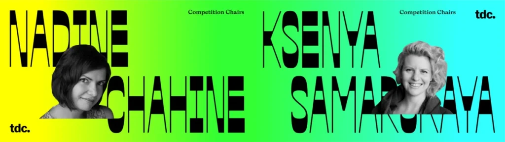

The Type Directors Club (TDC), a venerable institution in the design world, is undergoing a significant transformation as it prepares to host its 25th Typeface Design Competition. Under the co-chairmanship of Nadine Chahine and Ksenya Samarskaya, the competition is moving beyond its historical, often Western-centric, framework to embrace a more global and culturally diverse approach. This strategic shift aims to redefine what a design competition can be, fostering a broader sense of excellence and championing a wider array of typographic traditions.
A New Era for Typeface Design Competitions
For decades, design competitions have served as benchmarks for excellence and prestige. However, in the realm of typography, this often meant reinforcing established aesthetic norms and perpetuating a degree of gatekeeping, both geographically and financially. Recognizing these limitations, Chahine and Samarskaya are spearheading changes to make the TDC competition a more inclusive and representative platform.
"Competitions can at times act as a fig leaf for a sort of geographic and monetary gatekeeping that deters participation," noted Tanya George, the author of the original piece and an independent typographer and educator. "How can one judge excellence if a competition doesn’t allow all of the players onto the field?" This sentiment underpins the current efforts to democratize the competition and broaden its scope.

Responding to Industry Shifts and Past Challenges
The TDC has navigated a period of significant introspection, including well-documented challenges related to accusations of racism and financial insolvency in recent years. While neither Chahine nor Samarskaya were on the board during those specific events, their involvement signifies a commitment to addressing these issues and fostering a more equitable environment.
"We only have the external view of what was happening, at least for myself and the other judges," stated Nadine Chahine, reflecting on the period. "As I remember, we texted internally with the judges wondering, what is going on? Do we still want to judge? What does this mean?" She added that board members engaged with the judges, conveying the seriousness with which the accusations were taken. This led to a collective decision to continue judging, spurred by the organization’s apparent willingness to confront difficult issues and seek resolution.
Ksenya Samarskaya emphasized that these challenges are not unique to the TDC but are "industry-wide issues." She elaborated, "Dealing with diverse scripts is a large, complicated, nuanced set of problems to try to address. It’s a growth shift that’s happening overall in type design."
Expanding Horizons: New Categories and Global Inclusion
A cornerstone of the revamped competition is the expansion of categories to explicitly recognize and celebrate typefaces designed for global scripts. This move acknowledges the burgeoning talent and the increasing volume of high-quality work emerging from regions historically underserved by major international design awards.
"When I suggested we expand the categories, the insolvency was not on my mind," Chahine clarified. "The reasons we are expanding have to do with how the TDC needs to expand its mission for excellence in type design into a truly global mission. This is not a reaction to anything that might have happened in recent times. This is purely an evolution of where the TDC was going."
The initiative to create specialized categories for scripts like Arabic, Indic, and CJK (Chinese, Japanese, Korean) is a direct response to the growing number of submissions and winners from these regions in previous years. Historically, these scripts were often evaluated by general judges or consulted experts, but the increasing volume and sophistication of the work warranted dedicated recognition.
"It means a lot when the TDC says that we have a special category for Arabic or a special category for Indic or a special category for CJK," Chahine shared. "For me as an Arabic type designer, it means so much that there is recognition from the top institution for excellence in type design, that it says that we can have a special category for you because we are seeing interesting things coming and now there’s enough volume, so let’s give it the space and time."
The Art and Craft of Judging Typeface Design
The process of judging typeface design is inherently subjective, requiring a nuanced understanding of aesthetics, functionality, and cultural context. Chahine outlined a hierarchical approach to evaluating a typeface:

- Quality of Drawing: The foundational element, ensuring the letters are well-drawn, spaced, and technically executed.
- Inter-letter Relationships: Assessing how letters converse with each other to form coherent words and paragraphs, creating a unified system.
- Functionality and Feeling: Determining if the typeface effectively serves its intended purpose (e.g., text, display) and evokes the desired mood or emotion.
- The ‘Je Ne Sais Quoi’: The intangible quality that elevates a typeface, allowing it to communicate beyond its literal meaning and create a perfect harmony between language and form.
Samarskaya added that beyond technical excellence, her evaluation focuses on "what does it add to the conversation? How does it affect the ecosystem surrounding it? How does it push culture? What is it reflecting?" This broader perspective highlights the cultural significance of typography.
Assembling a Diverse Jury
A crucial aspect of ensuring fairness and inclusivity is the selection of judges. Chahine and Samarskaya have prioritized a diverse panel that reflects a wide range of experiences, perspectives, and geographical origins.
"What we’ve tried to achieve with the judges for this year is to bring a variety of voices within the list of experts," Chahine explained. This includes balancing experienced, mature designers with younger talent possessing different worldviews and life experiences. The goal is to "allow this variety of expression to come out" and to reflect the evolving nature of the world and how it influences design.
Samarskaya echoed this sentiment, stating, "It was balancing for contrast within everything—gender, style, point of view, background, region—with the hope that that would lead to interesting dialogue and conversation among the judges." This meticulous approach aims to foster rich debate and a more comprehensive evaluation of submissions.

Addressing Accessibility and Cost
Recognizing that cost can be a barrier to participation, the TDC has made efforts to ensure its competition remains accessible. The entry fees are among the lowest in the industry, with significant discounts for students and approximately 138 countries with lower per capita GDP.
"The TDC’s entry fees are some of the lowest in the industry," Samarskaya stated. "For all students it’s a $35 flat fee. We also have discounted rates for different countries… so there’re some 138 or so countries that automatically receive discounts upon checkout." She emphasized that the fees are designed not to be prohibitive, and the organization is open to communication regarding hardship.
Chahine further explained the necessity of the entry fees: "The competition is the main financier of everything the TDC does. How else can you function? So basically, when you are applying to the TDC competition, you are supporting the existence of the TDC. If there is no paid competition, there is no TDC." This revenue supports the organization’s operations, archives, paid staff, and the global exhibition of winning works.
The TDC’s Global Aspirations and Community Building
While historically based in New York, the TDC is actively working to expand its global reach and foster a more international community. This involves leveraging online platforms and seeking partnerships to bring exhibitions and discussions to new regions.
"When I ran for the board, I asked them to put as my aim in running for the board that I wanted the TDC to grow beyond the New York and US base to promote excellence and typography globally," Chahine revealed. This ambition is reflected in the increasing international participation in the competition, with entries received from 54 countries in 2020.
Samarskaya highlighted the organization’s commitment to inclusivity, noting the "discounts for approximately 138 countries with the lowest per capita GDP." She also clarified that the traditional requirement of printing and shipping physical copies has been eliminated, with entries now submitted digitally, further reducing barriers.
The TDC’s traveling exhibitions, though historically dependent on local partnerships, are a key component of its global outreach. The organization encourages interested parties in various regions to reach out to Carol Wahler, the Executive Director, to explore possibilities for hosting these exhibitions.
Future-Proofing the Competition
The TDC is keenly aware of the evolving landscape of type design, particularly with the rise of variable fonts and new technological advancements. While the current competition framework is considered adequate for showcasing variable fonts, the organization is committed to continuous adaptation.

"We are working on updating the categories, to adapt to what’s currently being done," Samarskaya said. "But I think by next year, there will be updated categories to reflect where type is seen and how it’s used today."
Chahine added that while technology like variable fonts presents new avenues for design, "At the heart of it, you are still designing masters." The focus remains on the fundamental principles of good type design, with efforts to refine how the variability of fonts can be showcased, potentially through animated GIFs or videos.
Ultimately, the TDC’s future-proofing strategy lies in its adaptability and the ongoing engagement of its members and volunteers. "The best way to future-proof, if we’re talking about that, is by having it be a living breathing organization," Samarskaya concluded. "Nothing we did this year is set in stone. It’s just one move toward what we’re seeing happening in the type world today."
The 25th TDC Typeface Design Competition represents a significant stride towards a more inclusive, globally aware, and dynamic future for the field of typography, promising to celebrate excellence in its broadest and most representative form.