
Since its inception in 1969, Ashton has stood as a foundational pillar of Quebec’s culinary landscape. As Canada’s first restaurant chain to specialize in poutine—the province’s quintessential comfort food—the brand became synonymous with the regional snack bar culture. For over half a century, the name Ashton evoked a specific sense of local pride and culinary heritage. However, by the early 2020s, the brand faced a precarious crossroads. Despite its historical significance, the chain’s physical infrastructure and brand identity had remained largely stagnant, failing to evolve alongside shifting consumer demographics and the heightened expectations of a modern dining public.
The 2022 acquisition of the company by Émily Adam and Jean-Christophe Lirette from founder Ashton Leblond marked a critical turning point for the 23-location enterprise. The transition was not merely a change in ownership but a strategic mandate to address systemic challenges. Internal assessments revealed a declining relevance among younger demographics, stagnant revenue growth, and a network of restaurants that were increasingly viewed as relics of a bygone era rather than vibrant community hubs. The new leadership recognized that to survive the next half-century, the brand required a comprehensive revitalization—a task they entrusted to the creative agency LG2.

A Legacy Reimagined: The Strategy Behind the Rebrand
The collaboration between Ashton’s new management and LG2 focused on balancing the delicate tension between tradition and modernity. The objective was to strip away the clutter that had accumulated over decades of operational drift, refining the brand into a streamlined, exportable model that retained its historical "snack bar" soul.
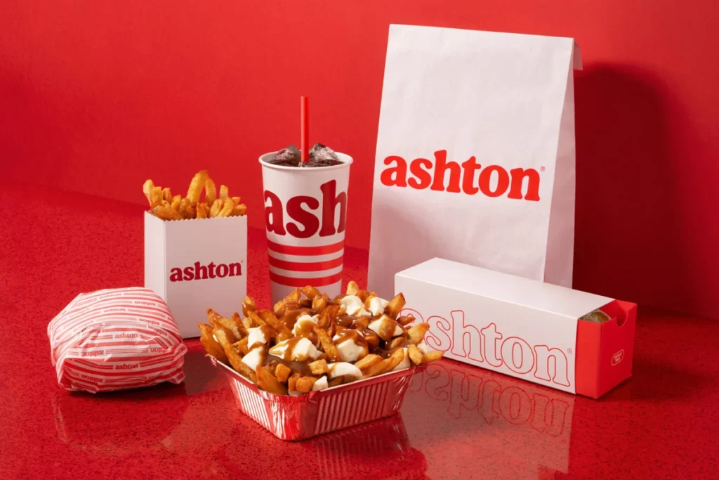
The revitalization project was rooted in a deep analysis of Ashton’s original brand DNA. The design team identified key visual markers from 1969—such as the distinctive neon lighting and the rustic, utilitarian aesthetic of the original food truck—and reinterpreted them through a contemporary lens. A central component of this redesign was the creation of a bespoke typographic signature, engineered to emphasize the indulgence and generosity inherent in the product. Simultaneously, the iconic Ashton red was updated to a more vibrant, cohesive palette, ensuring that every touchpoint—from the packaging to staff uniforms and promotional merchandise—communicated a unified, modernized brand story.
Chronology of Transformation
The rebranding initiative followed a phased approach, prioritizing the conversion of a flagship location to serve as a proof-of-concept for the rest of the chain.

- 1969: Ashton Leblond launches the first Ashton location, pioneering the specialized poutine chain model in Quebec.
- 2022: Émily Adam and Jean-Christophe Lirette acquire the brand with a mission to modernize operations and expand the footprint.
- Late 2022–2023: Strategic planning and brand audit conducted by LG2. Development of the new visual identity, focusing on a "retro-modern" aesthetic.
- 2024: Completion and launch of the first fully renovated flagship restaurant. The rollout of new packaging, uniforms, and interior design standards occurs in the first half of the year.
- Post-Launch: Immediate post-renovation data collection indicates a significant shift in consumer engagement metrics.
Supporting Data and Performance Metrics
The success of the rebranding effort was not merely aesthetic; it was reflected in concrete fiscal and operational performance indicators. Within the first 30 days following the launch of the renovated flagship restaurant, the chain recorded significant growth across multiple key performance indicators (KPIs).
Traffic to the location increased by 35%, a clear signal that the modernized aesthetic was successfully drawing in a demographic that had previously bypassed the aging infrastructure. Sales figures at the location rose by 34%, demonstrating that the aesthetic upgrade directly translated into higher transaction volume and, presumably, increased average ticket sizes. Furthermore, the brand’s digital footprint saw a 40% surge in website visits, suggesting that the "new" Ashton was successfully capturing interest through digital channels and social proof.
Operational and Environmental Design Shifts
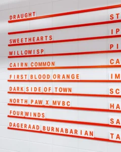
The redesign extended beyond the logo and color palette, fundamentally altering the customer experience within the physical space. The architecture of the new restaurants incorporates a "monochrome red" border, a design choice that guides the customer through the dining room while maintaining a visual connection to the brand’s history.

The integration of curved edges and neon-inspired elements throughout the interior was a deliberate attempt to pay homage to the original food truck origins while providing a clean, contemporary environment. The layout prioritizes the retention of the iconic banquettes, which remain the centerpiece of the seating area, signaling that while the brand has evolved, its core value of communal, comfort-based dining remains intact. This standardized, modular design approach is intentional; it allows the company to scale the renovation across the remaining locations with consistency, reducing the complexity of future site conversions.
Broader Implications for the Fast-Food Sector
The case of Ashton serves as a compelling study in brand equity management within the fast-food industry. For legacy brands, the risk of "fading into the background" is significant as consumer preferences shift toward cleaner, more digitally integrated, and socially conscious dining experiences.
The Ashton-LG2 partnership demonstrates that a successful rebrand does not require the abandonment of history; rather, it requires the distillation of that history into its most potent elements. By leaning into nostalgia—specifically through the use of early logo motifs on merchandise and the revival of 1960s design cues—the brand successfully courted the "retro-enthusiast" market while simultaneously signaling to younger, Gen Z and Millennial consumers that the brand is "current."

Moreover, the emphasis on a "locally rooted" identity serves as a defensive moat against larger, international fast-food chains. In a market where consumers are increasingly looking for authentic, local provenance, Ashton’s move to double down on its Quebecois roots—while upgrading its service standard—is a strategic play for long-term relevance.
Expert Analysis of the Brand Evolution
Industry analysts have noted that the 30-day performance spikes are indicative of a "curiosity effect" often seen in high-profile rebrands. However, the true test for the new management team will be sustaining these figures as the novelty wears off. The shift from a fragmented brand identity to a cohesive, exportable system provides the company with the necessary infrastructure to scale.
By simplifying the visual language of the brand, the owners have effectively lowered the barrier to entry for new, younger staff members who may have previously viewed the brand as "dated" or "stiff." In a labor market where talent retention is difficult, a refreshed brand image acts as a form of non-monetary compensation, pride, and belonging for employees.

Furthermore, the data suggests that the rebranding has effectively bridged the gap between the "diehard" fan base—who value the tradition of the original recipe—and new, younger customers who value the "vibe" and convenience of the modernized dining experience. The ability to appeal to both demographics simultaneously is the "secret sauce" that many legacy chains fail to secure.
Conclusion: A Blueprint for Legacy Chains
The transformation of Ashton is not just about a new coat of paint or a sharper logo. It is a comprehensive business pivot that uses design as a tool to solve operational, cultural, and financial stagnation. As the chain prepares to roll out these design changes to its remaining locations, the focus will likely shift from the initial "shock of the new" to long-term operational efficiency and brand consistency.
If the initial performance metrics are any indication, the gamble on a "retro-modern" identity has paid off. By treating its history as an asset rather than a liability, Ashton has provided a masterclass in how a legacy brand can reclaim its position in a hyper-competitive market. Whether this success can be replicated across the entirety of its 23-location network remains the next challenge, but for now, the brand has effectively secured a second lease on life. The transition confirms that even in an era of rapid technological change, the most effective way to reach the future is often to honor the past with precision and intent.