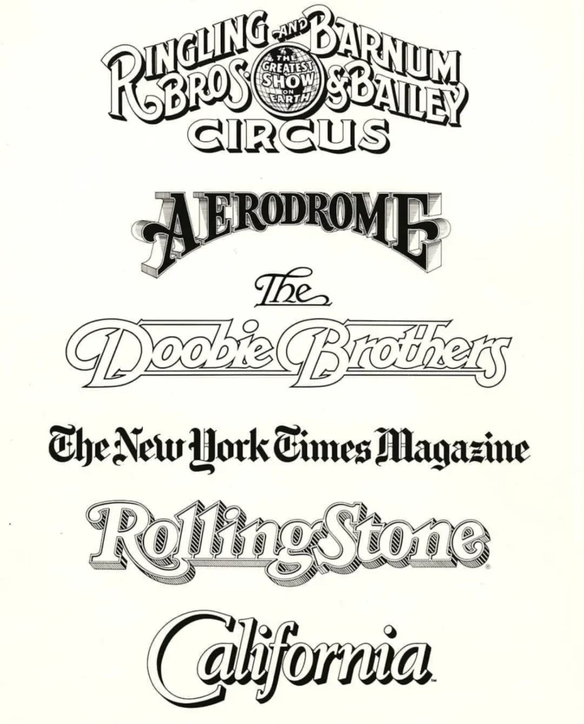

The design world is in mourning today following the passing of Jim Parkinson, an iconic figure whose hand-lettered aesthetic defined the visual identity of American journalism and pop culture for over five decades. Parkinson, a prolific type designer, lettering artist, and painter, died on June 26, 2025, at his home in Oakland, California, following a protracted battle with Alzheimer’s disease. He was 83. His death was confirmed by his wife, Dorothy A. Yule, a noted book artist who provided dedicated care for him throughout his illness.
Parkinson’s influence on the landscape of graphic design was profound. His work served as the connective tissue between the traditional craft of calligraphy and the digital revolution of type design. From the iconic mastheads of national newspapers to the logo identities of legendary musical acts, Parkinson’s career spanned a transformational era in media, during which he remained a steadfast proponent of the art of the human hand.
A Foundational Legacy: From Oakland to Hallmark
Born on October 23, 1941, in Oakland, California, Parkinson’s trajectory was set early by a unique childhood encounter. He lived across the street from Abraham Lincoln Paulsen, a renowned penman known for his gravity-defying calligraphic feats, including the ability to write the Gettysburg Address in reverse. This formative exposure to the power of the written word sparked a lifelong obsession. As a youth, Parkinson meticulously collected instructional lettering manuals and correspondence-school texts, creating a self-taught foundation that would later merge with formal education.
He enrolled at the California College of Arts and Crafts (CCAC), graduating in 1963. Following his studies, he ventured to Kansas City, Missouri, to join the creative team at Hallmark Cards. While his initial tenure involved the standard illustrative duties of the era, he quickly pivoted to the lettering department. This move proved to be the defining moment of his career; he realized that his technical precision and stylistic versatility made him an indispensable asset to a publishing industry increasingly reliant on bespoke typographic identity.
Chronology of a Prolific Career
Parkinson’s professional timeline reveals a relentless output that mirrored the evolution of 20th and 21st-century media:

- 1963: Graduates from the California College of Arts and Crafts and begins his career at Hallmark Cards.
- Late 1960s–1970s: Returns to Oakland to establish a freelance practice, quickly becoming the preferred collaborator for art directors at major national magazines.
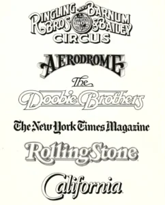
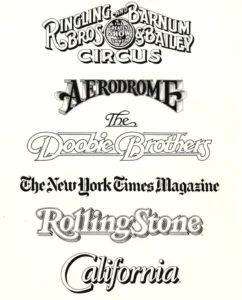
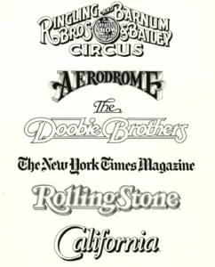
- 1970s–1980s: Solidifies his reputation by crafting iconic logos for musical groups such as The Doobie Brothers and creating enduring branding for the Ringling Bros. and Barnum & Bailey Circus.
- 1990s–2010s: Transitions successfully into the digital age, releasing both custom bespoke typefaces and retail fonts while continuing to refine the nameplates of major publications.
- 2020s: Continues to advocate for the value of hand-lettering even as automated tools and artificial intelligence begin to reshape the design industry.
- 2025: Passes away in Oakland, leaving behind an archive that is currently being preserved by the Letterform Archive.
Impact on Publication Design
Parkinson’s work is perhaps best recognized by the general public through his contributions to the newsstand. His nameplates for publications like Rolling Stone and the Los Angeles Times are not merely titles; they are brand anchors that helped these entities maintain their authority and visual relevance over decades. Art directors frequently commissioned Parkinson to refresh these mastheads, trusting his ability to honor the historical roots of a publication while updating the geometry of the letters to suit modern printing technologies.
Beyond his commercial work, Parkinson’s later years were marked by a transition into fine art. He developed a deep interest in the architectural history of the American West, specifically the decaying neon signage found in small towns and suburban strips. His paintings of these structures served as a poignant counterpoint to his commercial typography; while his fonts were clean, legible, and professional, his paintings were textured, atmospheric, and deeply nostalgic, capturing the "ghosts" of the mid-century American landscape.
Professional Philosophy and Mentorship
Colleagues and peers often cited Parkinson’s humility as his most defining trait. Despite his status as an industry legend, he remained accessible to emerging designers. Stephen Coles, a design historian and long-time acquaintance, noted that Parkinson frequently opened his home to visitors, sharing his vast collection of ephemera and original artwork with an infectious enthusiasm.
Parkinson subscribed to the mantra famously attributed to prima ballerina Margot Fonteyn: "Take your work seriously, but never yourself." This philosophy allowed him to navigate the high-pressure environment of New York and Los Angeles publishing with a characteristic levity that made him a favorite among collaborators. He avoided the "pedestal" effect often associated with master designers, preferring to engage in the collaborative, often messy, process of creation.
The Preservation of a Life’s Work
Recognizing the historical importance of his output, the Letterform Archive has announced that they will publish Parkinson’s memoir in 2026. This project is expected to serve as a comprehensive documentation of his design methodology, personal history, and the evolution of the trade. By capturing his story in his own words, the archives aim to ensure that his influence persists for generations of designers who may never have met him but who interact with his typefaces daily.
The publication of this memoir follows a broader trend in design history: the systematic preservation of the "analogue" era’s masters. As digital tools make type design increasingly accessible, the unique, manual craftsmanship of artists like Parkinson is being re-evaluated not just as a commercial skill, but as a critical cultural heritage.

Industry Reactions and Future Memorials
The design community has responded with an outpouring of tributes, acknowledging Parkinson’s role as a bridge between the physical and digital worlds. Industry organizations and design schools have begun coordinating tributes, with a formal memorial service expected to take place in the fall of 2025.
The family has requested that, in lieu of flowers, supporters consider making donations to the Alzheimer’s Association, a move that highlights the ongoing struggle faced by many families dealing with cognitive decline. The choice to direct support toward Alzheimer’s research underscores the personal toll the disease took on the final chapter of a man who, for over 50 years, used his hands to shape the way the world read.
Implications for the Future of Typography
The passing of Jim Parkinson marks the end of an era defined by the individual "master letterer." His career illustrates the transition from the drafting table to the screen, a shift that he navigated with more grace and technical proficiency than most of his contemporaries. The implications for the future of the field are significant: as the industry moves toward automated and AI-generated typography, the "Parkinsonian" approach—characterized by a deep knowledge of historical precedent, an eye for structural nuance, and a firm commitment to human-led design—stands as a necessary standard.
Jim Parkinson did not merely draw letters; he gave them character, weight, and history. His life serves as a testament to the idea that even in a rapidly digitizing world, the most enduring visual legacies are those born of patience, study, and the distinct, irreplaceable touch of a human hand. Whether it was the sharp serif of a newspaper headline or the vibrant, weathered glow of a painted neon sign, his work remains a permanent fixture of the American visual vocabulary.