
In March 2010, the Museum of Modern Art (MoMA) in New York announced a groundbreaking addition to its prestigious design collection: the symbol. This acquisition, lauded by Senior Curator Paola Antonelli as "momentous, elating," immediately sparked a profound discussion about the very nature of collecting and the evolving definition of design in the digital age. The symbol’s accession was particularly noteworthy as it involved no physical object and no monetary exchange, challenging traditional notions of ownership and possession within the museum context. Instead, MoMA credited Ray Tomlinson, the electrical engineer who, in 1971, famously selected the symbol to delineate user and host in email addresses. This curatorial decision was widely interpreted as a Duchampian gesture, elevating an ubiquitous, intangible element of digital communication to the status of art, further pushing the boundaries of what constitutes a collectible object.
The initial acquisition of the symbol set a precedent for MoMA’s expanding embrace of the digital and the conceptual. Less than a year later, in January 2011, the museum announced the acquisition of twenty-three digital typefaces. While the acquisition of specific typeface designs, such as Matthew Carter’s widely recognized Verdana, might appear more conventional than that of a symbolic glyph, it nonetheless presented a new set of challenges for museum practice. Unlike tangible objects like clocks or chairs, which have a clear physical presence and established market value, digital typefaces exist in a fundamentally different realm. This move signaled a significant departure from traditional museological practices, prompting a re-evaluation of how museums acquire, accession, and preserve non-material design assets.

A Paradigm Shift in Museum Collecting
MoMA’s strategic initiative to broaden its design holdings beyond traditional material artifacts has been a driving force behind these unconventional acquisitions. Paola Antonelli has been a leading proponent of this expansion, articulating a vision where physical possession is no longer a prerequisite for collection. In her 2010 announcement regarding the symbol, Antonelli stated, "physical possession of an object as a requirement for an acquisition is no longer necessary, and therefore it sets curators free to tag the world and acknowledge things that ‘cannot be had’—because they are in the air and belong to everybody and to no one, like the @—as art objects befitting MoMA’s collection." This philosophy extends to other universally recognized symbols, with MoMA later acquiring accession numbers for the radiation trefoil and the recycling symbol in 2015, further solidifying its commitment to collecting ideational and functional design elements.
This evolving approach to collecting raises fundamental questions about the role and definition of a museum. While the International Council of Museums (ICOM) has broadened its definition to encompass "the tangible and intangible heritage of humanity and its environment," MoMA’s position as a museum of art and design inherently involves a more complex consideration of these intangible acquisitions. The initial blog post announcing the symbol’s acquisition generated numerous critical comments, with many suspecting an early April Fool’s joke. Antonelli addressed these concerns through follow-up posts, outlining the criteria for an object’s worthiness for inclusion: form, function, innovation, cultural impact, process, and necessity. However, the legitimacy of applying the language of "acquisition" to elements that cannot be physically possessed remained a point of contention.
The Immateriality of Digital Typefaces
The acquisition of the twenty-three digital typefaces in 2011 further highlighted the complexities of collecting intangible design. These typefaces, alongside the symbol, were featured in the 2011–12 exhibition "Standard Deviations: Types and Families in Contemporary Design." For this exhibition, individual glyphs, phrases, and alphabets from each typeface were rendered directly onto the gallery walls. This marked a significant expansion from MoMA’s previous holdings, which, prior to 2011, included only one example of typeface design: a metal font of 36-point Helvetica Bold acquired in 2007.

A comparison of the catalog entries for the digital typefaces and the metal Helvetica font reveals the profound shift. The metal font is described by its material ("lead and wood tray") and precise dimensions in inches. In stark contrast, the digital typefaces are categorized simply as "digital typefaces," with their dimensions listed as "variable." This distinction underscores the fundamental difference: contemporary type designs are not discrete physical objects with fixed material properties.
A History of Dematerialization in Type Production
The history of type production itself reveals a progressive dematerialization, a trend that predates the digital age. This evolution can be broadly categorized into several overlapping eras:
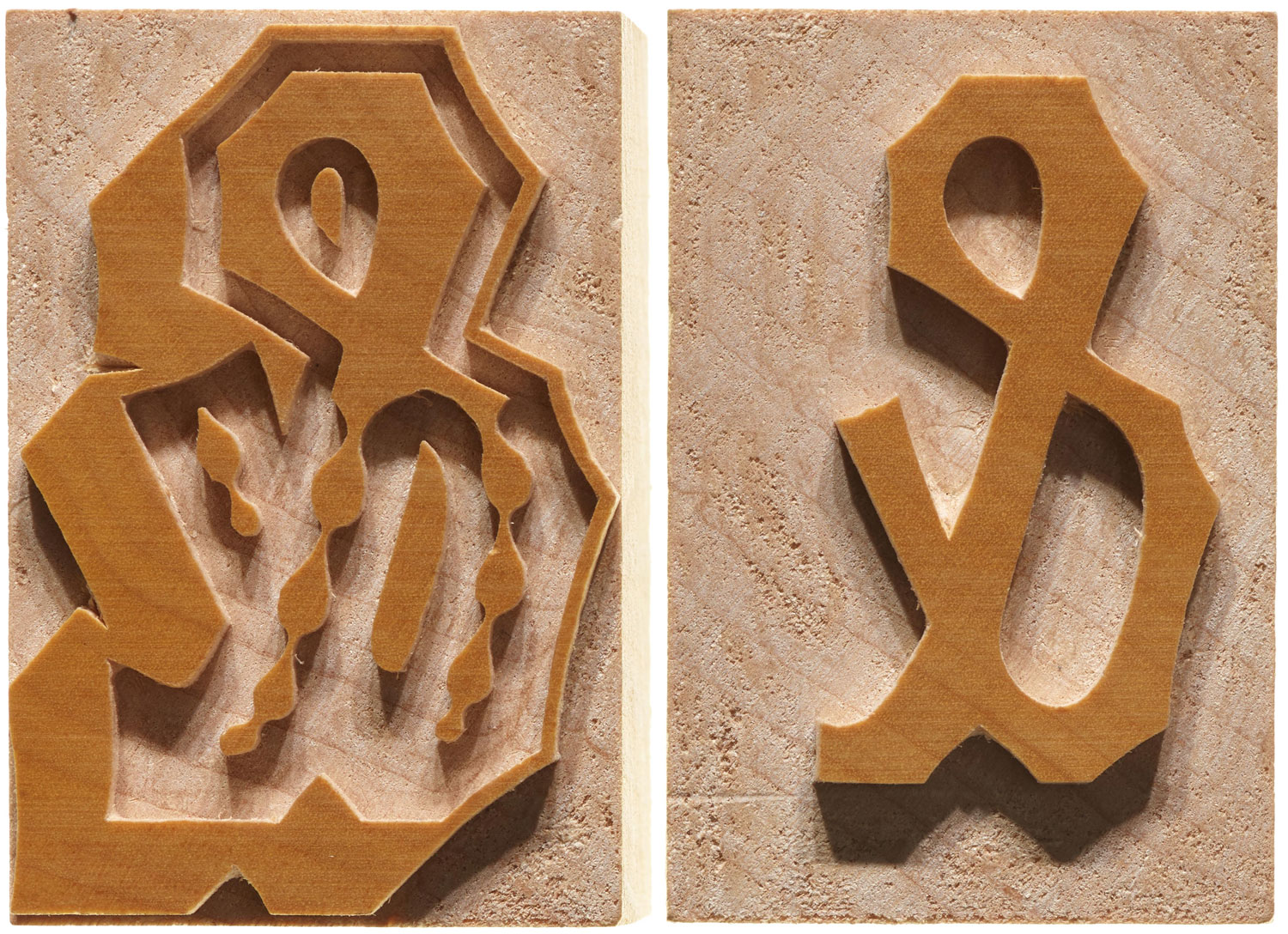
- Typefounding (15th Century onwards): The earliest era involved foundries casting letterforms from molten metal. The shapes were meticulously carved into punches by engravers, which were then struck into softer metal to create matrices. These matrices were used in hand molds to produce individual type sorts for printing. Johannes Gutenberg’s innovations in the 15th century marked the beginning of this era, with MoMA’s Helvetica font representing a late example of this foundry type.
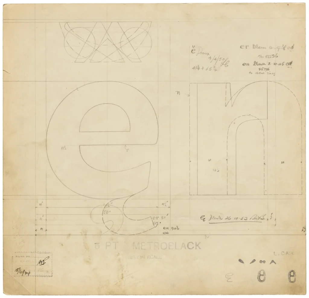
- The Pantograph Era (19th Century): The invention of the pantograph revolutionized type production by enabling pantographic punchcutting machines. These machines translated larger movements of a pointer into scaled-down movements of a cutting tool, allowing for the creation of punches, matrices, or wood-type sorts at any size by tracing a drawing. This era diminished the significance of a specific scale fixed by the creative process itself.
- Hot-Metal Typesetting (Early to Mid-20th Century): Manufacturers like Linotype and Monotype developed machines that cast metal type as needed at the printing site. The type sorts became ephemeral, melted down and recast after each printing job. This shift marked a loss of the type sort as an enduring product.
- Phototypesetting (Mid-20th Century onwards): Metal types began to be replaced by photographic technologies. In phototypesetting systems, type designs were no longer physical objects but images on a disk or strip exposed onto film by a strobe light. This transformation from a fixed-scale, three-dimensional object to a freely scalable two-dimensional image accelerated the dematerialization process.
- Digital Type Design (Late 20th Century onwards): The development of digital type represented the most radical departure. Contemporary typefaces are created within virtual design spaces using editing software and are output as computer instructions for rendering on screens or printers. This digital revolution completed the virtualization of type design.
Exhibitable Forms and the Nature of Type Design
The very essence of type design inherently confounds efforts to collect and represent it in a fixed physical form. Type design, by definition, involves shaping glyphs that can be endlessly recombined. The possibility of arbitrary sequences of glyphs is what distinguishes type design from lettering or calligraphy. A successful typeface is not solely judged by the aesthetic appeal of individual characters but also by their effective integration within any given sequence. Consequently, there is no single, definitive arrangement of letters that fully demonstrates a typeface’s design. While a poster featuring a typeface can serve as an example, it is more accurately considered an instance of typography rather than an embodiment of the type design itself. This inherent lack of a discrete, physical artifact that perfectly encapsulates a typeface design poses a significant challenge for museum collections and exhibitions.

MoMA’s approach to collecting physically uncollectible design elements is not unprecedented. The museum has a history of celebrating architecture, a discipline whose built achievements cannot be physically transported into its collections. Similarly, site-specific sculpture presents the same dilemma. In such cases, MoMA has acquired documentation of the designs, such as architectural models or preparatory sketches for remote artworks. For type design, analogous documentation might include drawings, sketches, specimens, and proofs. However, the museum’s 2011 acquisition did not involve ownership of these types of documentation but rather the typefaces themselves. In the "Standard Deviations" exhibition, printed examples of typefaces in use were displayed as ancillary material from the museum’s study collection, but the accessioned items were the typefaces above these displays, not the printed examples.
Ownership and the Nuances of Digital Licensing
The question of ownership becomes particularly complex when considering digital typeface designs. While graphic designers might colloquially say they "bought a font," in most instances, this is shorthand for purchasing a license to use it. The ease with which digital files can be duplicated has led to the widespread adoption of End User License Agreements (EULAs). These contracts control reproduction and sharing, thereby protecting the market value of type designs. EULAs explicitly state that ownership of the design’s intellectual property (IP) remains with the seller, with the user granted permission to install and use the file under specific conditions.
Crucially, EULAs do not discard the concept of ownership; rather, they assert it. The assertion of IP ownership is central to the EULA’s purpose, ensuring that ownership does not transfer with the licensing. This means that the "ownable" aspect of type design is its intellectual property. However, MoMA’s acquisition of the typeface designs did not include the associated intellectual property. Museum best practices, as outlined by organizations like ICOM and MoMA’s own collections management policy, stipulate that museums must confirm legal title and the owner’s willingness to transfer it for an acquisition. While MoMA’s catalog indicates that the typefaces were gifts from publishers or designers, the ownership of the design as intellectual property was not part of these gifts.

In the case of the twenty-three digital typefaces, the transaction involved specially drafted licenses for these gifts. These licenses were designed to circumvent the revocable usage rights often included in standard EULAs, aligning with the museum’s intention of permanent acquisition. This involved extensive negotiation to ensure permanent licenses were granted as donations. For proprietary designs like Matthew Carter’s Walker, which is exclusively used by the Walker Art Center, assent from both the manufacturer and the exclusive rights holder was necessary.
The Rationale Behind "Acquiring" Typefaces
Digital type designs present a unique challenge to the traditional concept of acquisition due to their virtual nature, their inherently variable form, and the non-transferability of their intellectual property. Yet, MoMA’s decision to "acquire" these designs and accession them into its collection can be understood by considering the implications of not doing so. If MoMA’s design department were to limit itself to physical, collectible objects, the entire digital creative landscape would remain outside its purview. Such a restriction would inevitably lead to obsolescence, contradicting the museum’s mission to engage with contemporaneity. As Antonelli has emphasized, "digital space is increasingly another space we live in."
Furthermore, while the font software programs themselves may not be unique, the acquisition process entails a commitment to preservation that MoMA takes seriously. The inevitable evolution of file types and hardware standards could render font files obsolete. Museum collection maintenance standards obligate institutions to ensure the accessibility of designs, even in the face of technological change. While the status of these digital typefaces as part of the collection may seem trivial in 2021, when many can be downloaded with ease, their long-term accessibility is a crucial consideration. As designer Jonathan Hoefler noted, "Digital artworks are prone to different kinds of damage than physical ones, but obsolescence is no less damaging to a typeface than earthquakes and floods to a painting." The fiction of ownership, therefore, brings with it a custodial responsibility that ensures these designs can manifest in material form for future generations.
The author acknowledges a lingering befuddlement regarding the acquisition of the symbol and the conceptual celebration of an operational Boeing 747. For the twenty-three digital type designs, the term "acquisition" is acknowledged as imprecise, given their reproducibility and the non-transfer of IP rights. This pragmatic, metaphorical extension of museological vocabulary, while perhaps necessary, is nevertheless imprecise.
The language of "collection," "acquisition," and "ownership" is rooted in an object-oriented epistemology. Type designs, however, are not material objects. By examining type design as a case study, the article highlights the unresolved contradictions within object-oriented museum practices. Ultimately, the focus may need to shift from the artifacts themselves to the broader purpose of the museum in its contemporary conception: an institution with a primary responsibility not just to artworks and designed objects, but to art and design in their broadest and most evolving forms.