
In the ever-evolving landscape of digital marketing, clarity often hinges on visual comprehension. Complex strategies, intricate funnels, and nuanced data points can become easily digestible when presented in a well-crafted diagram or chart. Recognizing this fundamental truth, a comprehensive collection of over 59 visuals, curated from more than 15 years of digital marketing expertise, has been compiled to illuminate some of the industry’s most challenging concepts. These diagrams, categorized into four key areas – Content Marketing, SEO and AI Search Optimization, Social Media and Influencer Marketing, and Web Design and Data Analytics – offer a powerful resource for marketers seeking to enhance their understanding and improve their campaigns.

The creators of this extensive visual library emphasize that these diagrams are not merely illustrative; they are intended as practical tools. Marketers are encouraged to integrate these visuals into their own content, provided they cite the source and link back to the original location of the image. For those requiring further textual context to accompany these visuals, a direct contribution can be requested, underscoring a commitment to fostering widespread understanding and application of effective marketing principles.
The Strategic Power of Content Marketing Visuals
Content marketing, at its core, is about creating and distributing valuable content to attract and retain a clearly defined audience. However, translating this broad objective into actionable strategies requires a clear understanding of various components, from content formats to promotional channels.
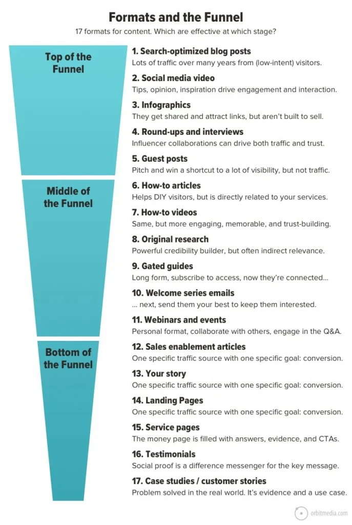
One pivotal visual, "Formats and the Funnel," illustrates how different content types align with distinct stages of the marketing funnel. This diagram highlights the strengths and weaknesses of various formats in attracting visitors and building trust, enabling marketers to strategically select and integrate them into their content mix for optimal results. This approach moves beyond a one-size-fits-all strategy, allowing for targeted content deployment that resonates with audiences at different points in their buyer journey.
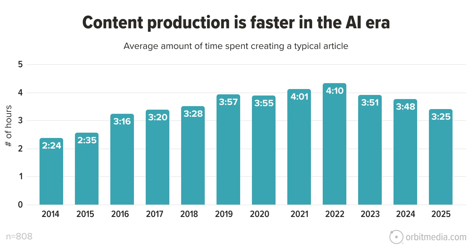
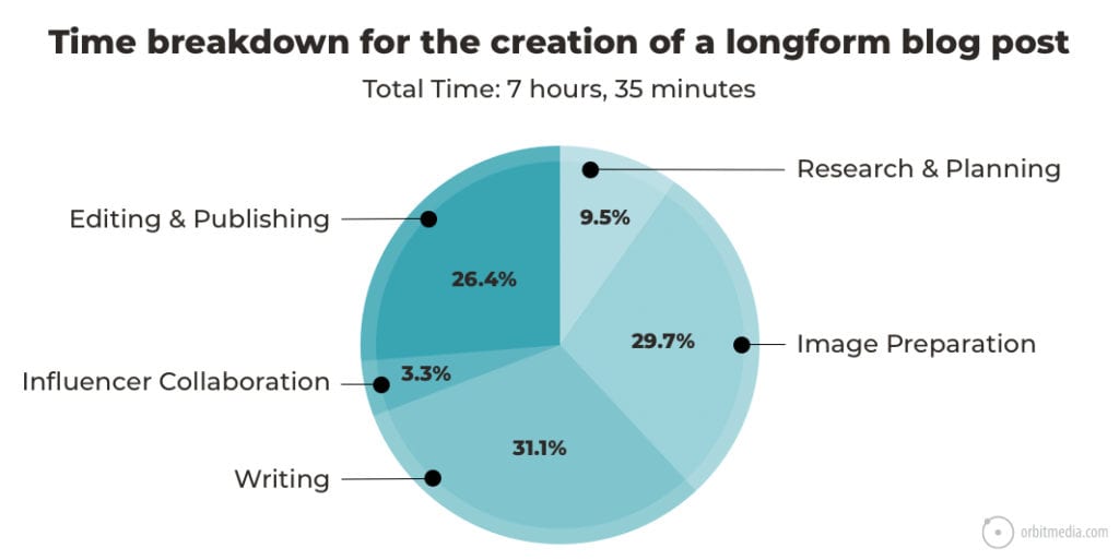
The time investment required for content creation is another critical factor demystified by these visuals. A chart from an annual blogger survey reveals the average hours spent crafting a single blog post, showing fluctuations over the years. For instance, data indicates a peak in time spent in 2022, followed by a slight decrease by 2025, suggesting evolving efficiency or perhaps a shift in content complexity. This insight is invaluable for resource allocation and setting realistic production timelines.
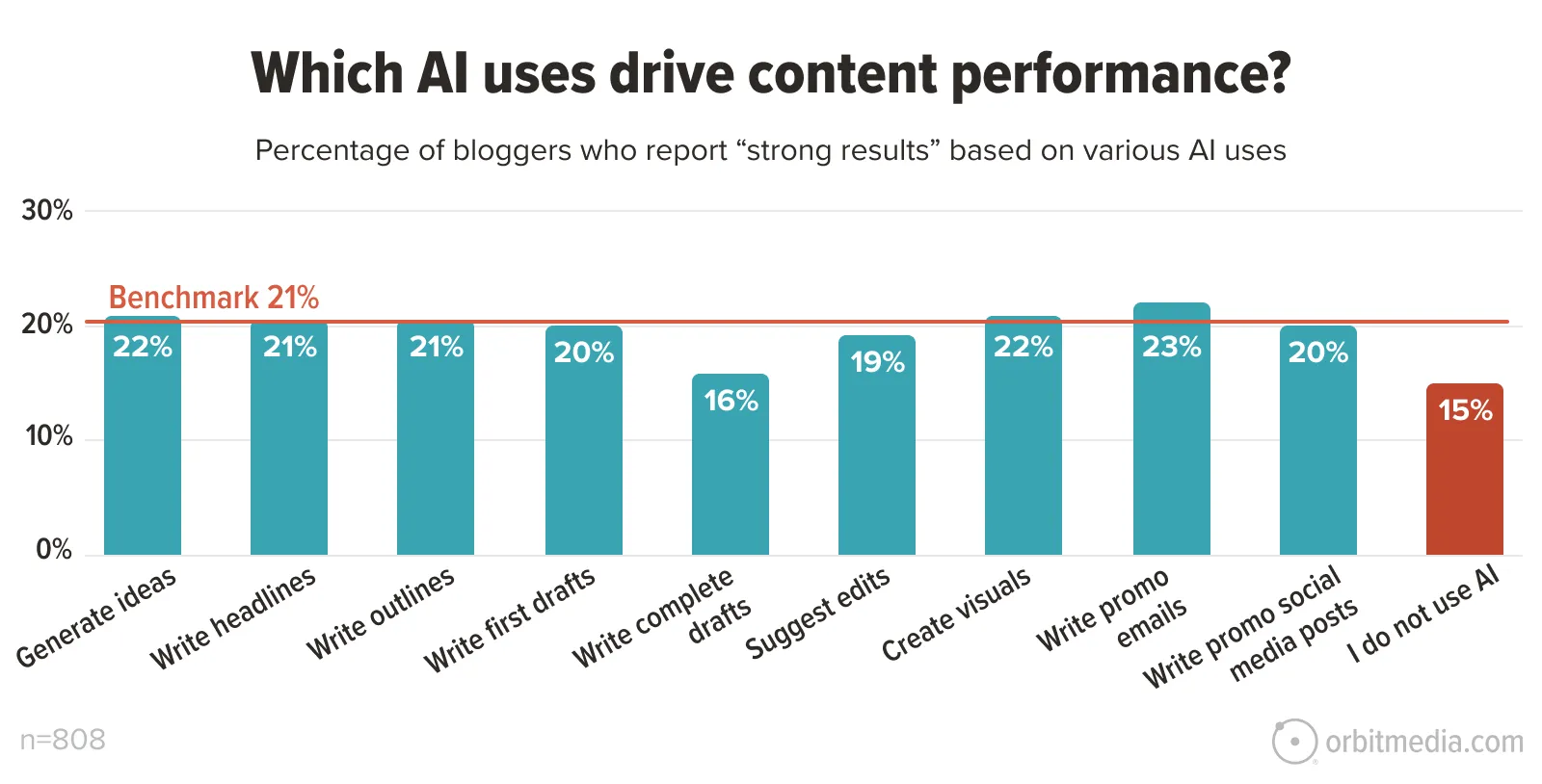
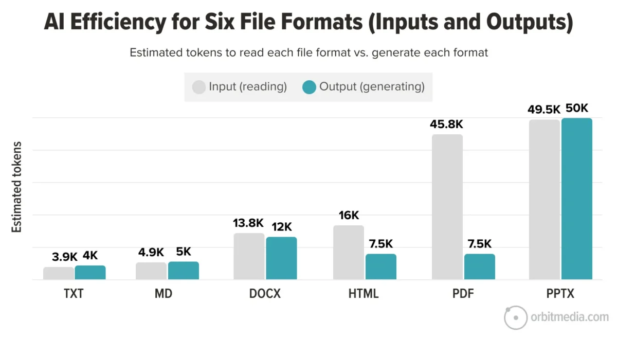
The integration of Artificial Intelligence (AI) into content marketing is a burgeoning area, and several diagrams address its impact. One chart specifically explores which AI use cases are driving the most significant results. It highlights that a balanced approach, rather than complete adoption or avoidance of AI, tends to yield the best outcomes. This nuanced perspective is crucial as marketers navigate the rapidly changing AI landscape. Further, a diagram on "AI efficiency: input and output formats" provides critical data on the computational resources consumed by different file types when processed by AI, offering insights into cost and environmental impact.
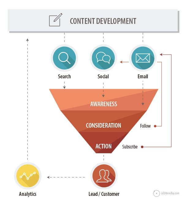
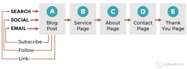
The promotional aspect of content marketing is also given significant visual attention. A diagram detailing "Content promotion channels and the funnel" breaks down how search, social media, and email marketing each contribute to different stages of the funnel. Search is positioned as a primary driver of awareness, social media bridges awareness and consideration, and email marketing solidifies consideration and drives action. This multi-faceted approach to promotion is essential for maximizing content reach and impact.
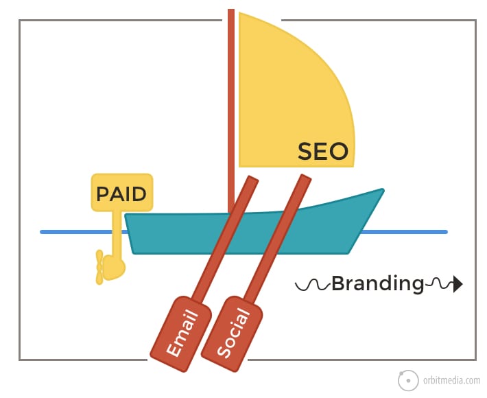
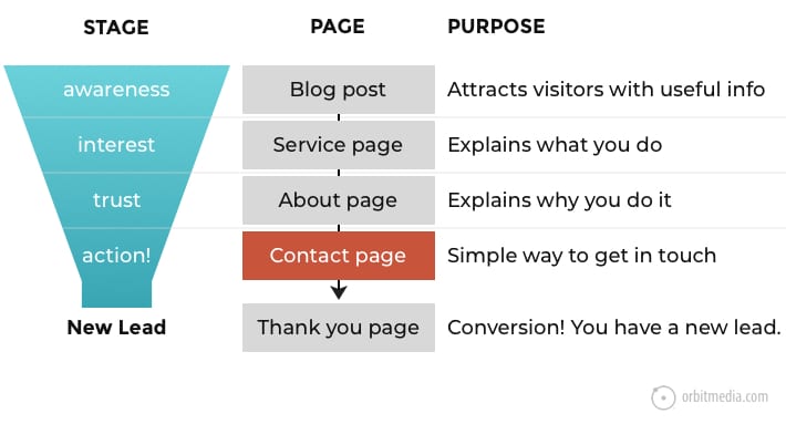
Furthermore, understanding website traffic sources is vital. A visual depicting traffic as "oars, sails, and motors" metaphorically explains the distinct roles of paid advertising, content marketing (SEO), email, and social media in driving visitors to a website, emphasizing that a combination of these elements creates a robust and sustainable traffic flow. The alignment of content with specific website pages, and the concept of a "virtuous cycle of blog traffic," are also visually represented, illustrating how consistent content creation and promotion can lead to sustained audience engagement and eventual lead generation.
A practical "Content Performance Matrix" offers a strategic framework for post-publication content management, categorizing content based on traffic and engagement levels into actionable strategies: Polish, Pursue, Pass, and Promote. This matrix provides a clear roadmap for optimizing existing content for maximum ROI.
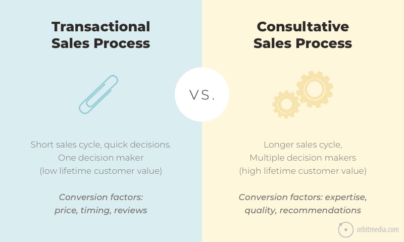
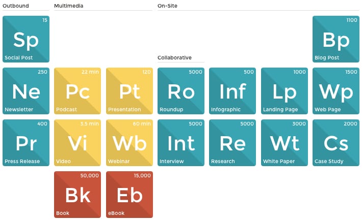
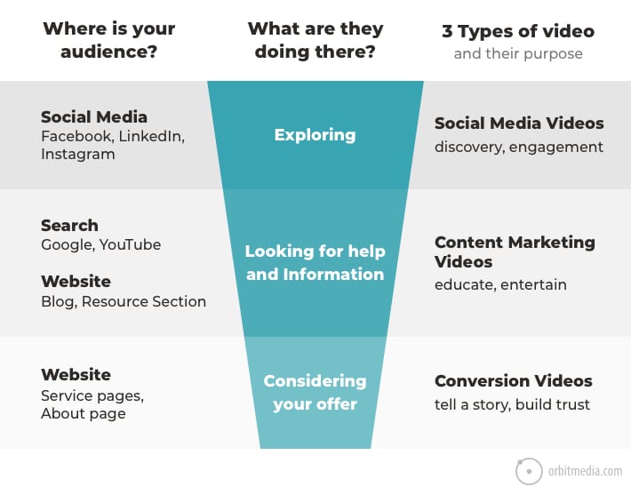
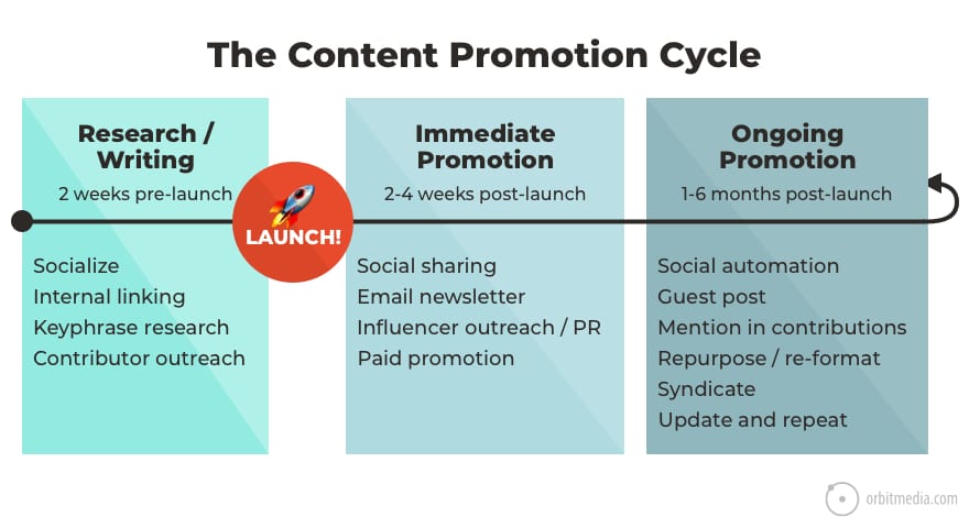
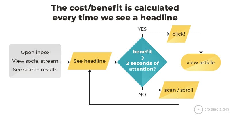
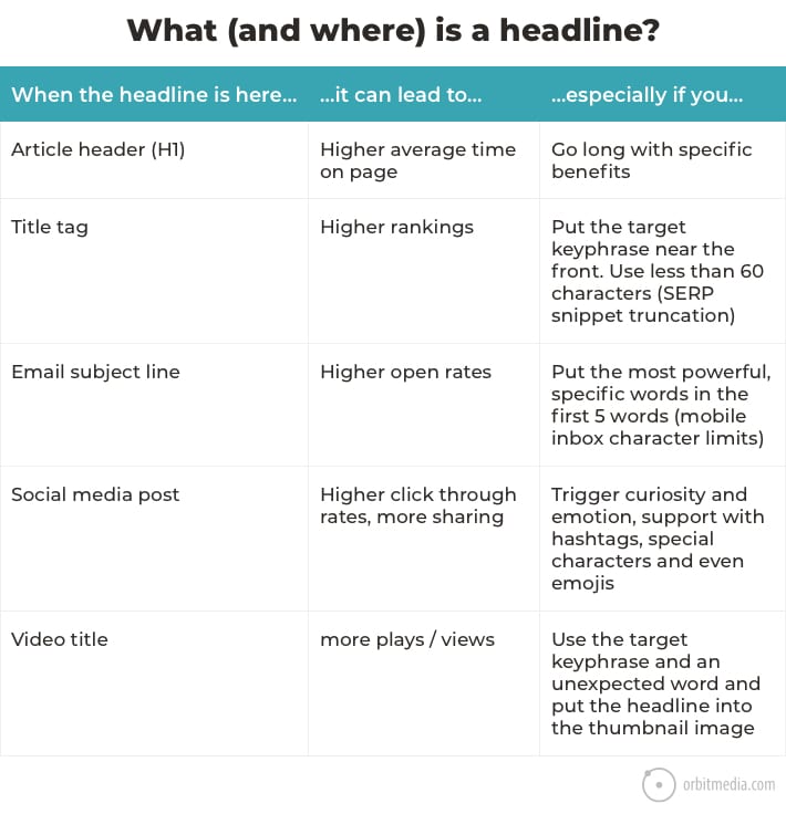
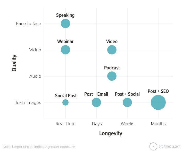
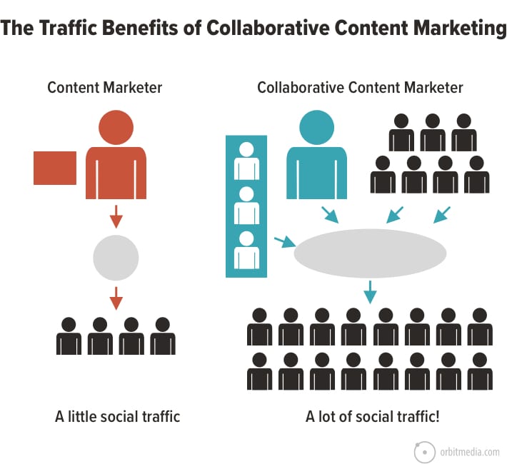
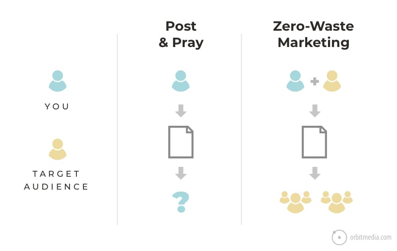
Finally, the distinction between transactional and consultative offerings, and the corresponding marketing approaches, is visualized. Similarly, the fundamental differences between brand marketing and performance marketing are clearly delineated, offering a foundational understanding for campaign strategy. The "Periodic Table of Content" serves as a comprehensive inventory of content formats, sparking ideas for repurposing and expansion. The three types of marketing videos and the content promotion cycle are also visually explained, reinforcing the importance of strategic planning and execution in content marketing success. The critical role of headlines is underscored by visuals explaining their cost-benefit analysis for readers and their varied forms across different digital platforms. Finally, the concepts of content quality versus longevity, and the benefits of collaborative content marketing and "zero-waste marketing" are all presented in easily understandable diagrams.
Navigating the Digital Frontier: SEO and AI Search Optimization Diagrams
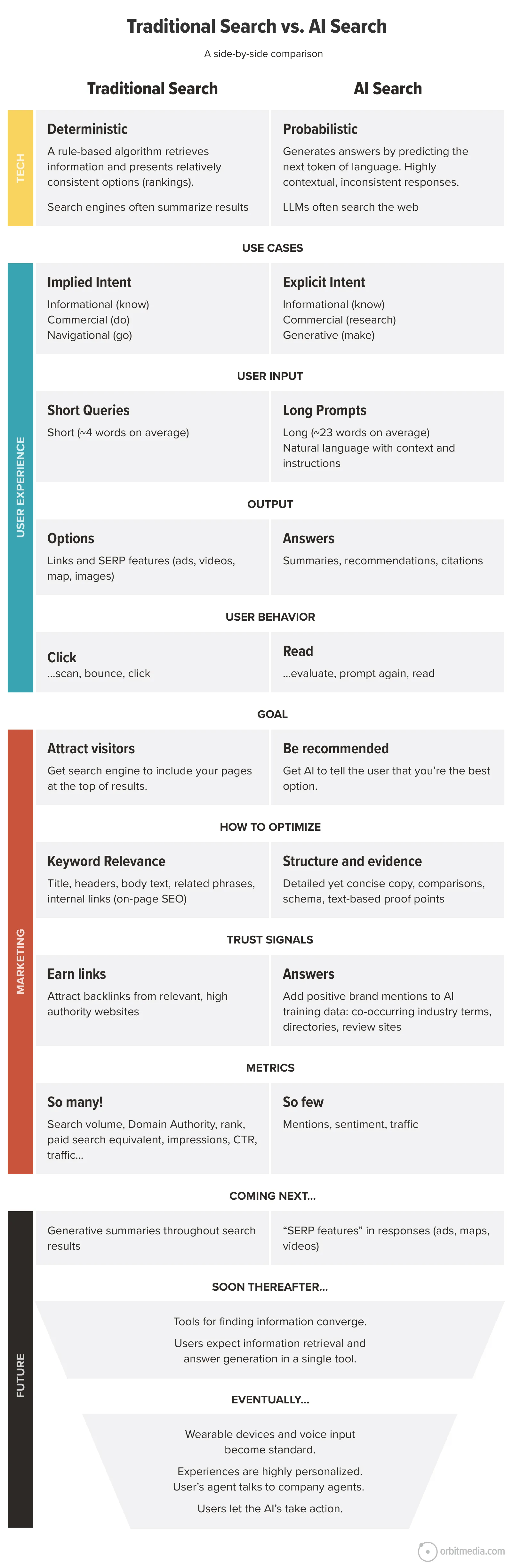
The realm of Search Engine Optimization (SEO) is inherently complex, and the advent of AI has further complicated the landscape. This section offers visuals that simplify these intricate concepts. A core comparison between "Traditional Search vs. AI Search" highlights the fundamental shift from ranking and clicking to recommendation and context. This shift has profound implications for how marketers approach visibility, trust, and optimization in the digital space. The visual breaks down these differences across technology, user experience, and marketing implications, providing a forward-looking perspective.

A crucial point of discussion within the SEO community is the nomenclature for AI-driven search optimization. A pie chart reveals the diverse terminology used, such as GEO, AEO, AI SEO, and LLMO, underscoring the lack of industry consensus on a definitive name. This highlights the nascent stage of this field and the ongoing evolution of terminology.
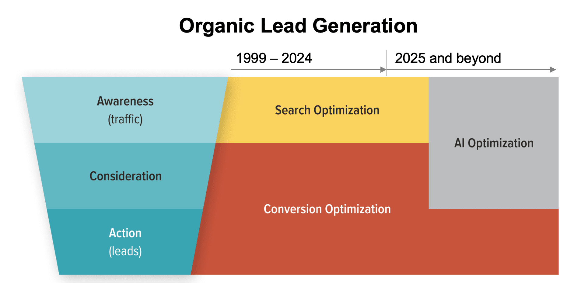
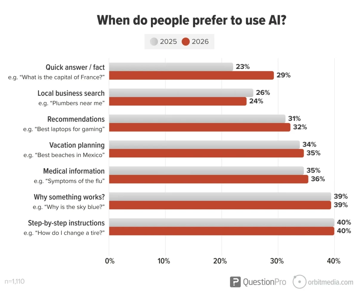
The impact of AI on organic lead generation is also explored. A funnel chart illustrates the changing user journey, where AI chat tools provide direct recommendations, moving beyond the traditional model of users clicking through multiple search results. This shift necessitates a re-evaluation of how businesses establish online presence and attract leads. Data also indicates a growing trend of users preferring AI chat tools for research, with projections showing a significant increase in AI usage compared to traditional search engines, particularly for tasks like step-by-step instructions and explanations. However, local search remains a stronghold for traditional SEO, as AI integration with mapping services is still developing.
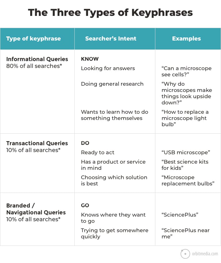
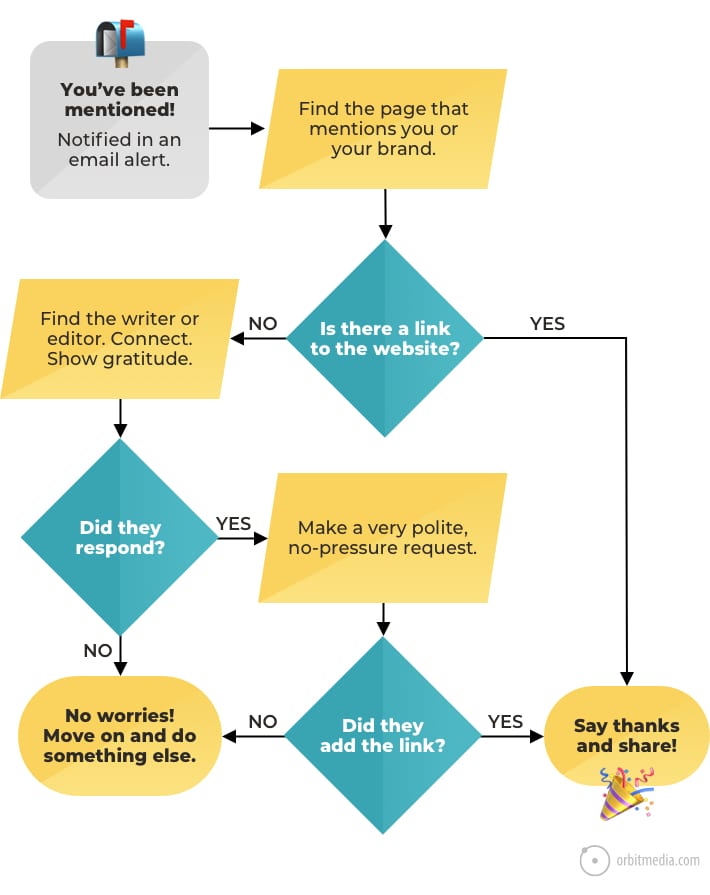
Understanding keyword strategy is fundamental to SEO, and several visuals address this. The "three types of keyphrases" – KNOW, DO, and GO – categorize search intent, guiding content creation and targeting. A simplified diagram of the "two main search ranking factors," authority and relevance, provides a foundational understanding of what drives search engine performance. The flowchart for "Link reclamation" offers a practical guide for turning brand mentions into valuable backlinks, a crucial aspect of off-page SEO.
The selection of effective keyphrases is visualized through a Venn diagram illustrating three key criteria: search volume, competition, and relevance. A correlation between "Domain Authority and keyphrase length" is also presented, suggesting that longer, more specific keyphrases can offer a competitive advantage for sites with lower domain authority. The value of a link is further dissected through a chart outlining seven factors that determine a link’s SEO worth. The impact of user interaction signals, such as "short vs. long clicks," on search rankings is also visually explained, emphasizing the importance of user engagement and dwell time.
Building Connections: Social Media and Influencer Marketing Diagrams
Social media marketing and influencer collaborations are cornerstones of modern digital strategy. This collection of visuals offers clarity on their complexities. A chart addressing "Which social media networks have the most spam?" provides valuable data on platform cleanliness, with Twitter/X showing a higher percentage of reported spam in recent years. This information is critical for advertisers and users alike to gauge platform trustworthiness and engagement quality.
The "Social Media ‘Rule of Thirds’" is a foundational concept, visually presented to illustrate the balance of promotional, educational, and engaging content necessary for a healthy social media presence. This framework helps marketers avoid over-saturation with promotional material and foster genuine community interaction.
The landscape of influencers is further clarified with a diagram outlining "The five types of influencers," ranging from micro-influencers to macro-influencers, and even acknowledging the growing role of nano-influencers. This categorization helps businesses identify the most appropriate partners for their campaigns. A related visual on "Influencer marketing strategy: Formats and outcomes" details how different influencer collaborations on various channels can lead to distinct results, from increased traffic to lead generation.
The impact of influencers on search engine rankings is also visually explained, highlighting how influencer-driven content and backlinks contribute to Domain Authority and improved search visibility. Finally, a practical guide to "Profile picture best practices" offers actionable advice for creating professional and recognizable online personas, a small but significant detail in building credibility across platforms.
Mastering the Inbox: Email Marketing Diagrams
Email marketing remains a potent channel for direct communication, and these diagrams aim to optimize its effectiveness. A visual on "The three main factors in email open rates" – sender name, subject line, and preheader text – provides a clear and actionable guide for improving inbox engagement without incurring additional costs. This focuses on the fundamental elements that capture a subscriber’s initial attention.
Optimizing for the mobile inbox is addressed with a diagram on "Email subject lines for the mobile inbox," emphasizing the importance of placing compelling words within the first five characters to account for truncation. This practical tip can significantly impact click-through rates on mobile devices.
The effectiveness of email signup forms is also visualized. A comparison of different signup boxes highlights the benefits of incorporating the "three Ps" – proposition, proof, and prompt – to increase conversion rates and accelerate list growth. Furthermore, a diagram on "Email engagement vs. website engagement" explains how to use campaign tracking codes to connect email performance directly to website analytics, enabling a more holistic understanding of the customer journey and marketing ROI.

Designing for Impact: Web Design and UX Diagrams
The effectiveness of a website hinges on its design and user experience (UX). This section provides visuals that illuminate key principles. The "psychology of conversion" is explained through a diagram illustrating the balance between visitor motivation and friction, emphasizing that clarity and ease of use are paramount to driving desired actions.
The importance of building trust through "evidence on webpages" is visually demonstrated by contrasting unsupported claims with pages that leverage testimonials, data, and awards. This visual reinforces the power of social proof in converting visitors. Best practices for essential website pages like "Contact pages" and "About Us pages" are also presented, with diagrams showcasing elements that enhance usability, clarity, and connection with visitors.

Homepage design is addressed with a visual emphasizing "quick communication with descriptive labels" to immediately answer the visitor’s question: "Am I in the right place?" Service page design is broken down into a "13-point checklist," offering a comprehensive guide to creating pages that emulate a sales conversation. The anatomy of a "great testimonial" is also visualized, highlighting the impact of including logos, headlines, and relevant keywords.
Visual design principles are made accessible through diagrams on "Color and visual prominence," explaining how complementary colors create contrast to guide the eye, and "The laws of visual hierarchy," which illustrate how position, size, and whitespace influence user attention. Finally, a diagram on "Web design standards" provides data on the prevalence of common website features, and another on "Making calls to action personal" demonstrates how incorporating faces near CTAs can improve click-through rates.
Decoding the Data: Data-Driven Marketing and Google Analytics Diagrams
Measurement is fundamental to digital marketing success, and these visuals simplify the complex world of data analytics. A diagram on "How to make marketing decisions using data" distinguishes between mere reporting and actionable analysis, emphasizing that analytics should serve as a decision support tool. The process of "Hypothesis formation" is visualized as a flowchart, guiding marketers from identifying potential issues to testing and validating solutions with data.
Beyond analytics, "Sources (and quality) of marketing insights" are explored, illustrating that valuable information can be gleaned from various channels, not just website traffic data. A comprehensive chart on "The 12 types of marketing research methods" expands the understanding of data collection beyond digital analytics, offering a broader toolkit for marketers.
The collection concludes with a visual on "How to use visuals in your marketing," reiterating their power to drive metrics across every stage of the marketing funnel, from email and social media to search and lead generation. This final diagram encapsulates the overarching theme of the resource: the unparalleled ability of visuals to demystify and enhance digital marketing strategies.


