

May 2026 marked a significant period for web development, with major browser vendors rolling out a suite of powerful new features to their stable channels and previewing exciting advancements in their beta releases. These updates, encompassing CSS enhancements, performance optimizations, and expanded API capabilities, collectively push the boundaries of what is possible on the web, offering developers more sophisticated tools for creating dynamic, responsive, and performant user experiences. The concerted effort by Chrome, Firefox, and Safari to standardize these features underscores a continued commitment to fostering an innovative and robust web platform.
Major Stable Browser Releases: A Deep Dive into May’s Innovations
The month saw the release of Chrome 148, Firefox 151, and Safari 26.5 to their stable channels, bringing a wealth of new functionalities directly into the hands of users and developers. These releases solidify several previously experimental features as "Baseline Newly Available," a crucial milestone indicating broad cross-browser support and reliability for mainstream adoption.
CSS Enhancements for Dynamic Interfaces
One of the most anticipated areas of advancement in May’s stable releases centered on CSS, providing developers with more granular control over styling and responsiveness.
The :open Pseudo-Class: Semantic State Management
Safari 26.5, while primarily a maintenance release, delivered a notable CSS enhancement with the full support for the :open pseudo-class. This addition achieves "Baseline Newly Available" status, meaning it can now be reliably used across all modern browsers. The :open pseudo-class provides a cleaner, more semantic way to style elements that possess distinct "open" and "closed" states. Historically, developers often resorted to attribute selectors like details[open] or relied on JavaScript to toggle classes to style elements such as <details> disclosure widgets or <dialog> modals when they were active. The :open pseudo-class simplifies this by allowing direct styling of these elements—and others like <select> dropdowns or <input> color/date pickers when their picker interfaces are displayed—when they are in their open state. This not only streamlines CSS code but also aligns with the platform’s move towards more declarative and semantic styling patterns, reducing the need for verbose JavaScript workarounds and improving code readability and maintainability. Its inclusion signifies a refinement in how interactive component states are managed directly within CSS.
Revolutionizing Responsive Design: Name-Only Container Queries
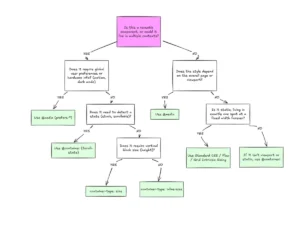
Chrome 148’s release brought a substantial evolution to responsive design with the "Baseline Newly Available" status of name-only container queries. This feature represents a significant leap forward from traditional media queries, which only respond to viewport dimensions. Container queries, by contrast, allow components to adapt based on the size or style of their parent container, fostering a truly component-driven approach to web development. Previously, implementing a container query necessitated specifying both a size or style query condition and establishing the container’s type using the container-type property. With name-only container queries, developers can now query the presence of a named container simply by its name, without requiring an additional condition. Furthermore, the container-type property on the ancestor is no longer strictly necessary if the query is solely based on the container’s name. This simplification greatly enhances the flexibility and ease of use of container queries, making it more straightforward to build encapsulated, adaptable components. For instance, a component can now adjust its layout simply because it’s inside a named --sidebar container, without needing to know the sidebar’s specific width. This paradigm shift empowers developers to create more resilient and reusable UI components that respond contextually, a long-sought capability in modern web architecture.
#container
  container-name: --sidebar;


@container --sidebar
  .content
    padding: 2rem;
This example illustrates how a .content element inside a container named --sidebar can have its padding adjusted without needing to specify a size condition, simplifying the responsive logic.
Advanced Styling with Custom Property Container Queries
Complementing the advancements in container queries, Firefox 151 introduced full support for style() queries on @container, achieving "Baseline Newly Available" status for container style queries based on custom properties. While size-based container queries are incredibly powerful, style queries extend this capability by allowing elements to apply styles based on the CSS properties of a parent container—not just its dimensions. This specific update brings full cross-browser support for querying custom properties, unlocking new levels of thematic and contextual styling. Developers can now, for example, check if a custom property --theme is set to dark on a parent container and apply corresponding styles to its children. This capability is transformative for implementing dynamic theming, component variations, or A/B testing directly within CSS, without the need for JavaScript to inspect or apply classes based on parent styles. It allows for a more declarative and efficient way to manage design systems and contextual adaptations, significantly reducing complexity in large-scale applications.
@container style(--theme: dark)
  .card
    background-color: #1a1a1a;
    color: #fff;
This snippet demonstrates how a .card component can dynamically adapt its appearance based on a custom --theme property set on an ancestor, illustrating the power of context-aware styling.
Performance and Media Optimization
Beyond styling, May’s stable releases also delivered crucial updates aimed at improving web performance and user experience, particularly concerning media handling.
Native Lazy Loading for Audio and Video: A Performance Boost
Chrome 148 significantly enhanced web performance by introducing native lazy loading for <video> and <audio> elements, utilizing the familiar loading="lazy" attribute. This feature, previously available for <img> and <iframe> elements, allows browsers to defer the loading of media resources until they are close to the user’s viewport. The impact on page load performance is substantial: pages with numerous media elements can now load significantly faster, as the browser only fetches essential content initially. This translates to reduced bandwidth consumption, lower data usage for users, and a snappier initial user experience, especially on mobile networks or pages rich in multimedia content. Studies on image lazy loading have shown page load time improvements of 20-30% for media-heavy pages, and similar benefits are expected for audio and video. This standardization of lazy loading across key media types reinforces the industry’s focus on building a faster, more efficient web. Developers can now implement this critical performance optimization with a simple HTML attribute, eliminating the need for complex JavaScript-based lazy loading libraries and ensuring a consistent, browser-optimized approach.

Expanding Web Capabilities: New APIs
The scope of web applications continued to broaden with new APIs enabling richer interactions and hardware integration.
Document Picture-in-Picture: Beyond Video Overlays
Firefox 151 rolled out support for the Document Picture-in-Picture API on desktop platforms, marking a pivotal moment for interactive web experiences. Unlike the standard Picture-in-Picture API, which is limited to displaying a <video> element in an always-on-top window, the Document Picture-in-Picture API empowers developers to open a separate, always-on-top window containing arbitrary HTML content. This distinction is critical, as it unlocks a vast array of possibilities for creating highly interactive and persistent overlays. Use cases include sophisticated video conference participant grids that remain visible while users navigate other tabs, interactive stock tickers that update in real-time, or customizable timers and productivity tools that persist even when the user moves away from the originating webpage. This API effectively allows web applications to create mini-applications that float above the main browser window, enhancing multitasking capabilities and user engagement for complex web services. Its introduction signifies a move towards the web platform supporting more desktop-like application behaviors, blurring the lines between native and web applications.
Bridging Web and Hardware: The Web Serial API
May 2026 also saw a significant expansion of the Web Serial API’s platform support. Firefox 151 added support for the API on desktop platforms, while Chrome 148 extended its reach to Android devices. The Web Serial API provides a standardized and secure way for websites to read from and write to serial devices, opening the web to direct interaction with a myriad of hardware. This includes microcontrollers like Arduino, 3D printers, development boards, and various peripheral hardware. This capability is transformative for educational tools, industrial control interfaces, and consumer electronics applications, allowing web browsers to act as universal interfaces for a wide range of devices. A notable aspect of Firefox’s implementation is the requirement for users to install a synthetically generated site permission add-on. This security measure ensures that access to serial devices is explicitly granted and managed by the user, maintaining a safe and controlled environment for hardware interaction. The broader availability of this API signifies the web platform’s increasing ability to interact with the physical world, fostering innovation in areas like IoT, robotics, and custom hardware control directly from a browser.
Glimpse into the Future: Beta Browser Releases
Beyond the stable releases, May also offered a preview of upcoming features through beta versions. Chrome 149 and Firefox 152 entered beta, hinting at the next wave of innovations destined for the stable channel. Safari did not have a public beta release this month.
Chrome 149 Beta: Innovations in CSS and Core Web Features
Chrome 149 beta unveiled several exciting CSS updates, particularly in layout and graphics. CSS gap decorations emerged as a notable feature, allowing developers to style the whitespace (gaps) between flex and grid items. This provides a new level of aesthetic control over layout, enabling designers to apply borders, backgrounds, or shadows directly to the spaces between elements, previously a challenging task requiring complex workarounds. Furthermore, Chrome 149 beta expanded support for advanced shape functions in the shape-outside property, including path(), shape(), rect(), and xywh() basic shape functions. These additions offer enhanced control over text wrapping around non-rectangular shapes, empowering more creative and dynamic web layouts. The path-length CSS property was also introduced, providing a way to query the total length of an SVG path, which can be useful for animations or layout calculations.
On the API front, programmatic scroll methods such as scrollTo(), scrollBy(), and scrollIntoView() are set to return Promises that resolve only when smooth scrolling completes. This update provides developers with more precise control over scroll animations, allowing for more reliable sequencing of actions post-scroll. A significant performance improvement is also expected with pages featuring active WebSocket connections now qualifying for back/forward caching (BFCache). Historically, WebSocket connections often prevented pages from being cached by BFCache, leading to slower navigations when users returned to a previously visited page. This change promises a smoother and faster browsing experience, particularly for real-time applications.
Firefox 152 Beta: Enhancing Form Controls and Notifications
Firefox 152 beta introduced full support for the field-sizing property, a practical CSS addition that allows form controls to automatically adjust their size to fit their contents. This feature will improve the responsiveness and user experience of forms, reducing the need for manual sizing or JavaScript solutions to ensure input fields accommodate user-entered text without overflow. The beta also enhanced the Notification interface by adding actions and maxActions properties, giving developers more control over interactive notifications. This enables richer, actionable notifications that can prompt users to perform specific tasks directly from the notification itself, improving engagement with web applications. Lastly, options.pseudoElement support was added to Element.getAnimations(), providing a more comprehensive way to inspect and control animations applied to pseudo-elements, crucial for complex CSS animations and transitions.
Broader Implications for the Web Platform
The updates in May 2026 reflect several overarching trends in web development. The "Baseline Newly Available" status for many features highlights the maturation of the web platform, with browser vendors achieving consensus and consistent implementation. This consistency is vital for developers, as it reduces fragmentation and allows for greater confidence in deploying new features.
The continued evolution of CSS, particularly with advanced container queries and gap decorations, signals a move towards more powerful, component-oriented, and context-aware styling capabilities. This empowers designers and developers to build highly adaptable UIs with less reliance on complex JavaScript logic, promoting cleaner codebases and more efficient development workflows. The emphasis on performance, exemplified by native lazy loading for audio and video, underscores the industry’s commitment to delivering fast and efficient user experiences, recognizing that performance is a critical factor in user retention and satisfaction.
Furthermore, the expansion of powerful APIs like Document Picture-in-Picture and Web Serial API demonstrates the web platform’s ambition to rival native applications in terms of functionality and hardware integration. These APIs open doors to entirely new categories of web applications, from enhanced productivity tools to direct hardware control, pushing the web beyond its traditional boundaries.
In conclusion, May 2026 was a pivotal month for the web platform, marked by a wave of significant advancements in stable browsers and promising previews in beta channels. These updates collectively enhance developer capabilities, streamline workflows, improve performance, and expand the functional scope of web applications, ensuring the web remains a dynamic and increasingly powerful platform for innovation. The ongoing collaboration and commitment from browser vendors to deliver these features are instrumental in shaping the future of the internet, empowering developers to create more immersive, efficient, and interactive experiences for users worldwide.