
Jim Parkinson, the preeminent American letterer, type designer, and painter whose work shaped the visual identity of iconic publications and global brands for over half a century, passed away on June 26, 2025, at his home in Oakland, California. His death follows a prolonged battle with Alzheimer’s disease. He was 83 years old. Parkinson leaves behind an indelible mark on the landscape of graphic design, having bridged the gap between traditional manual craftsmanship and the digital evolution of typography. He is survived by his wife, the noted book artist Dorothy A. Yule, who served as his primary caregiver throughout his final years.
A Foundational Fascination
Born in Oakland on October 23, 1941, Parkinson’s trajectory toward design was sparked by a singular, formative influence in his childhood. He grew up across the street from Abraham Lincoln Paulsen, a master penman celebrated for his technical prowess, including the ability to reproduce the Gettysburg Address in reverse and upside down using only the numeral "2." This early exposure to the mechanics of lettering captivated the young Parkinson, who spent his formative years collecting historical lettering manuals and correspondence-school texts. These vintage resources provided the foundation for a career-long commitment to historical styles, which he would eventually reinterpret through a modern, versatile lens.
After graduating from the California College of Arts and Crafts in 1963, Parkinson relocated to Kansas City, Missouri, to join the creative staff at Hallmark Cards. While his initial tenure involved illustration work, he soon transitioned into the firm’s specialized lettering department. This period proved to be a defining turning point, confirming that his aptitude for hand-rendered letterforms was not merely a talent but a professional vocation.
Chronology of a Prolific Career
Following his tenure at Hallmark, Parkinson returned to the San Francisco Bay Area to establish an independent freelance career. Over the next five decades, his output would define the aesthetic of American media:

- 1960s–1970s: Established his reputation as a master of bespoke lettering, transitioning from commercial illustration to specialized typography.
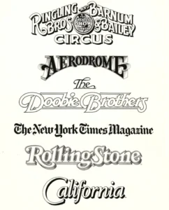
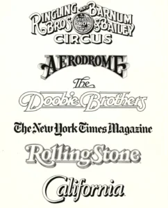
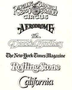
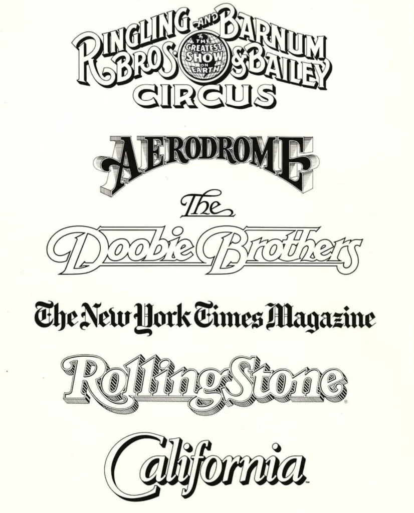
- 1980s–1990s: Gained international acclaim as the "go-to" designer for magazine redesigns, providing custom nameplates for major publications including Rolling Stone, the Los Angeles Times, and California magazine.
- 2000s: Embraced the transition to digital type design while maintaining his roots in analog craftsmanship. He became a fixture of the Oakland design community, mentoring younger designers and opening his archives to students and historians.
- 2010–2025: Focused on both digital font retail and fine art painting, specifically capturing the decay and aesthetic of vintage neon signage throughout the American West.
The Scope of an Iconic Portfolio
Parkinson’s portfolio represents a significant segment of 20th and 21st-century visual culture. His work for the Ringling Bros. and Barnum & Bailey Circus, alongside his iconic logo designs for The Doobie Brothers, demonstrated an uncanny ability to adapt his style to the requirements of the client while maintaining a distinct, high-quality finish.
His influence extended to the newsstand, where his redesigns of mastheads and headlines were instrumental in the branding strategies of major periodicals. Art directors frequently sought out Parkinson to refresh stale publications, relying on his ability to modernize classic serif and sans-serif forms without losing the historical integrity of the brand. His process—which involved meticulous hand-drawing—served as a masterclass in precision, even as the industry shifted toward computer-aided design.
Fine Art and Later Pursuits
Beyond the realm of commercial design, Parkinson cultivated a serious fine art practice. His paintings of vintage neon signage were not merely hobbyist endeavors but a systematic documentation of the American landscape. By capturing the weathered textures of glass and metal, Parkinson extended his interest in letterforms into the physical world, exploring how signs age and degrade over time. These works, which populated the walls of his home, serve as a testament to his obsession with the intersection of typography and physical environment.
Industry Impact and Institutional Recognition
The design community has reacted to the news of Parkinson’s passing with an outpouring of tributes, highlighting not only his technical brilliance but his characteristic humility. Stephen Coles, a design historian and friend of two decades, noted that Parkinson lived by the mantra, "Take your work seriously, but never yourself."
This ethos defined his interactions with peers and students alike. His home, a repository of rare type books and original artwork, functioned as an informal research center for those interested in the history of graphic design. His willingness to share his process and his collection played a pivotal role in the professional development of numerous Bay Area designers.

The preservation of his legacy is already underway. Letterform Archive, the San Francisco-based non-profit institution dedicated to the preservation of graphic design history, has announced that it will publish Parkinson’s memoir in 2026. This publication is expected to provide essential insights into the craft of lettering as practiced during the mid-to-late 20th century, serving as a primary source for future generations of designers.
The Broader Implications of a Manual Legacy
The career of Jim Parkinson provides a critical case study in the transition from analog to digital design. While many of his contemporaries struggled to adapt to software-driven workflows, Parkinson’s expertise in the underlying principles of construction, balance, and legibility allowed him to remain relevant across several eras of technological change.
His work suggests that the "digital" and "analog" are not binary opposites, but points on a continuum of craft. By grounding his digital fonts in the deep history of manual lettering, Parkinson ensured that his work possessed a character and warmth that purely digital, algorithmically generated typefaces often lack.
Memorial and Contributions
A memorial service for Parkinson is planned for the autumn of 2025. In recognition of the challenge he faced in his final years, his family has requested that, in lieu of flowers, donations be directed to the Alzheimer’s Association to support ongoing research and care initiatives.
As the design industry continues to grapple with the automation of creative labor, the life and work of Jim Parkinson remain a poignant reminder of the value of the human hand in the creative process. His legacy persists not only in the thousands of pages of magazines and the logos on thousands of products, but in the enduring conviction that the act of drawing a letter is an act of historical preservation. Through his upcoming memoir and the extensive archives he helped to curate, Parkinson’s influence will continue to inform the field of typography for years to come.