
The landscape of contemporary digital typography is frequently defined by a tension between historical reverence and modern utility. While the blackletter genre—historically rooted in the Gothic scripts of medieval Europe—has long been sequestered to niche applications such as ecclesiastical documents, academic diplomas, and commemorative inscriptions, recent design developments are challenging these restrictive boundaries. James Hultquist-Todd’s Elfreth, a typeface family released under his JTD Type foundry, represents a sophisticated intervention in this space. By deconstructing the rigid architecture of traditional blackletter and infusing it with idiosyncratic, humanist flourishes, Elfreth invites a reassessment of how historical letterforms function in a digital-first, multi-platform environment.
Historical Context and the Evolution of Blackletter
To understand the significance of Elfreth, one must first consider the trajectory of blackletter typography. Emerging in the 12th century, blackletter served as the primary script for manuscripts throughout the Holy Roman Empire and beyond. When Johannes Gutenberg developed the movable type printing press in the mid-15th century, he modeled his type on the existing Textura script, effectively cementing blackletter as the foundational style of Western printing.
However, the Renaissance brought about the rise of Antiqua and Humanist typefaces, which were perceived as more legible and aligned with the cultural shift toward classical aesthetics. By the 20th century, blackletter had become largely relegated to the realm of "display" type, often laden with heavy cultural baggage, ranging from nationalist movements to the stereotypical aesthetics of heavy metal album covers or gothic subcultures. Modern type designers are now tasked with the challenge of stripping away this heavy semiotic weight, re-introducing the structural integrity of the style while modifying the character design to meet contemporary demands for clarity and personality.
Technical Anatomy of Elfreth
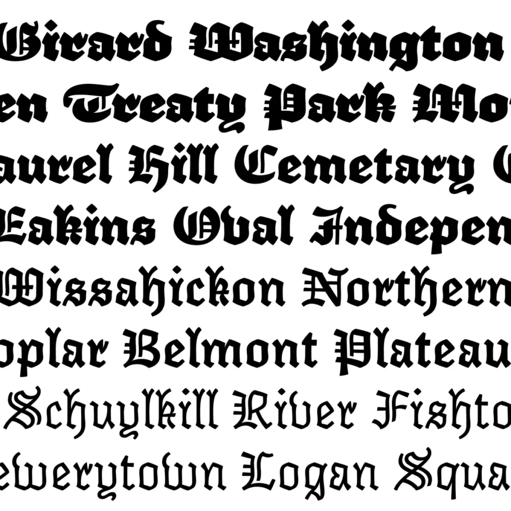
Elfreth distinguishes itself through a deliberate rejection of the "serious" nature typically associated with the genre. In a review by Grant Hutchinson, a veteran typographer and board member of the Society of Typographic Aficionados, the typeface is lauded for its "stylish typographic cowlicks" and "perky dog’s ear terminals."
From a technical perspective, the family utilizes modulated strokes that mimic the movement of a pen without adhering to the calligraphic rigidity of the Middle Ages. The design exhibits a "wobble"—a subtle, intentional irregularity in the stroke—that provides a sense of warmth often missing in digital type. This is particularly evident in the lighter weights, which retain the verticality of a traditional blackletter but possess the airy, open architecture of a contemporary sans-serif.
The range of the family is significant. The lightest cut functions with the clinical precision of a typewriter, while the boldest weights shift into the territory of heavy display type, characterized by a substantial, almost "cuddly" presence that balances density with readability. This flexibility suggests that the typeface was engineered for versatility, allowing it to transition from editorial headers to branding applications where a recognizable, non-standard voice is required.
Chronology of Development and Release
The development of Elfreth follows a trajectory consistent with independent foundries operating in the 2020s. JTD Type, directed by James Hultquist-Todd, has carved a reputation for producing high-quality, research-driven typefaces that balance historical investigation with modern technical execution.

- Early Research Phase: Hultquist-Todd conducted an extensive analysis of historical woodblock type and manuscript scripts, identifying the specific "flared" terminals and calligraphic nuances that would form the DNA of Elfreth.
- Design Iteration: The design process focused heavily on the "cuddly" aesthetic described by critics, prioritizing the removal of the sharp, aggressive angles typically found in Blackletter, opting instead for softened junctions.
- Release and Distribution: The typeface was made available for licensing through the JTD Type platform, targeting designers looking for display solutions that avoid the "graduations and gravestones" trope.
- Critical Reception: Since its 2021 release, the typeface has been adopted by a variety of independent publishers and boutique design agencies, marking it as a successful example of "genre-bending" typography.
Supporting Data and Market Trends
The market for display typefaces has seen a marked increase in interest regarding "transitional" and "hybrid" styles. According to industry reports from platforms such as MyFonts and Monotype, designers are increasingly seeking fonts that possess high "character index"—a metric used to define how distinct or memorable a typeface is in a crowded market.
Elfreth fits into the broader trend of "humanist blackletter." This sub-category of type design aims to retain the vertical rhythmic quality of historical scripts while adopting the legibility improvements of the 21st century. Data from independent design surveys suggest that projects featuring typefaces with unique, non-conforming terminals (like those found in Elfreth) see higher engagement in social media advertising and editorial layouts. By offering a "spared" version of a historically "heavy" style, Hultquist-Todd has successfully created a product that solves the "legibility-personality" paradox for branding professionals.
Official Responses and Industry Impact
While James Hultquist-Todd has not issued a formal manifesto regarding Elfreth, the design itself serves as a statement of intent. By explicitly acknowledging the limited, stereotypical use-cases for blackletter, he positions Elfreth as an agent of liberation for the genre.
Industry experts have noted that the success of such a typeface reflects a maturing design market. "We are moving past the era where a font is just a tool for legibility," says one anonymous industry consultant. "Typefaces like Elfreth are being purchased for their ‘vibe’—a synthesis of nostalgia and modern friendliness that is difficult to manufacture without a deep understanding of typographic history."
Broader Implications for Typography
The implications of Elfreth’s release are twofold. First, it demonstrates that there is still significant creative territory to be explored within historically burdened styles. Designers are no longer required to accept the cultural baggage of a typeface’s origin; through strategic modification, the "bones" of a style can be repurposed for new, disparate functions.
Second, it highlights the importance of the independent foundry model. Unlike large corporate type houses that often prioritize safety and broad market appeal, independent designers like Hultquist-Todd can take risks, such as releasing a blackletter face that is intentionally "cuddly." These risks contribute to a more diverse and vibrant typographic ecosystem, ensuring that the digital landscape remains visually diverse.
Conclusion
Elfreth is a testament to the fact that type design is as much about cultural interpretation as it is about stroke weight and kerning. By taking a traditional form and infusing it with contemporary sensibility, JTD Type has provided designers with a versatile tool that defies easy categorization. Whether applied in a minimalist editorial context or a high-impact branding campaign, Elfreth serves as a reminder that the most compelling designs are those that respect the past while refusing to be held hostage by it.
As digital media continues to evolve, the demand for typefaces that can bridge the gap between historical weight and modern agility will only increase. Elfreth stands as a primary example of this evolution, proving that even the most "serious" of historical scripts can be taught to be both spare and affable. Through its balanced anatomy and intentional design choices, the typeface has successfully carved out a new space in the typographic canon, moving beyond the cemetery gates and into the modern studio.