


Posted inWeb Development
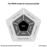
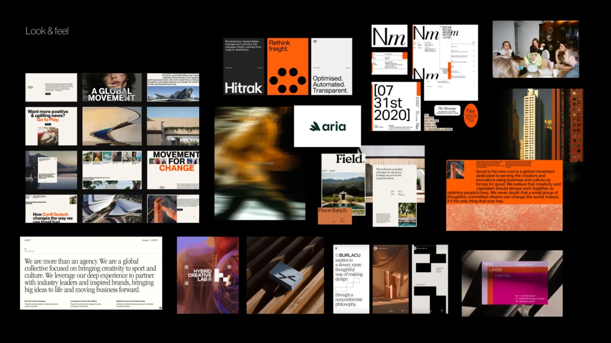
Bridging Strategy and Visuals: The Critical Pre-Concept Phase in Brand Identity Design
The journey to a potent visual brand identity rarely begins with a blank canvas in design software. Instead, it starts much earlier, in a crucial "pre-concept" phase where the most…


